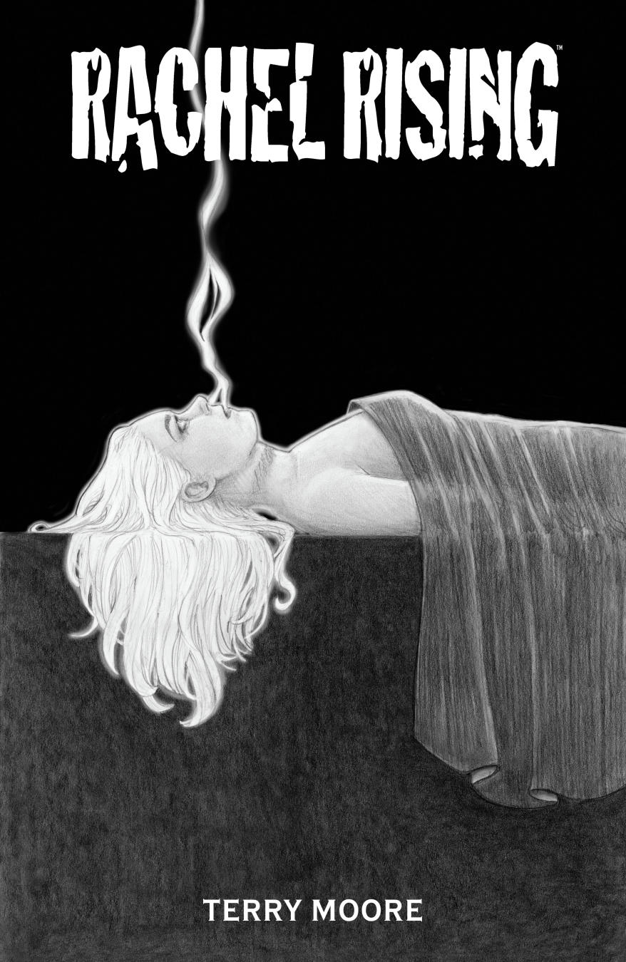
TERRY MOORE’S MODERN HORROR CLASSIC TO BE COLLECTED IN THE COMPLETE RACHEL RISING
Terry Moore’s character-driven and genre-blending stories return to hardcover formats, featuring new covers, fresh design
Terry Moore’s character-driven and genre-blending stories return to hardcover formats, featuring new covers, fresh design

Game Outlet Europe®, an independent distributor of video games and gaming accessories, announced today that
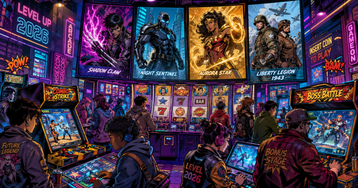
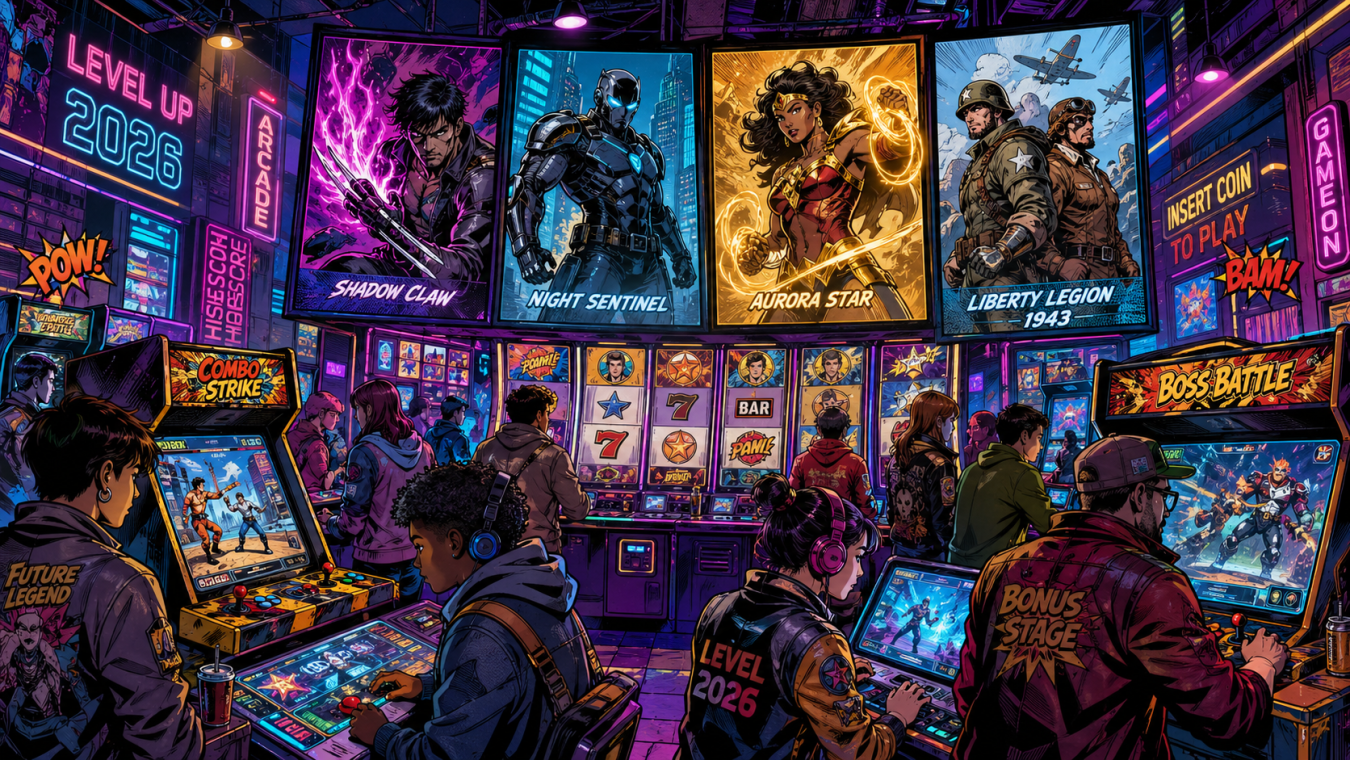
Comic books and games have always felt like a natural match. Big characters, bold visuals,
What’s on the Shelf is built from distributor order forms and shipping date information, giving
What’s on the Shelf is built from distributor order forms and shipping date information, giving
What’s on the Shelf is built from distributor order forms and shipping date information, giving
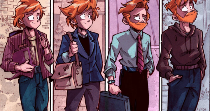
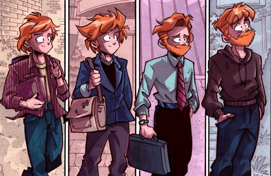
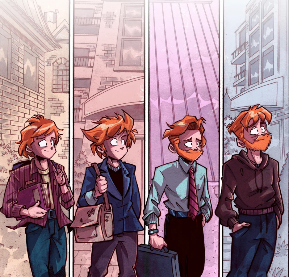
Sometimes a comic doesn’t need explosions, capes, cosmic portals, or somebody getting punched through a
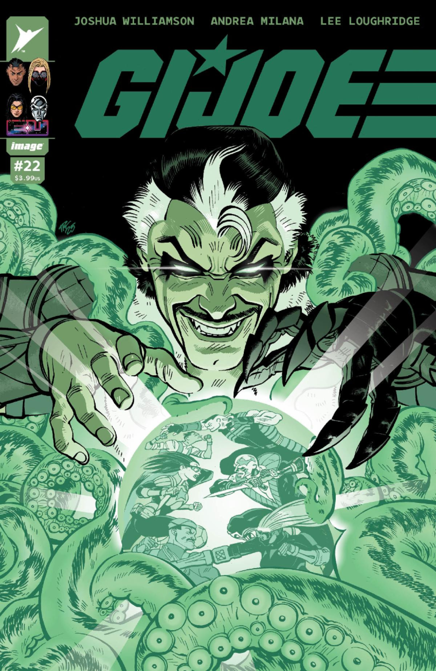
Skybound, Image Comics, and Hasbro, a leading games, IP and toy company, revealed preview pages and the lineup of
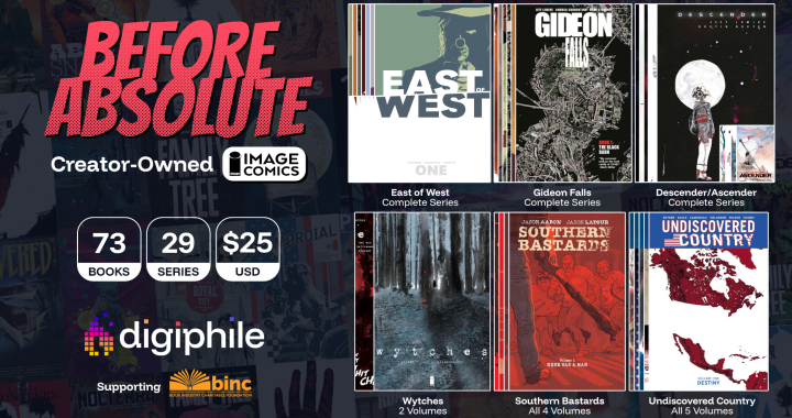
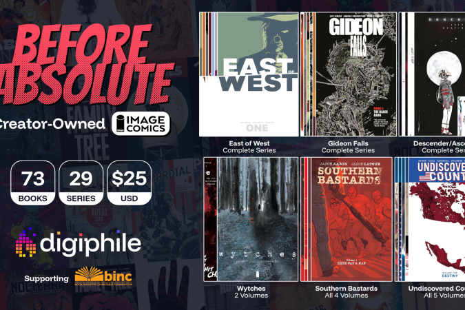
Only $25 for the full digital collection worth over $1,100, featuring classics from 29 acclaimed
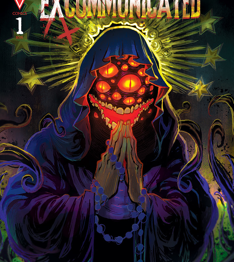
WEPA! Now this is how you kick open the church doors, throw holy water in
Dark Horse Comics and Tiny Onion present The Perfectly Monstrous Life of Adam Frankenstein, a one-shot
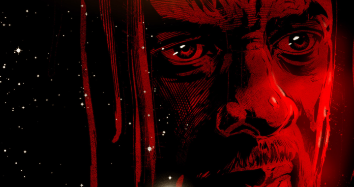
Rage Against the Machine’s Tom Morello Unites with Emmy Award-Winning Writer/Producer Marc Guggenheim and Artist
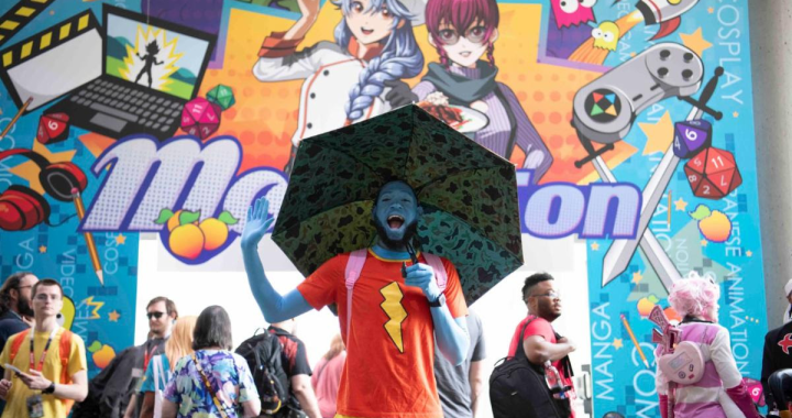
This year features the first-ever US Wonder Festival, the legendary figure and model expo MomoCon,
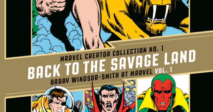
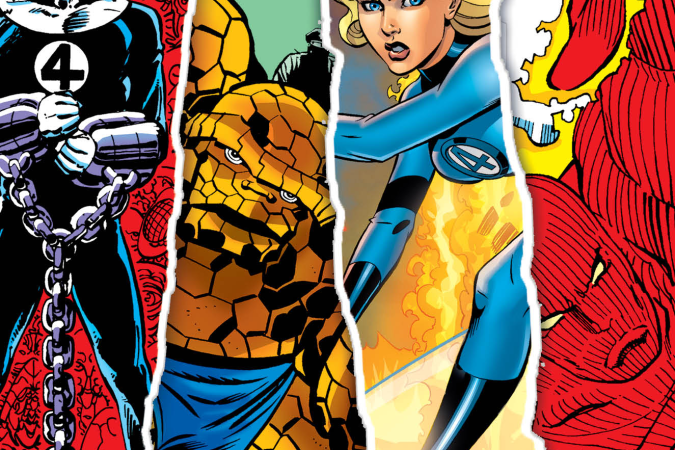
Fantagraphics and Marvel Join Forces to Collect Windsor-Smith’s Long Out of Print Comics A master
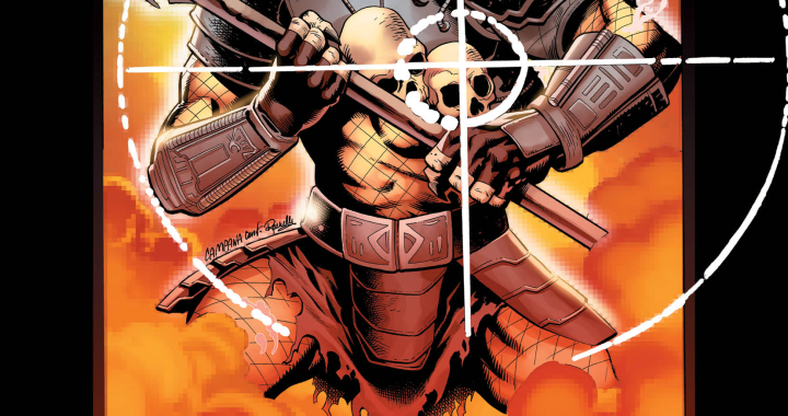
Marvel Comics’ Predator and Planet of the Apes comic book storytelling evolves this July in
Nothing will prepare fans for the most-anticipated Invincible Universe showdown yet. Today Skybound and Image Comics shared a first
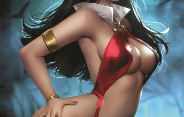
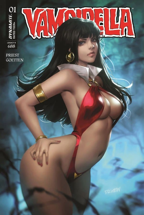
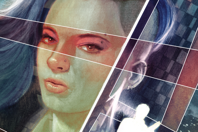
Vampirella #1 hit shops on April 22, 2026. This new #1 is written by Christopher
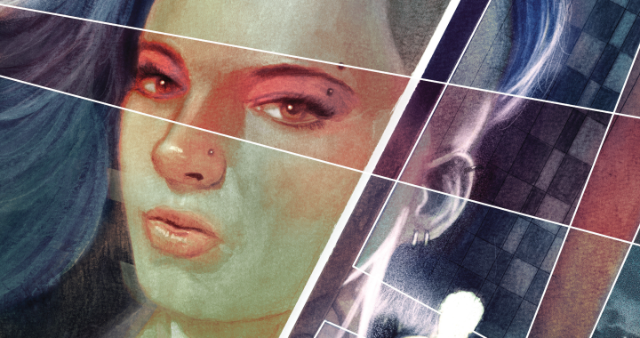
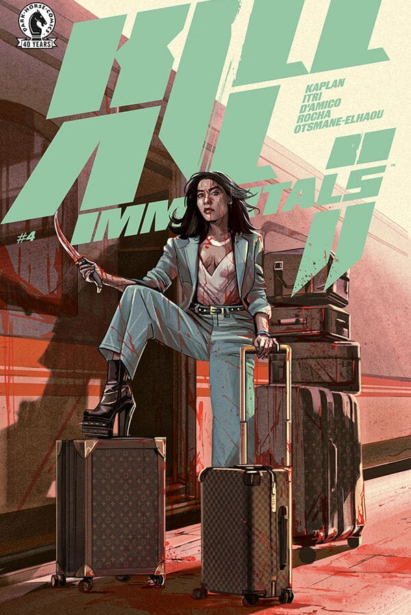
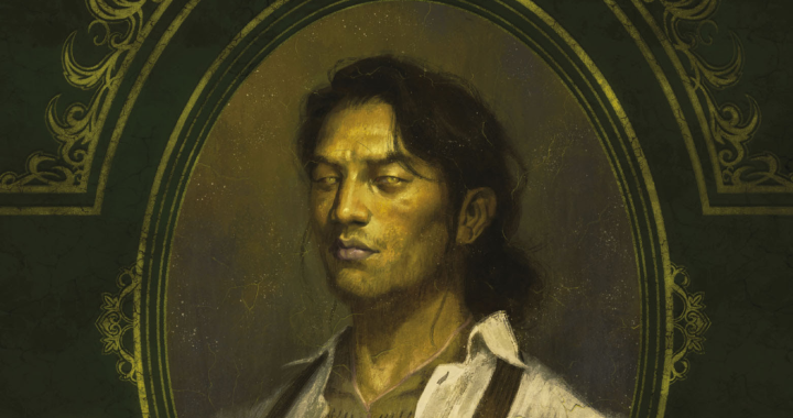
The second series in Zack Kaplan’s 2026 Dark Horse slate is a modern sci-fi detective

Built from the ground up around what made the original MG-1 great. New chassis, expanded
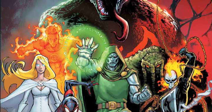
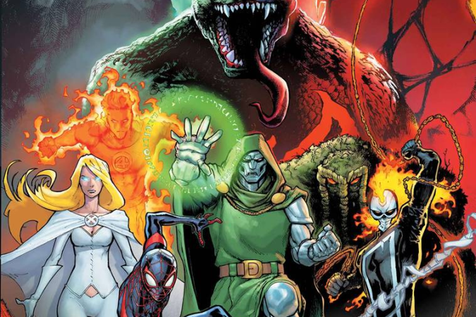
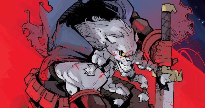
GODZILLA CONQUERS THE MULTIVERSE by Gerry Duggan and Javier Garrón, the next chapter in Godzilla’s