Advance Review: Danger Devil #1
 One of the things I love about the comic book industry is that there is always a book out there for anyone. You want superheroes, you got them. You want horror tinged mature books, you got them. You want thoughtful books that focus on relationships or real issues, you got them too. You even have books that feel so ham fisted, that it is almost too hard to wonder who the said book is aimed at. This is where Danger Devil squarely lands.
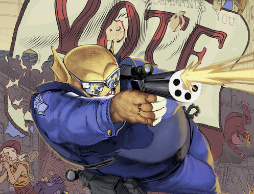
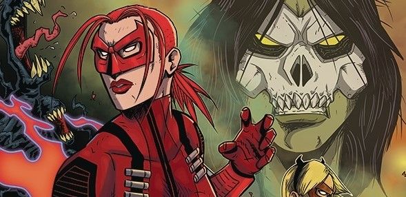
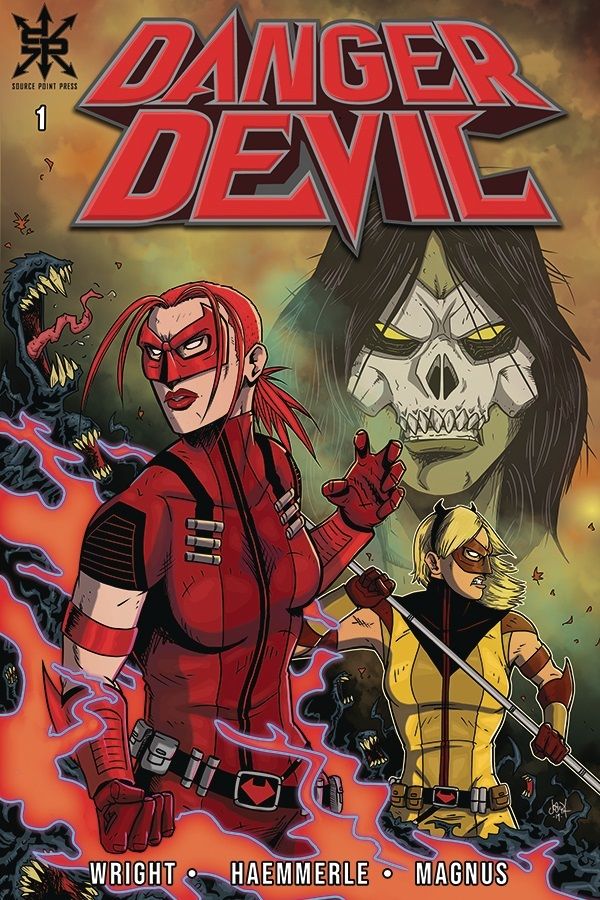
Here’s the lowdown; there is a kid that is being escorted by a member of the Mystic Bureau to a safe place. However things start going pear shaped when “Jenny from the dead block” pops up. Never fear though; Danger Devil and her sidekick and Kid Diabla are jetting their way to save the day and stop the Order of Methalia.
The book is written by Tony Doug Wright in a style, that tries really hard to be fun and on point, but comes across like a constant Dad joke! The idea of the book isn’t original; I get originality is few and far between nowadays, but the main thrust of the story is self-evident to anyone who has watched a Wesley Crusher episode of ST:TNG! The heroes are terrible with their stilted dialogue that tells more than the art shows. Having the speech bubbles were altered to thought bubbles, the constant talking of the characters when there is no-one around to hear them, would make just a tad more sense. The language used is trite and cliched that made me cringe in the way they were misused, as were the coincidences and contrivances that had to occur to see the story through.
The art is supplied by Joseph Haemmerle who tries really hard to make the book work. His work is a little cartoony for my taste, a little too bendy and squishy in places as if more structure was needed. Changing the camera angles may help give the poses more cohesion in places and a more subtle, delicate approach to faces would also help out immensely. The style reminds of me of a pre-teen book; which may be where the creators are heading, though the inclusion of demons and monsters confuses that idea. With no colorist mentioned in the credits I received, I am left to assume that Haemmerle was also responsible for the colors. The scheme here has no nuance, no texture. It is just there, boom on the page. Digital coloring is an art technique all of itself . Too many indie books suffer from a lack of decent coloring. Here, that critique is saved for the writing. Finally, MaGNus does well with a font that is easy to read and again offers the idea that is is supposed to be child friendly book.
In many ways the book kind of reminds me of the Buffy TV show. I recently re-watched a couple of episodes and I have to say, it hasn’t aged well at all. What is surprising is how well Jordie Bellaire’s Buffy book reshapes that world. Unfortunately, it is this “not aged well” vibe that I get from this mixed audience book.
Writing – 2 Stars
Art – 3 Stars
Colors – 3 Stars
Overall – 2.5 Stars
Written by; Tony Doug Wright
Art & Colors by; Joseph Haemmerle
Published by; Source Point Press
Author Profile
- I am a long time comic book fan, being first introduced to Batman in the mid to late 70's. This led to a appreciation of classic artists like Neal Adams and Jim Aparo. Moving through the decades that followed, I have a working knowledge of a huge raft of characters with a fondness for old school characters like JSA and The Shadow
Currently reading a slew of Bat Books, enjoying a mini Marvel revival, and the host of The Definative Crusade and Outside the Panels whilst also appearing on No-Prize Podcast on the Undercover Capes Podcast Network
Latest entries

 Comic BooksApril 19, 2024Review: Jill and the Killers #4
 Comic BooksApril 11, 2024Review: Deadweights #1 (of 6)
 Comic BooksApril 10, 2024Review: Jim Henson’s Labyrinth Archive Edition #1 (of 3)
 Comic BooksApril 3, 2024Review: Red Sonja Empire of the Damned #1