Advance Review: Hawkeye Kate Bishop #1 (of 5)
 The merry Marvel marketing machine of serendipity comes into full play this week as just before the new Hawkeye show debuts on Disney+ we get a new mini series featuring Hawkeye; no not the other one, Kate Bishop! This then is the transition series that moves Kate from West Coast back to good old New York City.
With pressure to return NYC and to remain on the West Coast, Katie chooses the route of prevarication by taking a detour to the Hamptons, following an invitation, which is sure to be a trap of some sort down the line. But who or what is waiting for Katie and Lucky, and perhaps the most pertinent question is why Kate in the first place?
Marieke Nijkamp, a Dutch author who gained a huge amount of plaudits for her first graphic novel, The Oracle Code, looks to focus on the emotional impacts on Kate, something of a trend for Nijkamp. These impacts come from several aspects, which should make Kate’s journey quite interesting. The dialogue fits the current “Marvel humour” model, albeit with a touch of modern day life in form of the now ubiquitous mobile/cell phone text messages; all I need now is a 🙂 to make me LOL! Normally I find this type of inclusion to be twee, but it works well for this character.
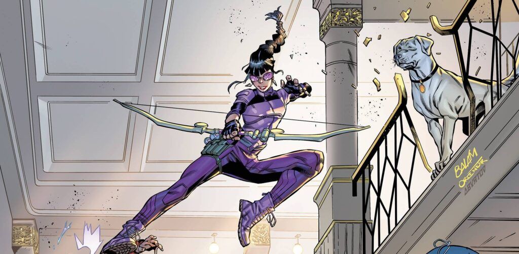
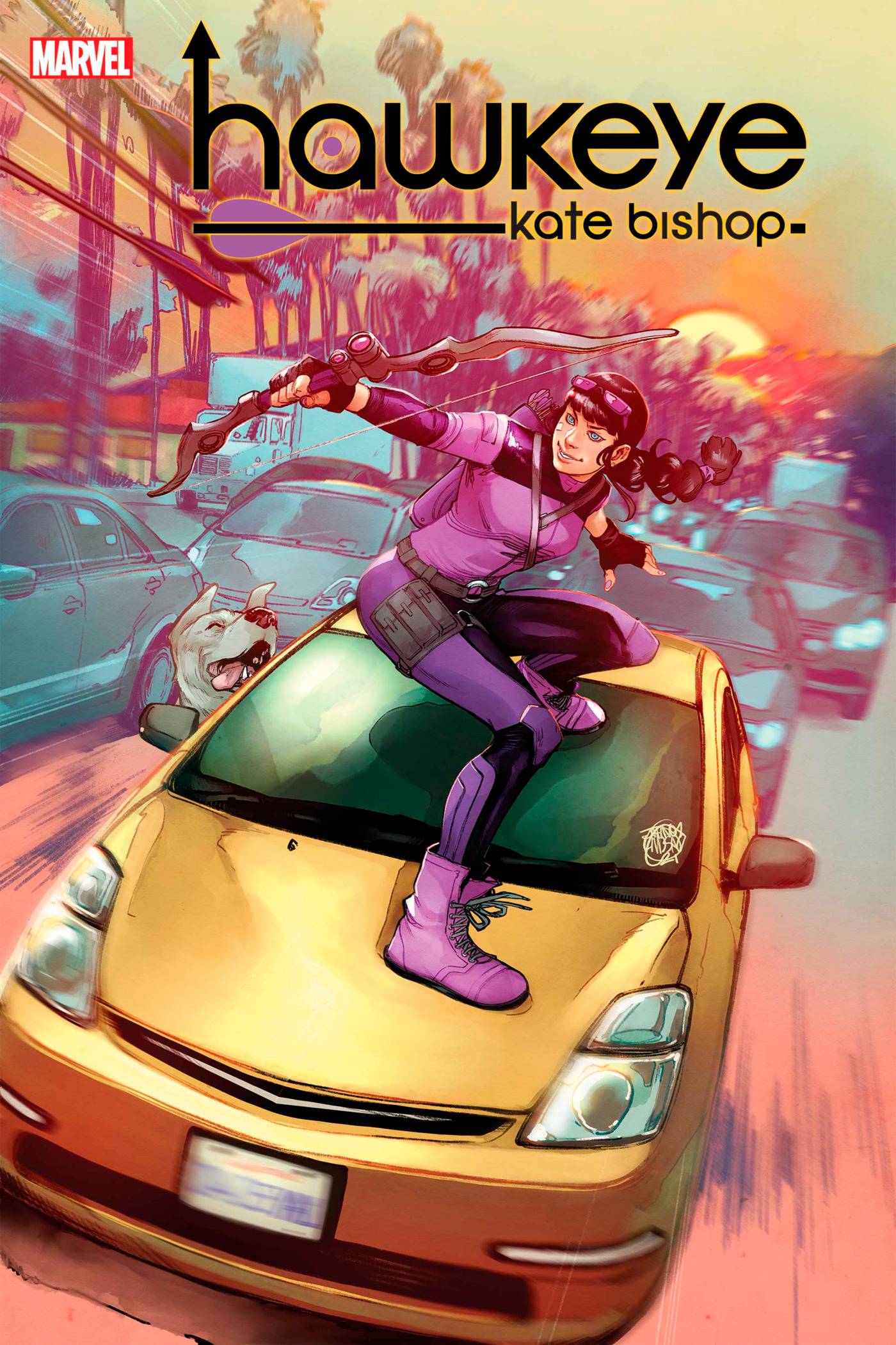
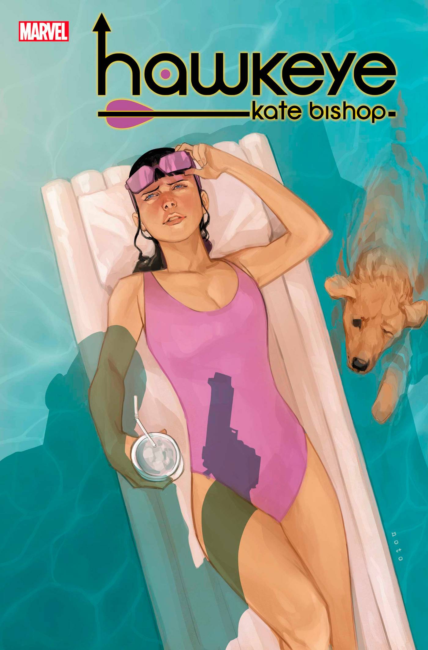 When I first looked at the art in this book I dismissed as aimed at kids. Things is, upon further review, whilst Enid Balám’s style may not be my cup of tea, I have to say that I loved the east flowing action scene which was pacy and fun. I am not keen on the elongated angular style as I feel that is distorts the age and size of the character. Still, this style does allow for some comedic elements to show through, especially in the hotel setting in the third act. Oren Junior adds inks over Balám’s pencils with a mix of heavy and light lines. Colors are provided by Brittany Peer who does a pretty standard job, which now seems to include the Marvel standard of using a blurred lens at times. VC’s Joe Caramagna provides the letters, this time a nice easy font is mixed in with the text speak to give the book a breezy feel. Finally, there are a range of covers to choose from, some more story accurate than some and others being more character focused. The main one from Jahnoy Lindsay is pretty good as the one from Balám, used in the banner at the top of the page. Personally I like the Adam Hughes-esque cover from Phil Noto!
Not being a big Hawkeye (either of them to be honest), fan I had very little interest in this book. I am glad to say that I was pleasantly surprised to find an easy going, light-hearted book that fits the mould of any of Marvel’s main universe line of books.
Writing – 3.5 Stars
Art – 3.5 Stars
Colors – 3.5 Stars
Overall – 3.5 Stars
Written by; Marieke Nijkamp
Art by; Enid Balám & Oren Junior
Colors by Brittany Peer
Letters by; VC’s Joe Caramagna
Covers by; Jahnoy Lindsay, Enid Balám, Phil Noto,
Skottie Young and Todd Nauck
Published by; Marvel Worldwide Inc.
Author Profile
- I am a long time comic book fan, being first introduced to Batman in the mid to late 70's. This led to a appreciation of classic artists like Neal Adams and Jim Aparo. Moving through the decades that followed, I have a working knowledge of a huge raft of characters with a fondness for old school characters like JSA and The Shadow
Currently reading a slew of Bat Books, enjoying a mini Marvel revival, and the host of The Definative Crusade and Outside the Panels whilst also appearing on No-Prize Podcast on the Undercover Capes Podcast Network
Latest entries

 Comic BooksApril 19, 2024Review: Jill and the Killers #4
 Comic BooksApril 11, 2024Review: Deadweights #1 (of 6)
 Comic BooksApril 10, 2024Review: Jim Henson’s Labyrinth Archive Edition #1 (of 3)
 Comic BooksApril 3, 2024Review: Red Sonja Empire of the Damned #1


