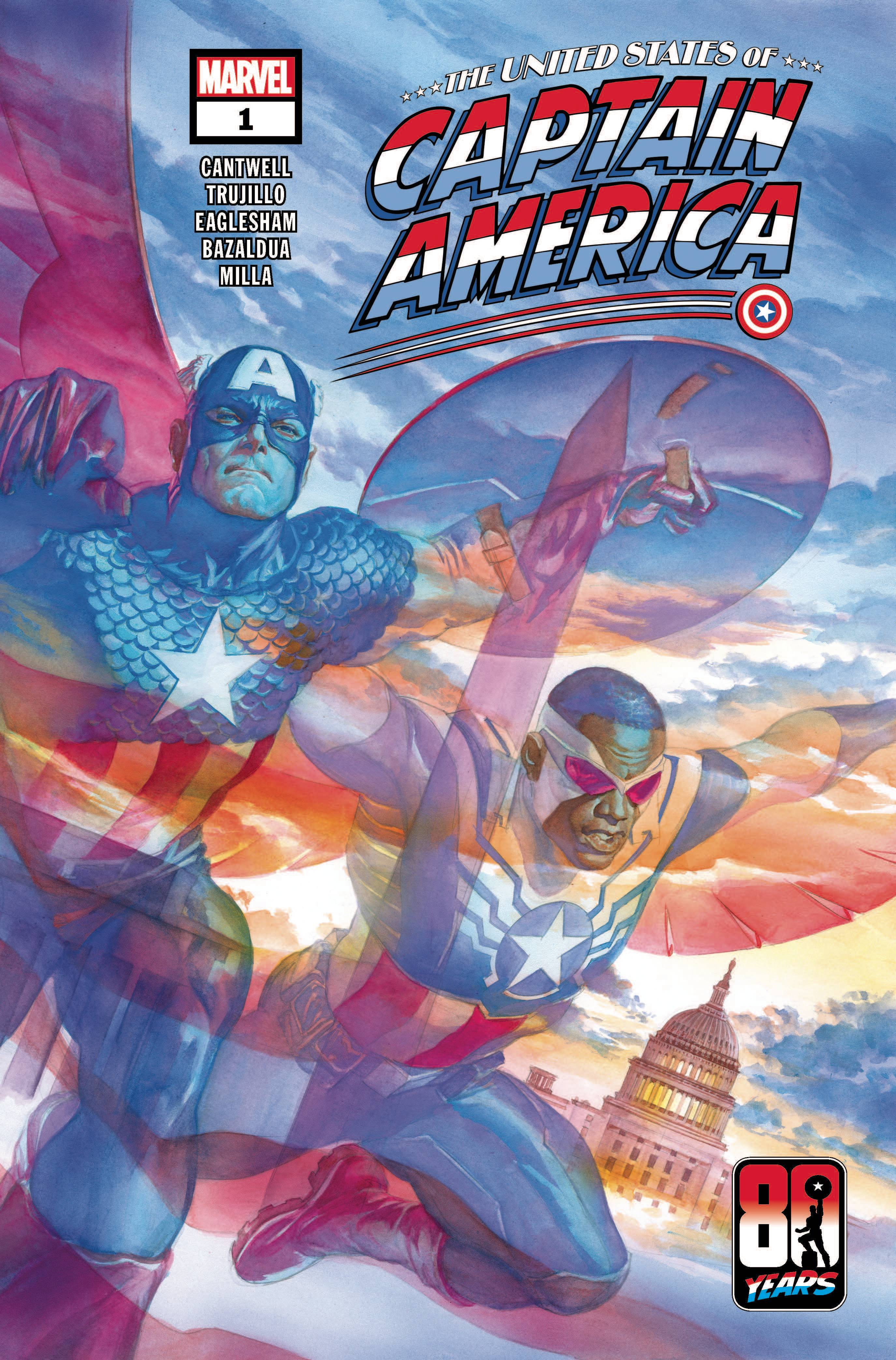
Advance Review: The United States of Captain America #1 (of 5)
 Following on from the the Heroes Reborn / Return, at least in spirit if not continuity, this series looks to re-establish Steve Rogers’ place in the world.
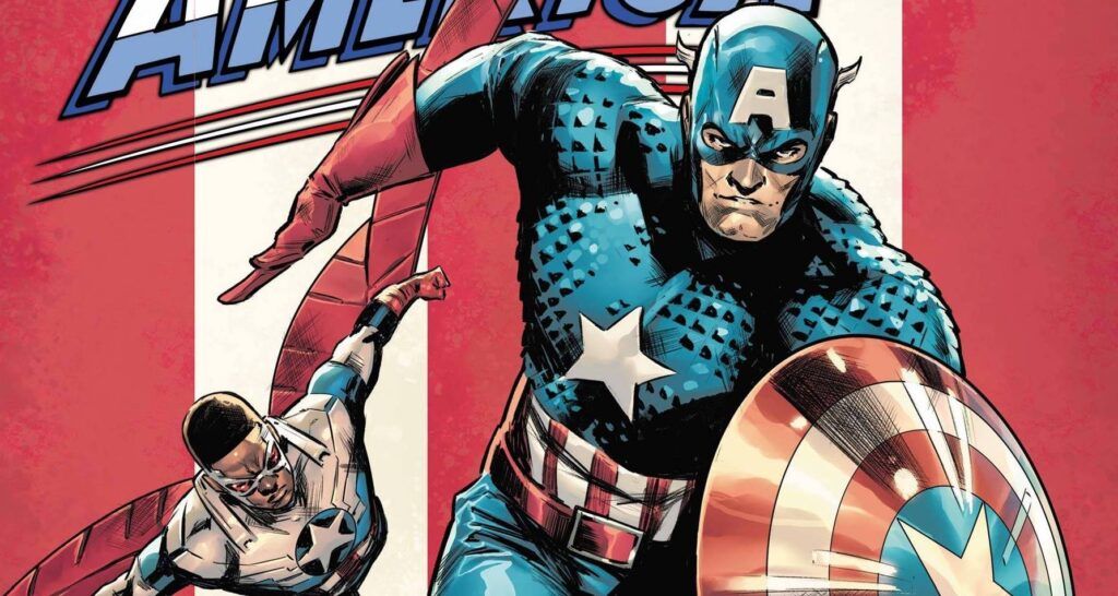
Feeling more out of place than he possibly has previously, Steve is wrestling with the weight of his role and that of his shield. It is a very interesting place to start this new mini-series. After all, where does an overly patriotic character that can be used to interpret the far right and the far left of the political divide actually fit? With the theft of the most symbolic pieces of kit in any comic universe, Steve and Sam team-up to catch the culprit, recover the item and discover a startling revelation depicting Captain America’s true influence.
Having spent time on Iron Man, writer Christopher Cantwell takes on the First Avenger. It is a more thoughtful Cap on show which I think reflects how difficult a character he is to write. When draped in a flag, it is hard to ensure that the everyone is represented. Cantwell tries to deal with this in a twofold manner; first up is the inclusion of Sam Wilson and then there is the main thrust of the Captain’s influence that looks to drive the series. Maybe it is not so much of of Steve Rogers looking for America, but more America finding Steve Rogers? The dialogue is a little dry in places, mainly due to the topics discussed, though it certainly not worth scrimping any of it.
The art is by comics veteran Dale Eaglesham, who I last saw on Geoff Johns Shazam book for DC Comics. Eaglesham is a “classic” style of artist that is evocative of DC’s house style rather than Marvels. Here, Steve is depicted of having muscles on top of muscles as is Sam to some extent, especially out of costume. I know that Steve has is super solider stuff, but I never see him as being as muscular as he is here. Maybe Eaglesham is taking his nods from the movies. The action scenes kind of work; there are other movie influences on show. There are a number of different panel designs in play, which helps keep the reader’s eyes interested. The credit page insinuates that the colorist and letter are the same across the main and back-up stories. With that in mind, Matt Milla’s colors fit the current Marvel preference. Letters are by VC’s Joe Caramagna who excels by delivering a nice easy font that belabours the sheer verbiage on show.
There is a back-up story that looks to add context to some of the happenings in the main half. This is written by Josh Trujillo with art by Jan Bazaldua. Its something of an origin piece; Bazaldua’s art is clean and the colors take a less heavy handed approach really help set the scenes.
Marvel have a bit of a perception problem when it comes to Captain America. With a fractured society, how can one character represent the whole country? This book, through Cantwell, Eaglesham, Trujillo and Bazaldua is taking a bold step to try answer that tricky question.
Writing – 3.5 Stars
Art – 3 Stars
Colors – 4 Stars
Overall – 3.5 Stars
Written by; Christopher Cantwell & Josh Trujillo
Art by; Dale Eaglesham & Jan Bazaldua
Colors by; Matt Milla
Letters by; VC’s Joe Caramagna
Published by; Marvel Worldwide Inc.
Author Profile
- I am a long time comic book fan, being first introduced to Batman in the mid to late 70's. This led to a appreciation of classic artists like Neal Adams and Jim Aparo. Moving through the decades that followed, I have a working knowledge of a huge raft of characters with a fondness for old school characters like JSA and The Shadow
Currently reading a slew of Bat Books, enjoying a mini Marvel revival, and the host of The Definative Crusade and Outside the Panels whilst also appearing on No-Prize Podcast on the Undercover Capes Podcast Network
Latest entries

 Comic BooksApril 19, 2024Review: Jill and the Killers #4
 Comic BooksApril 11, 2024Review: Deadweights #1 (of 6)
 Comic BooksApril 10, 2024Review: Jim Henson’s Labyrinth Archive Edition #1 (of 3)
 Comic BooksApril 3, 2024Review: Red Sonja Empire of the Damned #1


