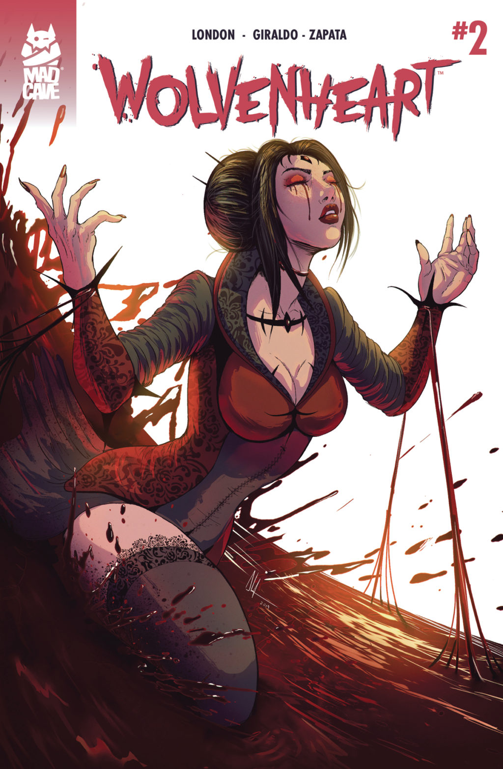
Advanced Review: Wolvenheart #2 (of 6)
 One of the biggest benefits of the medium of comics is that they can be so many different things at once. Mad Cave Studio“s Wolvenheart series is clearly testing that theory to the fullest extent. Creator Mark London along with his entire creative team including artist Alejandro Giraldo and letterer Miguel Angel Zapata put together a book that brings together monster hunter fantasy, gothic horror tales, and time-traveling dimension-hopping science fiction. Why pick one when you can be everything?Â
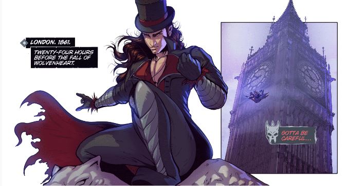
Now two issues in the crux of the narrative is beginning to form. Armed with the knowledge the Black Queen may be more than a myth Sterling Cross is attempting to confront Queen Victoria who is distraught over the loss of her Prince Albert. With only twenty-four hours until the fall of WolvenHeart Sterling has little time to stop the coming of the Great Crossing from occurring. Quickly he discovers this may be a battle he is not capable of winning.Â
If there is one downside to this concept so far is that the ideas are present but the purpose and along with that the stakes are a bit lacking. This world is still in development so the concern of it all falling apart does not have the same impact as it would if things were better established. Progressing mystery is important but when that mystery clouds purpose it can be troublesome and hinder investment. A simple focus on the why behind the what would flesh out the story and make it even stronger.Â
For example, seeing characters like Van Helsing Dorian Gray and Nikola Tesla exist within the same narrative has a surreal sense of adventure to it. Fans of history, classic literature or horror will have a lot to like, however, if you do not bring in any outside knowledge of who those people are their introduction into the story will bare little impact. The climax of this issue involves a lot happening including the hidden intentions of characters being revealed, however minus the briefest of cameos in issue one not much as done to give that shock the setup it needed. Obviously two issues into a seven-issue story there is a lot more time for that concern to be addressed, however, a story can quickly lose itself if it has to consistently go back to fill in gaps that were left in previous issues.Â
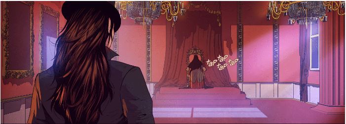
Where the story has excelled so far is with the character of Sterling Cross, and with him being our main antagonist that is by far the most important piece of making a good comic. Sterling has that type of brash attitude that rejects authority for the sake of doing what he feels he needs to do–a man or perhaps a monster of action committed to the cause. What has made him more than that though are the quieter moments where we see how much he cares Kesia and Sabrina showing he is not your atypical selfish hero. When you place a character around so many legendary figures there is pressure to make him or her as larger than life as they are. So far this is doing just that.Â
Artist Alejandro Giraldo is pulling double duty as he does the colors as well. When you are dealing with time travel in comic colors are super important to make each period feel distinct from the next. Overall the color choices lean more towards the modern side when visiting the 19th century but never to a distracting level. Something that should not be overlooked is the costume design. Drawing Victoria gowns and overcoat suits is a lot harder than it looks, especially with some of the intricate designs he includes.Â
Not all the art worked to that level. Something like the two-page spread chase sequence at the start of the issue has a good idea with messy execution. The center of the page gives you this aerial map of London to provide context to the distance between Big Ben to Buckingham Palace, while on the bottom panels are laid out to give windows into the actual action of the moment. Why it does not fully work is because it undercuts itself right away. The aerial map tells the reader he made it to his destination so by the time you shift your eyes to the actual action you are waiting for the inevitable. By no means is this a major issue. Simply worth pointing out as it is indicative of the comic as a whole.
A book like this will live and die on its lettering and Miguel Angel Zapata certainly allows it to live. His world placement and design give room for the art to breathe even with the script gets more dialog heavy. There was a lot of stylized lettering as well. Although it was odd that Sterling“s inner thoughts differed in design in this issue compared to the last one. Both the dialog box and word color changed. One cool choice was when small logos were used to distinguish between a character“s dialog when the story flipped back and forth between time. It was the type of decision that shows you the power of good lettering. Without it, that scene would be much harder to follow.Â
Final Thoughts:
Two issues in and WolvenHeart has the genius of a great comic it just needs to give more time for the ideas to breathe and that potential will be realized. Any fan of genre stories will appreciate the creativity behind the world this is building. Getting to see Sterling Cross explore that world in the next five issues should be a lot of fun.
Score: 3 out of 5
Author Profile
- A fan of all things comics. Growing up on a healthy diet of 90's Batman and X-Men cartoon series ignited a love for the medium that remains strong today.
Latest entries

 ColumnsSeptember 8, 2021What Big Fan teaches us about Fandom
 Comic BooksSeptember 2, 2021Review: Second Coming: Only Begotten Son #4
 Comic BooksAugust 12, 2021Review of Spider-Man: Spider’s Shadow #5
 Comic BooksAugust 5, 2021Advanced Review: PRIMORDIAL #1 (OF 6)