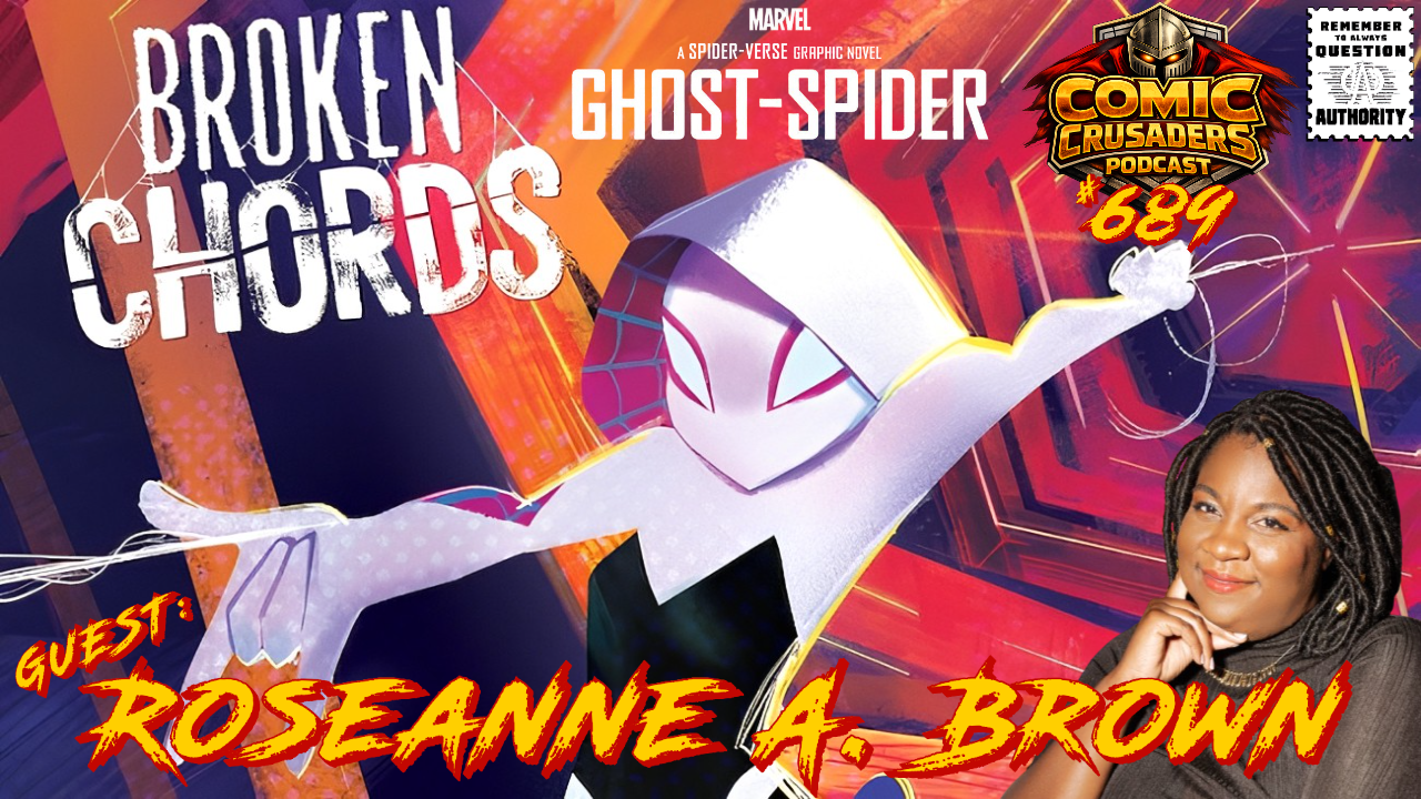


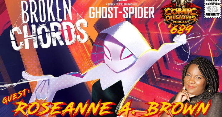
Ghost-Spider: Broken Chords w/Roseanne A. Brown | Comic Crusaders Podcast #689
The Comic Crusaders Podcast is swinging into the Spider-Verse with Roseanne A. Brown to talk
The Comic Crusaders Podcast is swinging into the Spider-Verse with Roseanne A. Brown to talk
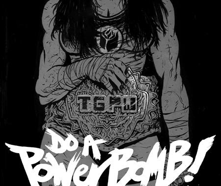
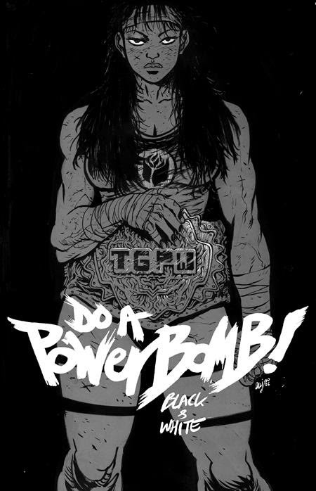
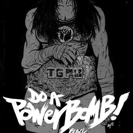
The action-packed, Eisner Award winning Do A Powerbomb by Daniel Warren Johnson (Transformers, The Moon is Following
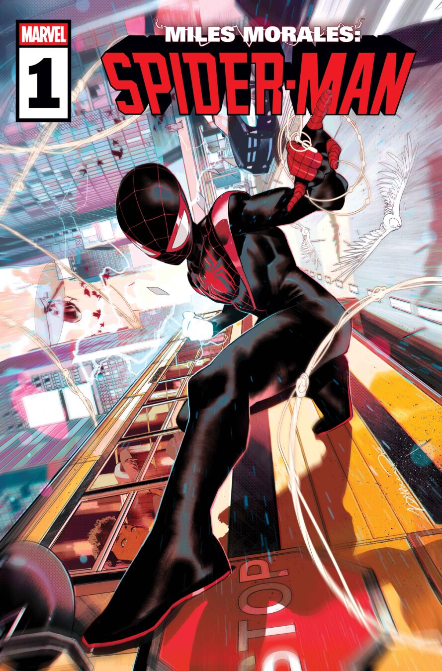
Miles is back in the classic red and black costume this August for the beginning
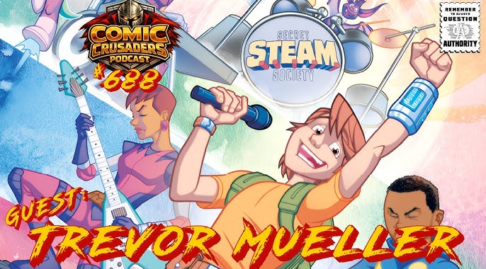
Trevor Mueller is back on the Comic Crusaders Podcast, and this episode hits that sweet
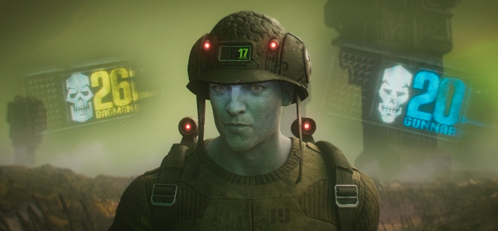
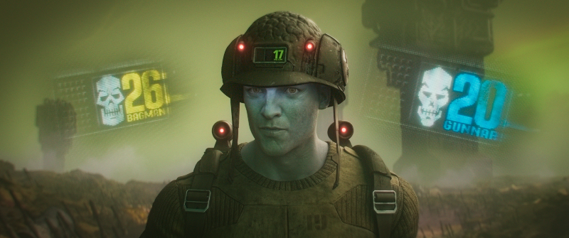
The first teaser trailer for the forthcoming Rogue Trooper movie was revealed today as part of

Asia has firmly established itself as the global epicenter of gaming, with rapid growth driven
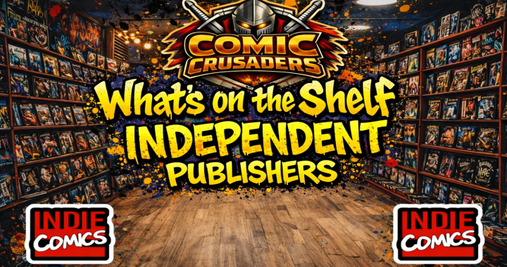
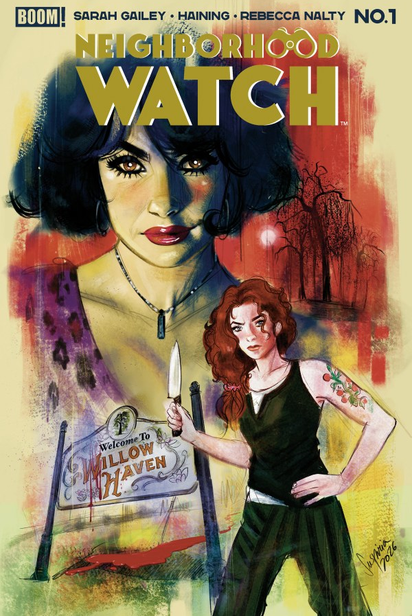
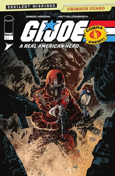
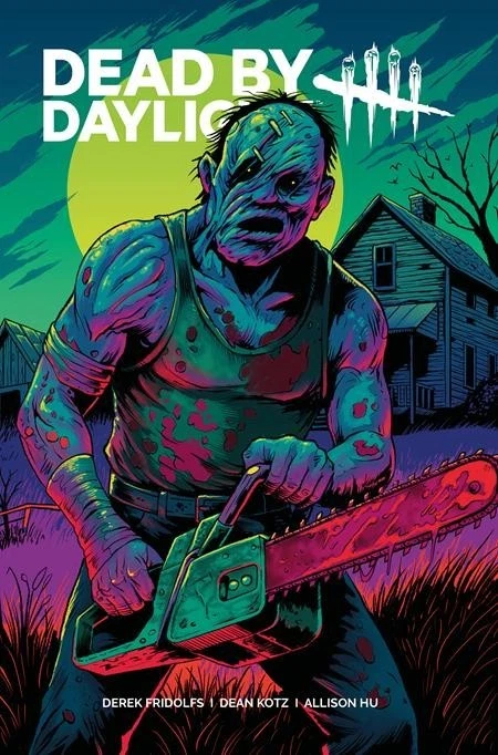
What’s on the Shelf is based on the shipping dates from the distributors order forms.
What’s on the Shelf is based on the shipping dates from the distributors order forms.
What’s on the Shelf is based on the shipping dates from the distributors order forms.
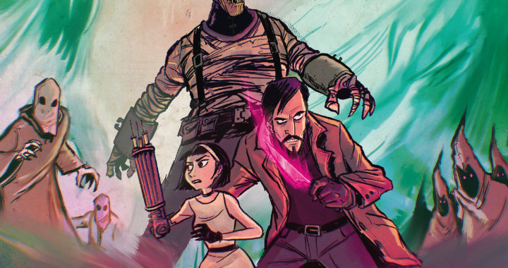
From acclaimed creators Shannon Eric Denton and David Hartman comes Spectors, a pulse-pounding supernatural adventure blending
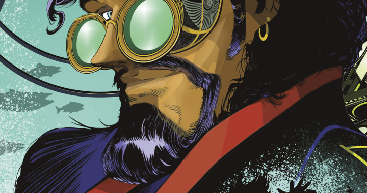
Coming This July From Mad Cave Studios A Hidden World of Covert Power and Impossible
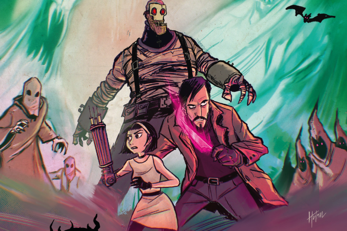
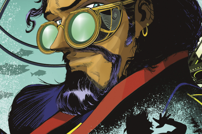
A Hidden Legacy, a Violent Path Forward, and Something Ancient Waiting at the End of
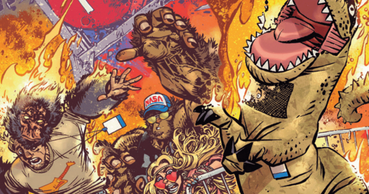
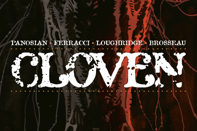
The Lines Are Longer. The Panels Are Wilder. And This Time, Even the Ads Might
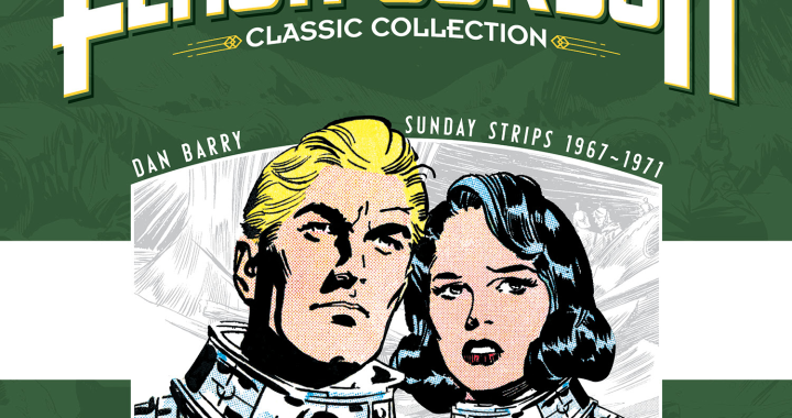
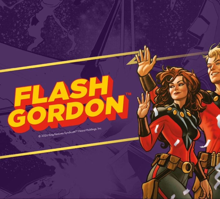
From Pluto to the Death Planet, Dan Barry’s Vision of Flash Gordon Expands the Boundaries
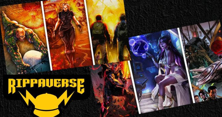
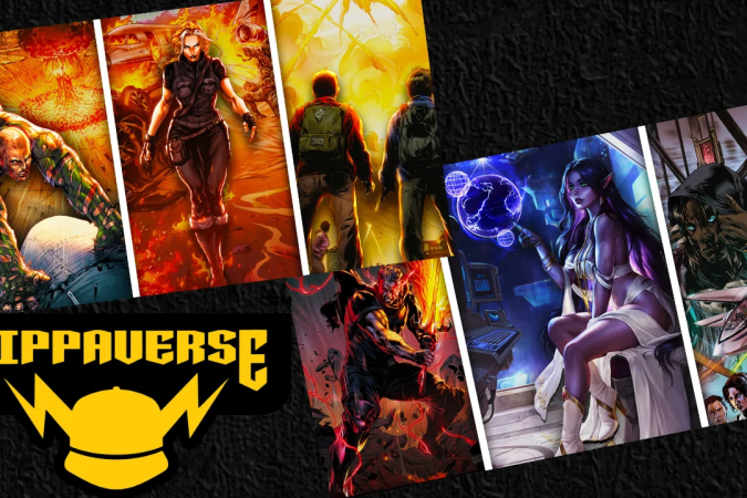
The Rippaverse is not creeping forward quietly. Nah. It is kicking the door open again
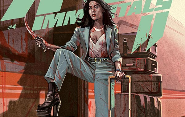
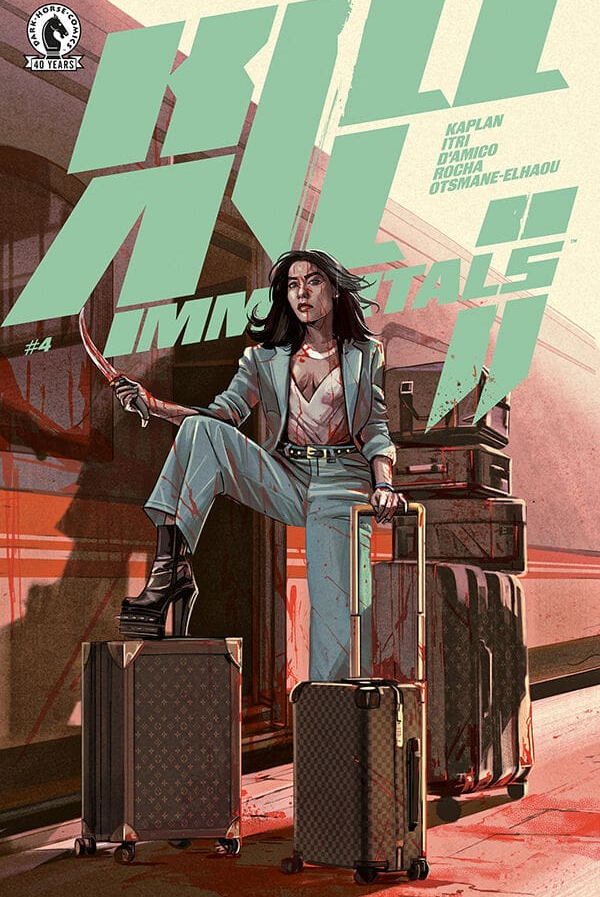
Kill All Immortals Part 2 #4 is the kind of comic that does not tiptoe
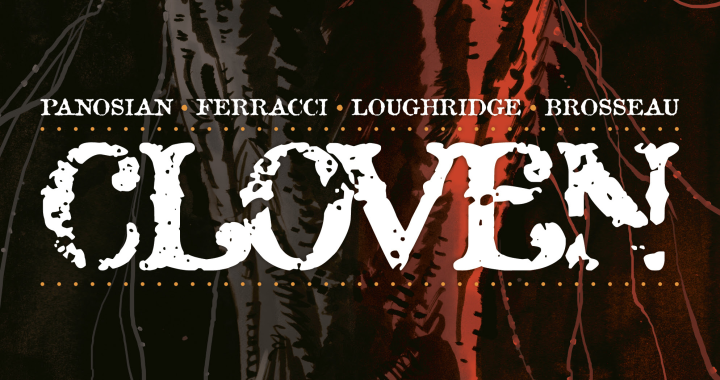
There are comics that ease you in nice and slow… and then there are comics
Skybound and Image Comics, in collaboration with Hasbro, a leading games, IP and toy company, shared a first look
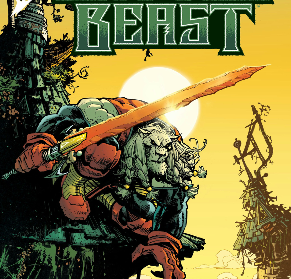
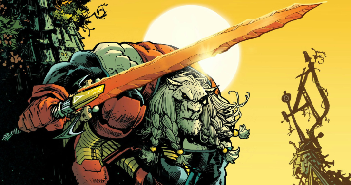
The brutal sword and sorcery mythos of Fire and Ice brings even more exciting comics action this
Kristin Kreuk is making her comic book debut in haunting style, and Black Star already