Review: Madballs vs Garbage Pail Kids #4
 Oh, the 80s with the Ghostbusters, E.T., and LegWarmers. What an interesting time that was, especially with the unlikely fame of the Garbage Pail Kids. What started as a parody of the uber cute cabbage patch kids, the GPK were grotesque character cards created by the Topps Company. While increasingly disgusting, the art in those cards was filled to the brim with character and charm. They were fun, weird, wild, and most importantly unique. It is not by chance that one day these crazy characters would end up in stories of their own, and well here we have this book.
Accompanying the GPK we have Madballs, and what are Madballs you might be asking? Well if you weren’t born in the 80s like me then you probably had to google and came to find out that they were equally ugly and grotesque characters but instead of characters, they were actually foam balls you could throw at your friends. Not unlike the GPK they are filled to the brim with really cool and gross character designs, so it only makes sense to take these two repulsive things from the 80s and bring them together to duke it out in their own comic.
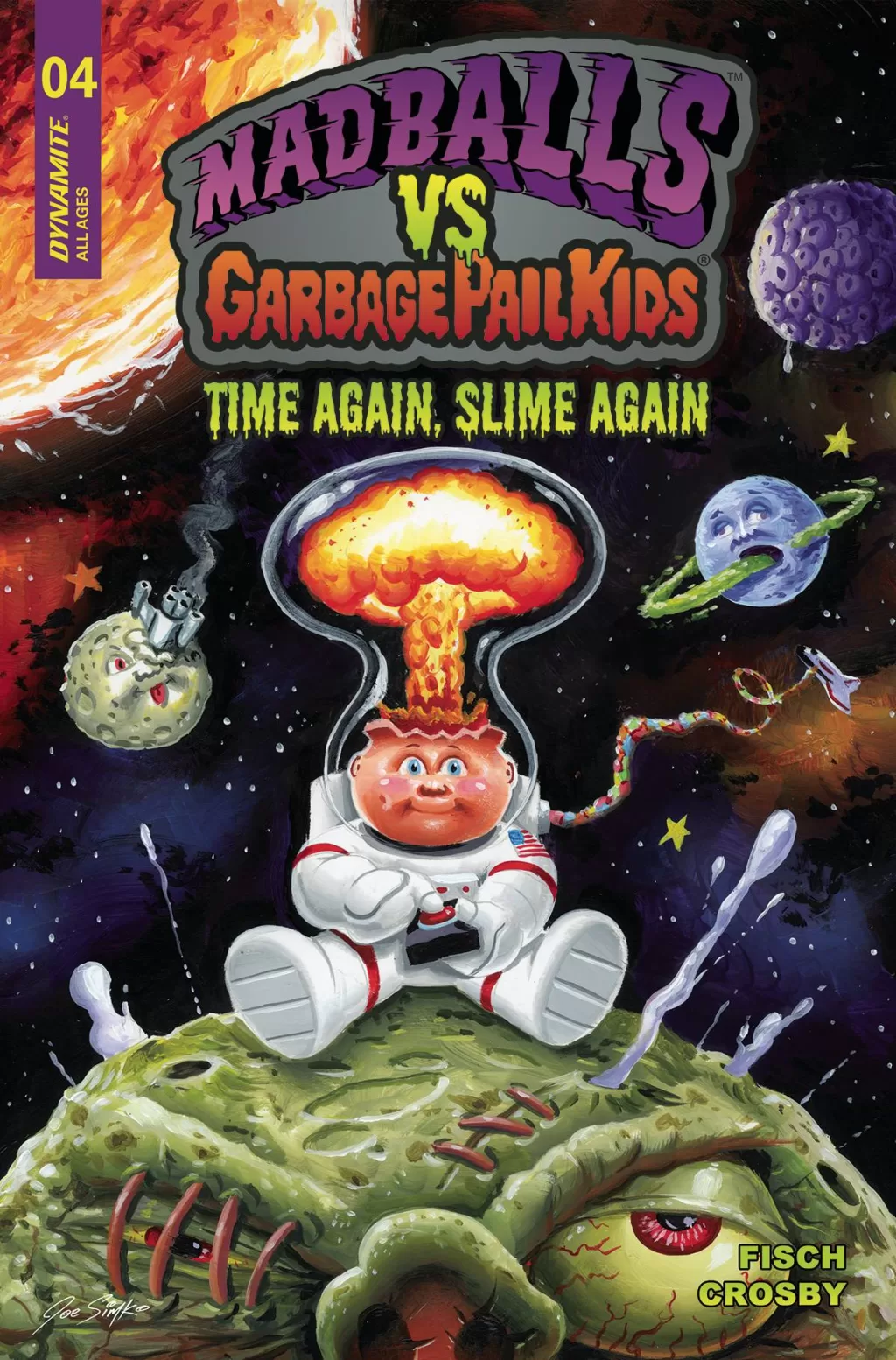
Madballs vs GPK is a fun ride filled with really gross illustrations. A lot of snot, slime, puns, and actually funny dialog. This particular issue is about our revolting repertoire of personalities going on a race to see who will reach the moon first, it also includes a second story about them traveling to the future where they find a perfect society based on efficiency. I honestly don’t know what to say about this, it’s so weird and gross just like the original cards and toy lines, but so fun to read. The art is very good and feels so much like the original cards but the colors are where it’s really at, Jason Crossby does an amazing job at keeping the feel of the original cards but updating it for a modern audience. It’s fun and childish but at the same time, it’s not particularly dumb. Whilst I am a fan of the occasional dad humor, this book is filled to the brim with punny jokes that actually land not unlike the GPK landing on the moon. Having read and reviewed two books now based entirely around puns, I am surprised to say this is the better of the two books. I believe it’s because the puns actually add to the story in fun ways that move the story forward one way or another. I also really liked the fact that the eye Madball always says the word eye instead of “I” That was clever and adds a bit of background to an otherwise gimmicky persona.
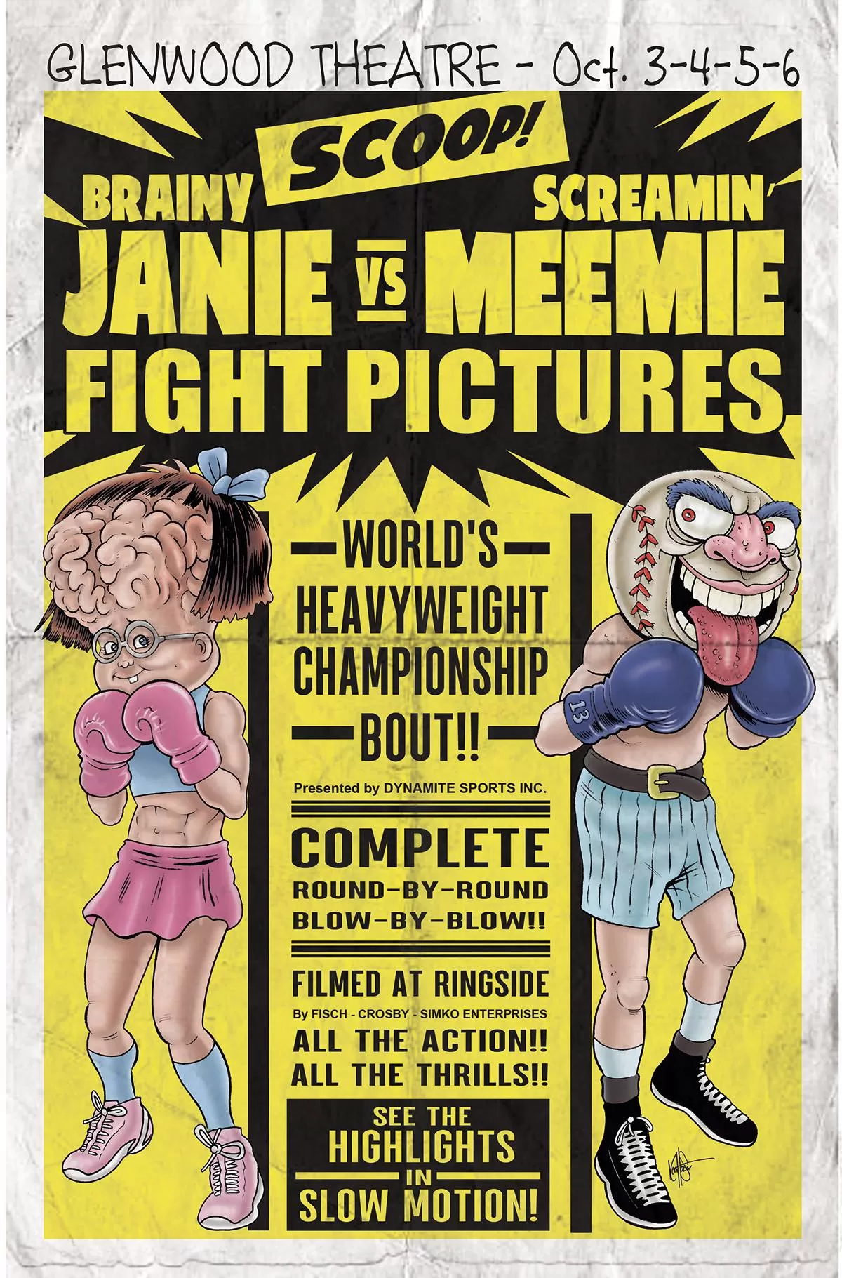
The cover art by Joe Simko is very good as well, and I love how they used a lineless painterly technique for it because it makes the title text and logo really pop against the beautifully rendered space backdrop. Also, big props to whoever made the inside credit page because that black and white illustration of the Madballs terrorizing the GPK is fantastic, and I love the use of the negative space to put in all the credit information and publishing text.
One other thing about the art is that they used full-page illustrations to the maximum by creating amazing rendered illustrations of the characters complete with their nauseating imperfections. The lettering is very good as well, and I especially love the use of custom word balloons to differentiate when the GPK is talking versus when the Madballs are talking. It actually creates a divide between the characters and helps to further drive the narrative that in this series they will be arguing, quarreling, bickering, tussling, wrangling, and skirmishing against each other. (That’s a little inside joke for when you read the story)
All in all it’s a fun little read, it’s not too short and it’s packed with all sorts of gooey action and fun, so it’s quite a fast read as well. This makes the fact that you have two stories for the price of one that much more satisfying, it definitely shows that they know what they are doing with this title. I have two tiny quirks that I must mention however, the first one is that whilst I like the little activity pages at the end of each story I don’t know how much I can sign off on them. As an avid comic book collector, I dread the idea of writing on one of my comics, that being said I still enjoyed doing the little word games and puzzles in my mind so that’s nice. I just picture a little kid getting one of these books and writing on them and it gives me the heebie-jeebies. The second issue I have is that there are a couple of typos here and there which is never good to find in any story, and with so many great things going for this book I wish those typos weren’t there. This is interesting actually because it’s not so much as words being misspelled but words actually not being there at all, which makes me think that maybe someone forgot to double check a script there or maybe they did an edit on balloon size and then went to a bigger size but forgot to add the words back in. Whatever the case may be this was fun and I would recommend you pick it up. Be warned though it is gross in so many ways, but the fun kind of gross you know, the 80s kind of good gross.
Writing- 4.8 Stars
Art – 5 Stars
Colors – 5 Stars
Overall – 4.8 Stars
Writing by; Sholly Fisch
Art and Colors by; Jason Crosby
Lettering by; Saida Temofonte
Edited by; Joseph Rybrandt
CoverArt by; Joe Simko & Various
Published by; Dynamite
Reviewed by Antonio “Mabs”
Author Profile
Latest entries
 Comic BooksApril 30, 2024REVIEW: Rick and Morty: Kingdom Balls #1
 ReviewsApril 30, 2024PRCC2024 Recap: Fans from all over the world join together in Puerto Rico to celebrate all things comics, anime and videogame
 Comic BooksMarch 30, 2024REVIEW: Monstress #50
 Comic BooksMarch 28, 2024REVIEW: Cemetery Kids Don’t Die #2