
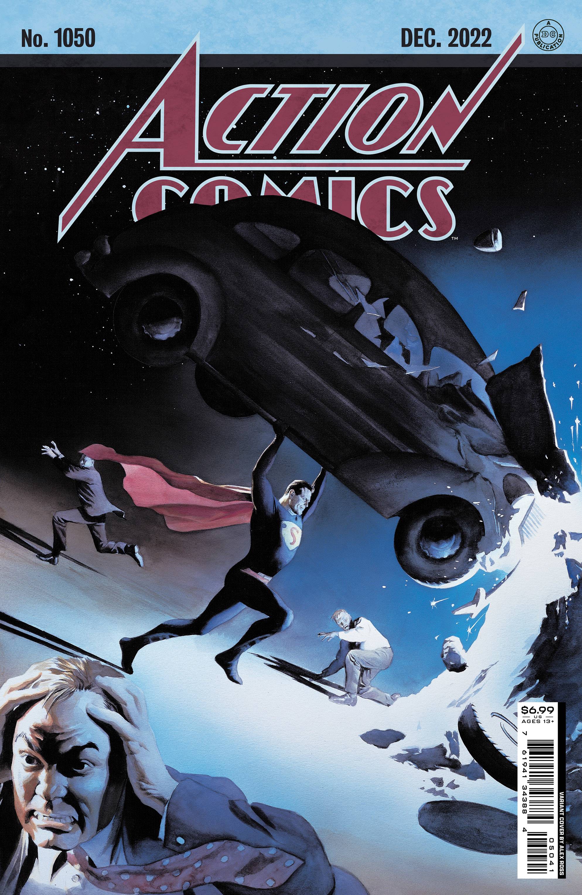
Review: Action Comics #1050
 The more things change……
A little while ago, Brian Michael Bendis took the Man of Steel in a whole new direction as the outed Clark Kent as Superman. Truth be told, this sort of thing was a long time coming and it worked, though when this sort of change of pace occurs there is always a kind of spider (should that be super?)-sense that states at some point things will go back to the status quo; what matters is how we get there.
Lex Luthor has had something of an epiphany; with Warworld, Dark Crisis amongst other threats to the universe, he has come to the realisation that the world needs Superman. Not the ‘gee, golly, wow’, Superman who lives on a farm, with parents and a wife. The world needs, da da da da daaa Superman, not Clark Kent! With this idea as Lex’s plan, it is time for him to take on Superman, again!
Philip Kennedy Johnson has been laying tracks for this story for a while. How successful this issue works for you depends on a couple of things. Firstly, have you seen Spider-Man No Way Home? Secondly, have you read Spider-Man One Day More? Finally, have you read Dark Reign? In all three examples, identity and who knows what are vital to the stories success. Johnson does well extolling the virtues of the identity issue, from both Lex’s and Superman’s point of view. Surprisingly, it is Batman who makes the most sense. The ramifications affect not just Supermen; Jon Kent gets to fly under the radar, in a well observed moment. The book also gives little nudges to the future of the Super books with snippets from Tom Taylor and Joshua Williamson. Disappointingly, there’s no Power Girl preview.
The art is provided by Mike Perkins, Clayton Henry and Nick Dragotta. I believe that Perkins provides the main thrust of the book with a languid, kind of stretched out look to the bodies. The action scenes work really well, even if Lex’s head seems more egg than egg-head! Superman looks great, large chest, strong neck and powerful frame. The Manchester Black situation is creepy and thoroughly menacing; if I can feel the threat level for a character that I don’t particularly like then something must have been done very well indeed! The final act art is ultra dark, which is probably a given considering it it based in Gotham. I would like to give credit where credit is due, but the credits page doesn’t list whom did what. Colors across the board are provided by Frank Martin who does well in providing a scheme that matches the individualistic art styles. Dave Sharpe’s letters work throughout the book, in. all stages. Its a shame that he is the only creator not mentioned on the cover!
So there you have it. Another version of the DC Universe is coming to a close. Next month sees the start of the Dawn of DC and with it more changes for a range of characters. Who better than Big Blue to kick things off?
Writing – 4 Stars
Art – 4 Stars
Colors – 5 Stars
Overall – 4.5 Stars
Written by; Phillip Kennedy Johnson, Tom Taylor & Joshua Williamson
Art by; Mike Perkins, Clayton Henry & Nick Dragotta
Colors by; Frank Martin
Letters by; Dave Sharpe
Published by; DC Comics
Author Profile
- I am a long time comic book fan, being first introduced to Batman in the mid to late 70's. This led to a appreciation of classic artists like Neal Adams and Jim Aparo. Moving through the decades that followed, I have a working knowledge of a huge raft of characters with a fondness for old school characters like JSA and The Shadow
Currently reading a slew of Bat Books, enjoying a mini Marvel revival, and the host of The Definative Crusade and Outside the Panels whilst also appearing on No-Prize Podcast on the Undercover Capes Podcast Network
Latest entries

 Comic BooksApril 19, 2024Review: Jill and the Killers #4
 Comic BooksApril 11, 2024Review: Deadweights #1 (of 6)
 Comic BooksApril 10, 2024Review: Jim Henson’s Labyrinth Archive Edition #1 (of 3)
 Comic BooksApril 3, 2024Review: Red Sonja Empire of the Damned #1


