Review: Batman ’89 #1 (of 6)
 This is one of the books that somehow gained a lot of attention. Sure, most Bat-fans love the ’89 movie; it paved the way for a more adult Batman, at least until Joel Schumacher got involved, but the knock was that it was more style than substance even going as far as to focus on the villain than the hero. This book then follow the movies continuity leading directly from the ’89 movie.
A peace of sorts has descended upon Gotham. With Batman now a regular sight, crime is on the decrease. Still that’s not quite good enough for Harvey Dent. Now romancing Commissioner Gordon’s daughter, Harvey has his sights set on bringing in the Bat before things escalate with copycats and such. There is also a case of social injustice to resolve; maybe Bruce Wayne can be a bigger help than his body armoured alter ego.
The book is the brainchild of Sam Hamm who was a co-writer on the movie itself. After so long, there has been much written about the movies, the things that were intended and the things were left out. The mechanic that features in an episode of B:TAS is a direct lift from and idea for Batman Returns. That got me thinking, how many more “not right for the movies’ elements will appear in this mini series. There is even a robbery featuring a helicopter that scream Batman Forever Hamm takes license, which seems to be the norm at the moment, regarding a bunch of characters, be it Barbara or a would be Robin or even Gordon’s role in this dark Gotham. The book reads disjointed, as if a bunch of story elements were thrown together with no though of how to make the jigsaw pieces fit.
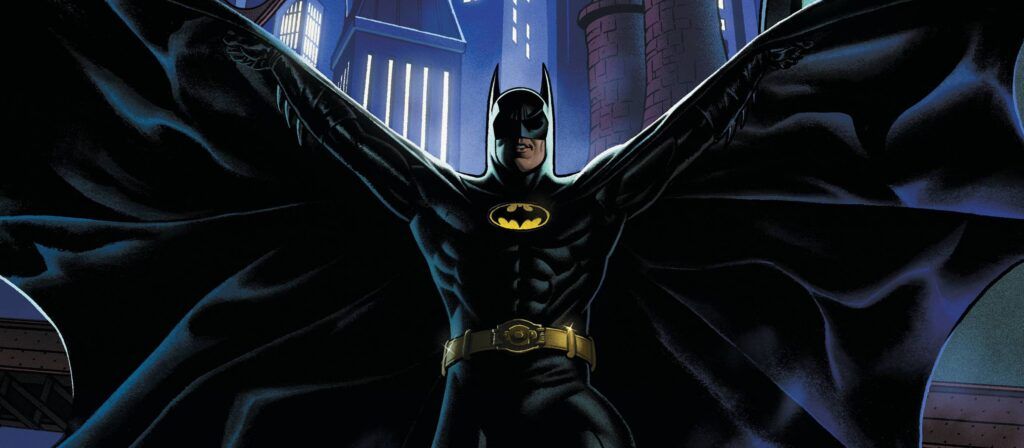
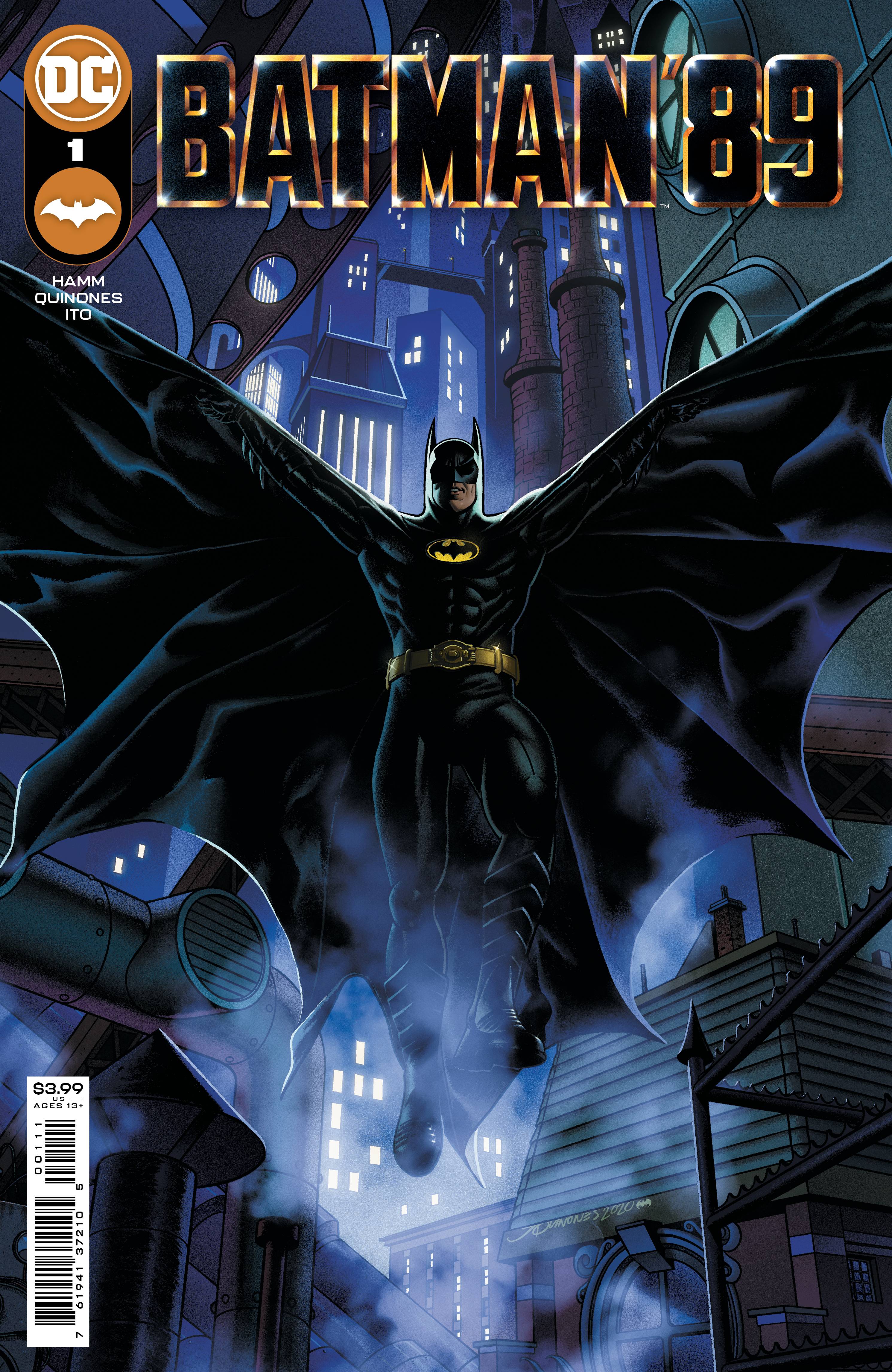
The art from Joe Quinones is equally inconsistent. Is Bruce Wayne supposed to look like Michael Keaton or not? Jim Gordon looks more like the version from the Harley cartoon not the movies series. Even Batman gets a bit of a rough ride. Since when does his bat-rope fire from his wrist and the movie versions don’t have white eye. The poses are also a little bit off. The art is a shame, given how gorgeous fantastic cover A is as a homage piece. The only other thing that gives this book its “movie’ fell are the colors from Leonardo Ito who captures the scheme of the movie adaptation brilliantly. Few people however, buy a book or a series just for colors. Letters are provided by Clayton Cowles, again capturing the font of the movie adaptation.
I will admit that I have been caught up in the hype for this book; its currently on my pull list. How long it stays there will depend on if any of the ideas put forward that “weren’t good enough’ for the movie are actually “good enough for a comic”.
Writing – 3 Stars
Art – 3 Stars
Colors – 4 Stars
Overall – 3 Stars
Written by; Sam Hamm
Art by; Joe Quinones
Colors by; Leonardo Ito
Letters by; Clayton Cowles
Published by; DC Comics
Author Profile
- I am a long time comic book fan, being first introduced to Batman in the mid to late 70's. This led to a appreciation of classic artists like Neal Adams and Jim Aparo. Moving through the decades that followed, I have a working knowledge of a huge raft of characters with a fondness for old school characters like JSA and The Shadow
Currently reading a slew of Bat Books, enjoying a mini Marvel revival, and the host of The Definative Crusade and Outside the Panels whilst also appearing on No-Prize Podcast on the Undercover Capes Podcast Network
Latest entries

 Comic BooksApril 19, 2024Review: Jill and the Killers #4
 Comic BooksApril 11, 2024Review: Deadweights #1 (of 6)
 Comic BooksApril 10, 2024Review: Jim Henson’s Labyrinth Archive Edition #1 (of 3)
 Comic BooksApril 3, 2024Review: Red Sonja Empire of the Damned #1


