Review: Batman Catwoman #3 (of 12)
 Thankfully, DC are continuing their other books, rather than rest on the mixed laurels of Future State. In doing so, they have published a book that is starting to court its own level of controversy.
The Joker is dead, killed by Selina in his old aged pensioner pad down in sunny Florida. News travels fast reaching Commissioner Grayson who enlists the help of Gotham’s newest Bat vigilante. Meanwhile the past plays out, adding weight, motive and reasons for the Jokers demise.
Tom King is on full go slow mode; three issues in and we have the start of the Joker Catwoman relationship, which potentially is going to have an impact on Bruce down the line. King is hoping that the reader has the patience to see this story out. Thing is, readers have had their fingers burnt before with books that have promised much and delivered little, Three Jokers being a perfect example. Whilst that series may not be ultimately King’s problem, it is something that he definitely needs to consider. The meandering script may well work on a smaller run, Heroes in Crisis notwithstanding, but for twelve issues, thats a big ask. I do have a fear that all the clever posturing between past, present and future, depending on your point of view, is just a means to hide a rather simple plot. King has a knack for dialogue, giving all the characters a decent voice, though maybe Dick could be fleshed out a bit more.
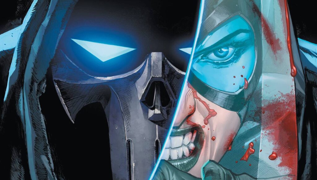
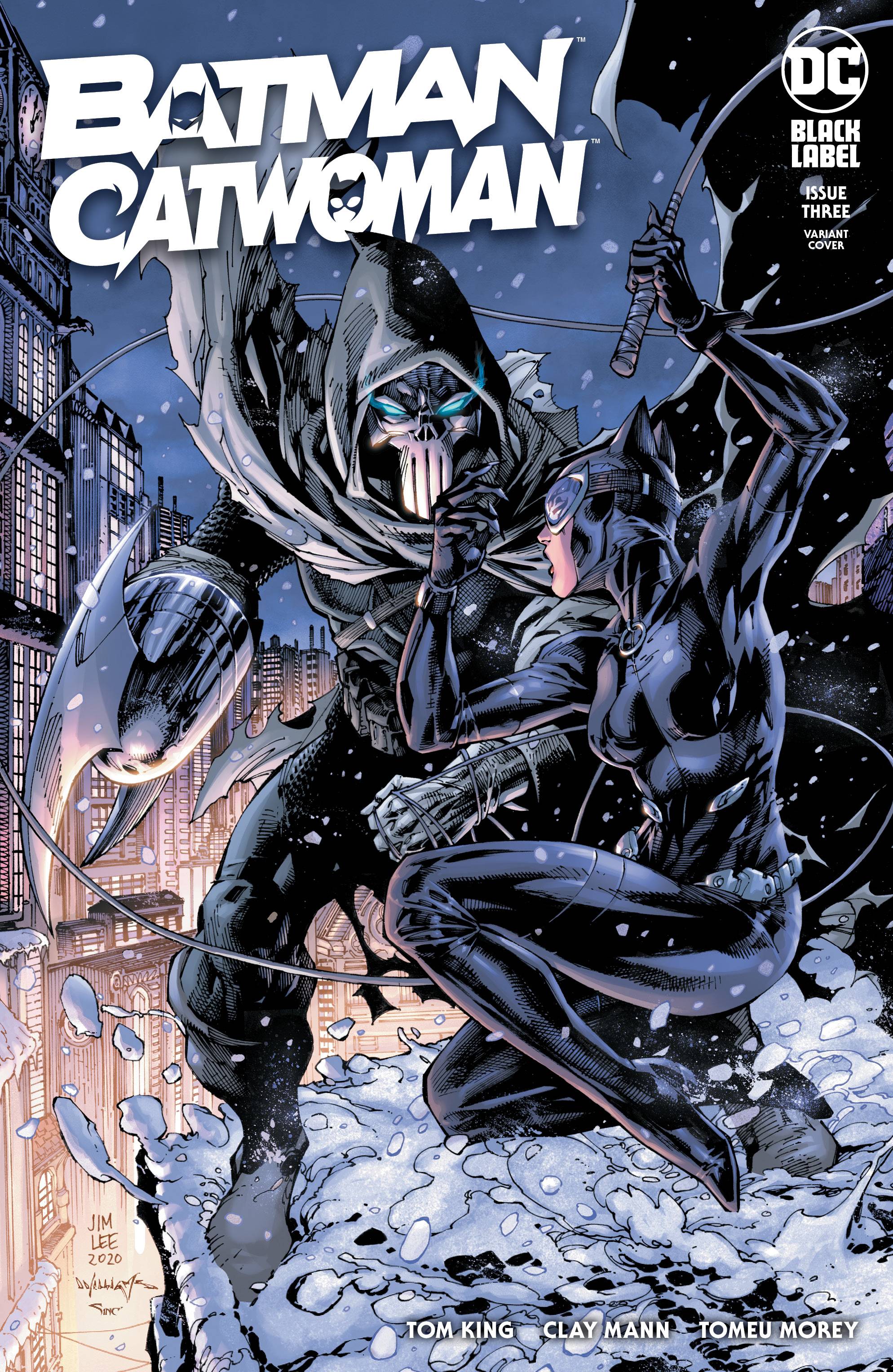
Clay Mann’s art this issue has already caused a stir on Twitter, be it the costume that is so tight you can see a bellybutton on one side or the visible underwear line on the other. Personally, I don’t have a problem with either to be honest. This is Black label book so it doesn’t have to be just the writing that is mature. Remember it wasn’t too long ago that we all saw a lot more of Bruce then we expected; for the record I didn’t complain about that either. Mann’s pencil lines are as clean as ever, smooth lines that lead to extended legs and muscular frames. Simply put, it is gorgeous! Mann’s fine lines are match perfectly with Tomeu Morey’s colors who uses a mix of colors and shadows to effectively promote the characters in action . Morey’s colors add a level of high quality to proceedings as does the letters fromClayton Cowles, a name which has become a name that exudes quality. Finally, there are a choice of covers to choose from; for the first time in a while, I prefer the Jim Lee one over the Mann cover.
I am enjoying this run so far, but I am concerned that the pace is going to come back and haunt this series. I guess only time will tell.
Writing – 5 Stars
Art – 5 Stars
Colors – 5 Stars
Overall – 5 Stars
Written by; Tom King
Art by; Clay Mann
Colors by; Tomeu Morey
Letters by; Clayton Cowles
Published by; DC Comics / Black Label
Author Profile
- I am a long time comic book fan, being first introduced to Batman in the mid to late 70's. This led to a appreciation of classic artists like Neal Adams and Jim Aparo. Moving through the decades that followed, I have a working knowledge of a huge raft of characters with a fondness for old school characters like JSA and The Shadow
Currently reading a slew of Bat Books, enjoying a mini Marvel revival, and the host of The Definative Crusade and Outside the Panels whilst also appearing on No-Prize Podcast on the Undercover Capes Podcast Network
Latest entries

 Comic BooksApril 19, 2024Review: Jill and the Killers #4
 Comic BooksApril 11, 2024Review: Deadweights #1 (of 6)
 Comic BooksApril 10, 2024Review: Jim Henson’s Labyrinth Archive Edition #1 (of 3)
 Comic BooksApril 3, 2024Review: Red Sonja Empire of the Damned #1


