Review: BRZRKR #2
 The second issue of this vowel resistant book looks to delve further into the origins of B, in what some could see as a sort of re0imaging on christianity,
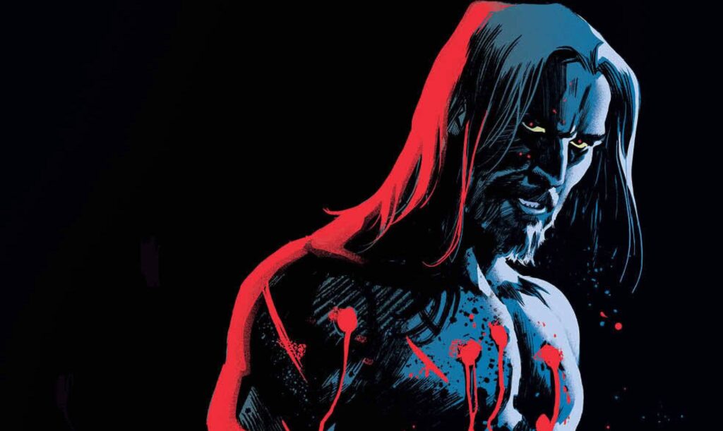
Dr Diana Ahuja is taking the time to get to know B, the titular character. In doing so we get a kind of Conan vibe with more than an alternative Christ like metaphors. But to what end or ends does the good doctor strive and are her intentions truly altruistic?
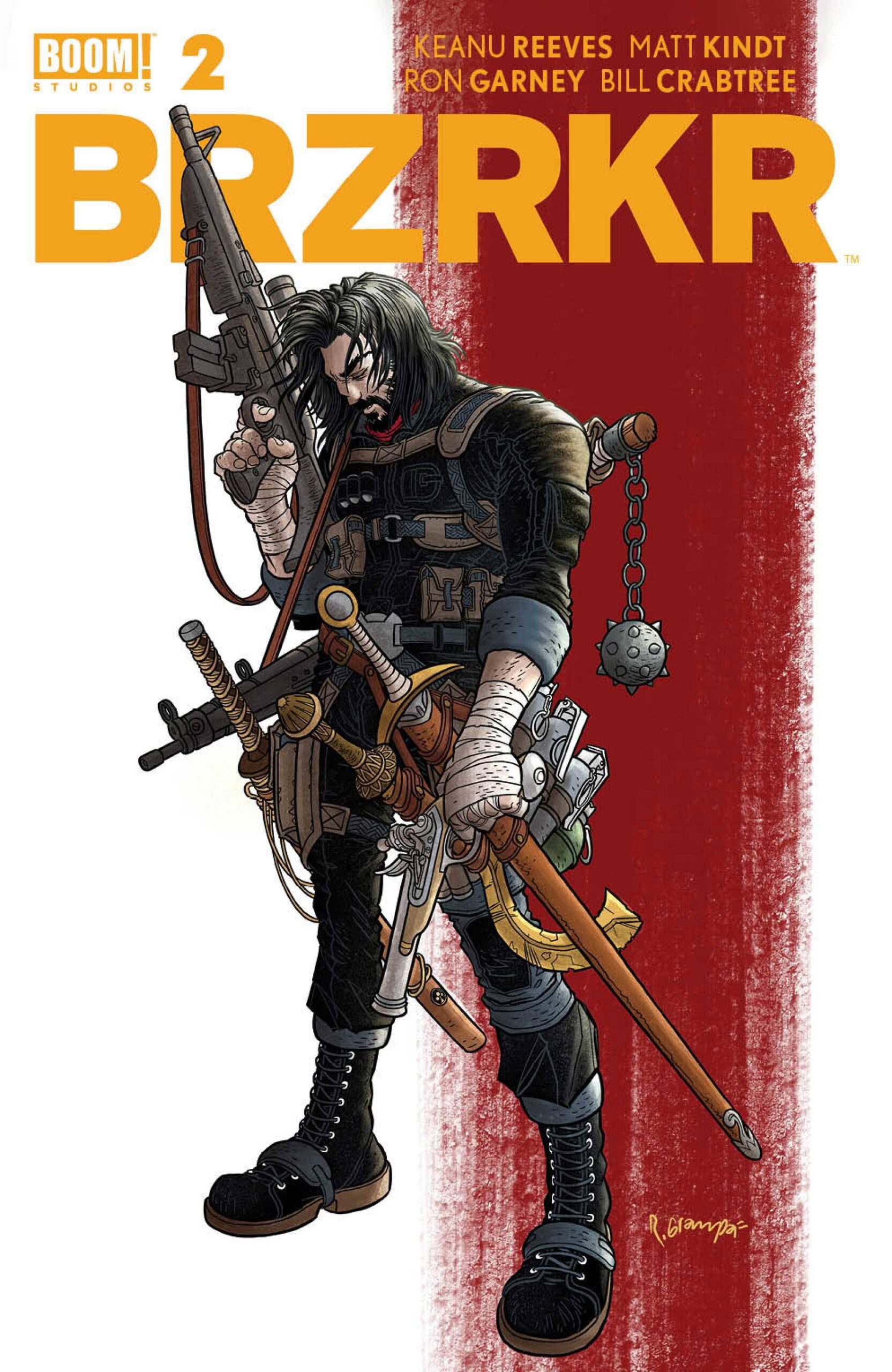
This book is written by Keanu Reeves who is partnered with Matt Kindt. Now when it comes to Reeves’ film, I think i am in the minority as regardless of how good the first John Wick film is, I actually don’t like the others! I do like the more of the wall movies to be honest. So it was with a little trepidation that I picked up this book. Given that I have read a number of barbarian books from Conan to Berserker Unbound, the book manages to add a ruffle or two in its inception. Reeves and Kindt have given B an epic destiny; by utilising the religious connotations they have managed to quickly and easily explain away the impracticalities of dealing out and receiving tons of damage. The book is violent, as you may expect though the darkness within the characters deliver a different and perhaps darker aspect.
The graphic nature of the book, in all its various vibes and tones is well served by veteran Ron Garney who has practically worked on every character from the big two. Here, he gets to flex his indie muscles and does so with style and aplomb even if it seems that editorial conceit is that B has to look like Reeves himself. With that little bit of ego boosting out of the way, Garney delivers a mature look that kind of reminds me of aspects of Mike Mignola’s Marvel work. The panel designs are great, carrying the reader through an engaging, if seen before in parts, manner. The colors from Bill Crabtree are perfect throughout the different environs and situations, whilst keeping overall tone of the book on point. Finally, Clem Robins’ letters add voices to the characters, dripping in context and threat, implied or otherwise. Some people might say that there is a sparseness of letters in places, for me this style allows the book to breath and gives the reader a chance to really feel enveloped by the story,
Originally I thought nothing more of this book than a vanity project, catering to fans of the movies. After reading this second issue, I am quite happy to have my assumptions changed.
Writing – 5 Stars
Art – 5 Stars
Colors – 5 Stars
Overall – 5 Stars
Written by; Keanu Reeves & Matt Kindt
Art by; Ron Garney
Colors by Bill Crabtree
Letters by; Clem Robbins
Published by; BOOM! Studios
Author Profile
- I am a long time comic book fan, being first introduced to Batman in the mid to late 70's. This led to a appreciation of classic artists like Neal Adams and Jim Aparo. Moving through the decades that followed, I have a working knowledge of a huge raft of characters with a fondness for old school characters like JSA and The Shadow
Currently reading a slew of Bat Books, enjoying a mini Marvel revival, and the host of The Definative Crusade and Outside the Panels whilst also appearing on No-Prize Podcast on the Undercover Capes Podcast Network
Latest entries

 Comic BooksApril 19, 2024Review: Jill and the Killers #4
 Comic BooksApril 11, 2024Review: Deadweights #1 (of 6)
 Comic BooksApril 10, 2024Review: Jim Henson’s Labyrinth Archive Edition #1 (of 3)
 Comic BooksApril 3, 2024Review: Red Sonja Empire of the Damned #1


