Review: Dancing with the Dragon #1 (of 4)
 Having dreams is one thing, how you go about them is another thing altogether. In this new crime come gang mini series from Scout Comics we get to see the pressures of love and the desire to give that special person the life that they deserve, not the life they have.
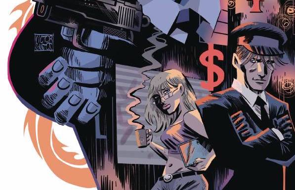
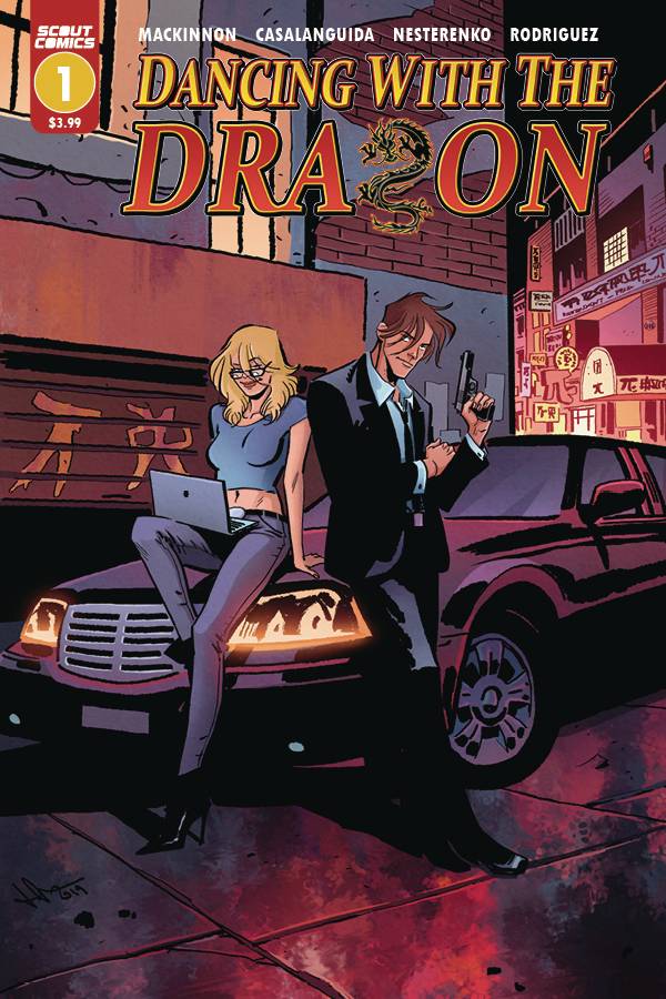
Connor O’Sullivan, a transplanted Irish man living in San. Francisco with his girlfriend, Blythe, lives a kind of hand to mouth existence. He brought his girlfriend over with him for her dream of working in Silicone Valley. The reality is that he is a limo driver, eking out a living, grateful that his hot girlfriend is still with him. All he needs is one lucky break and when one of his dodgy clients has a heart attack, he decides to take on the dead guys shady business that promises so much. But he will be lucky to get out with his girlfriend and his life when he starts Dancing with the Dragon!
Writer Rob MacKinnon hopes that his character, Connor, has enough of the Irish charm to keep the reader engaged. He looks to achieve that by showing his struggles along with Connor’s reason for trying so hard in Blythe. For a first issue, the book is paced meaning that the reader has to take things at face value. There are a couple of situations that gave me pause, so hopefully those will be resolved or at least explained at some point. Dialogue wise, MacKinnon uses the trick of writing as we talk, so “me” appears instead of my, quid as a term for cash; its a well observed element. what isn’t so well observed is the constant “*translated from Mandarin”; I saw the first box and have enough memory to apply this across all the occasions in the book.
The art has a fluid style to it, fine line work, with a lack of details in places allows for the intimation of situations. This could be a good style for Luca Casalanguida as when details are used, they disappear with no explanation. For example, Blythe is shown wear glasses in one panel and the very next one, they disappear. Now the glasses are on the cover, which show that Blythe is the brains and the beauty of the operation, so you would thing that they would be a constant. Other than that, Casalanguida uses extremes to prove his points; Connor is tall and lanky, the mark overweight, the thugs ugly, Blythe sexy. Moving away from the characters, Casalanguida fills the book with excellent backgrounds filled with landmarks that you should recognize. Colors are provided by Natalia Nesterenko who seems to use red and black as her base colors which gives the books a seedy look. Finally letters are supplied by Joel Rodriguez who creates a nice simple font that makes it easy to read, the subtly doesn’t affect the art or the pace of the story.
Four issues keeps things tight, so don’t expect any wasted panels or pages, as MacKinnon and company have produced a fun little book with a boundless amount of energy; it will be interesting to see what happens when Connor stops for a breather.
Writing- 3.5 Stars
Art – 3.5 Stars
Colors – 3.5 Stars
Overall – 3.5 Stars
Written by; Rob MacKinnon
Art by; Luca Casalanguida
Colors by; Natalia Nesterenko
Letters by; Joel Rodriguez
Published by; Scout Comics
Author Profile
- I am a long time comic book fan, being first introduced to Batman in the mid to late 70's. This led to a appreciation of classic artists like Neal Adams and Jim Aparo. Moving through the decades that followed, I have a working knowledge of a huge raft of characters with a fondness for old school characters like JSA and The Shadow
Currently reading a slew of Bat Books, enjoying a mini Marvel revival, and the host of The Definative Crusade and Outside the Panels whilst also appearing on No-Prize Podcast on the Undercover Capes Podcast Network
Latest entries

 Comic BooksApril 19, 2024Review: Jill and the Killers #4
 Comic BooksApril 11, 2024Review: Deadweights #1 (of 6)
 Comic BooksApril 10, 2024Review: Jim Henson’s Labyrinth Archive Edition #1 (of 3)
 Comic BooksApril 3, 2024Review: Red Sonja Empire of the Damned #1


