Review: DC vs Vampires #3 (of 12)
 Its universe shaking time once again as an alternative DC universe is engulfed with vampires. Those who have been around a bit may remember when zombies took on the Marvel universe in an interesting first series, before receptiveness and a lack of stellar casts down the line spoilt the idea. Of course DC has their own zombie tale in DCeased and Dead Planet, so it make sense to see what would happen to the DC Universe when the sexier undead people invade.
The Flash is dead……again! Someone has killed Barry Allen. The Justice League are stymied even with the worlds greatest detective on hand. As the group splits up to chase down leads, the missing Green Arrow and Black Canary are in the midst of their own investigation. Of course the Flash isn’t the only hero who has died; we recently lost one of the Wonder Twins (who cares, right?), which is being investigated by Batman whilst Wonder Woman and Green Lantern have a heart to heart, or teeth to throat moment.
This series is written by James Tynion IV and Matthew Rosenberg. Now both of these writers have large followings; I love Tynion’s Batman work and Rosenberg was great in a thankless task that was Uncanny X-Men before Hickman reset that franchise. Here, the pair show a great understanding of the characters, making me even care about a Wonder Twin! On top of that they have the voices of all the characters down pat, right down to Hal being cocky and Diana being caring. This then leads to a key point in the book that may seem obvious, though is well handled in a logical and sexy manner.
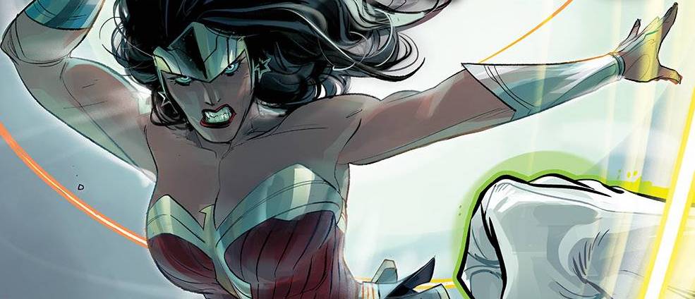
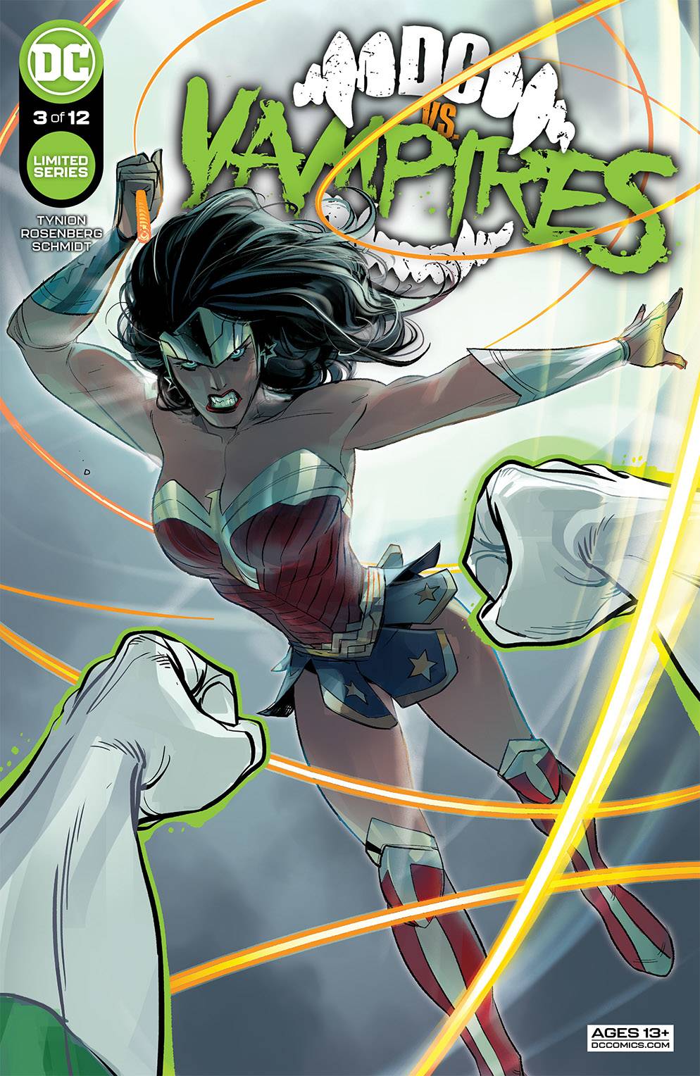
One of the highlights of Future State was the art from Otto Schmidt in the pair of Catwoman book. Twitter users will no doubt have seen a raft of Schmidt images featuring a range of characters, albeit more Canary than others. Schmidt unique style works throughout the book, with each heroes characteristics being well shown. The art is pacy, moving between the various arcs well, never featuring one more than the other; well, except for the twist. I would question why one character has her fishnets and another one doesn’t but that would be quibbling the details. With Schmidt also on colors, the book has a consistent feel. Schmidt also establishes the various locations well, from sunny beaches to the darkness of the streets of Gotham City. Letterer Tom Napolitano uses a nice easy font, that seems smaller than normal. I could be wrong, but the reason for this could be the amount of verbiage or ensuring that the words do not detract from the art or the pace of the story.
If I ma honest, I am a tad sick of alternative universe stories that are out of continuity. With that said, this series has been fun from the get go and I am really looking to see how it plays out over the remaining issues and thanks to the quality of the work from Messrs Tynion IV, Rosenberg and Schmidt, this book has a real bite to it! #sorrynotsorry
Writing – 5 Stars
Art – 5 Stars
Colors – 5 Stars
Overall – 5 Stars
Written by; James Tynion IV & Matthew Rosenberg
Art & Colors by; Otto Schmidt
Letters by; Tom Napolitano
Published by; DC Comics
Author Profile
- I am a long time comic book fan, being first introduced to Batman in the mid to late 70's. This led to a appreciation of classic artists like Neal Adams and Jim Aparo. Moving through the decades that followed, I have a working knowledge of a huge raft of characters with a fondness for old school characters like JSA and The Shadow
Currently reading a slew of Bat Books, enjoying a mini Marvel revival, and the host of The Definative Crusade and Outside the Panels whilst also appearing on No-Prize Podcast on the Undercover Capes Podcast Network
Latest entries

 Comic BooksApril 19, 2024Review: Jill and the Killers #4
 Comic BooksApril 11, 2024Review: Deadweights #1 (of 6)
 Comic BooksApril 10, 2024Review: Jim Henson’s Labyrinth Archive Edition #1 (of 3)
 Comic BooksApril 3, 2024Review: Red Sonja Empire of the Damned #1


