Review: Dejah Thoris versus John Carter of Mars #3
 Whilst it is standard comic book fare to have a comic book cover that has no bearing to the story, it could be argued that this series from Dynamite suffers from an inconsistent title. After all, nothing is a valued or as true as the love between Dejah Thoris and John Carter. So where is the versus?
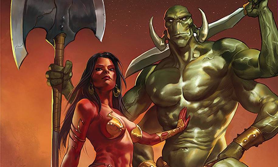
The evil plan lay unfurled as Gall stands in full preening mode, with a naked, bondage entwined Dejah as a gift for his masters. Regardless of his current mindset, John Carter fights to protect his Princess one more time. Unbeknownst to the “savage with a sword”, this is all part of much larger scheme with the fate of Barsoom on the line.
This third issue is the fulcrum issue, that finally starts to fulfil its title’s promise. Writer Dan Abnett has traded the differing mindsets and worldly perceptions as the battlegrounds of previous issues, to mirror Gall’s masters idea of dealing with a problem the Barsoom way. In doing so, Abnett has spent a lot of time on exposition. True, there are action panels in the shape of John’s barrage on the enemy, but truth be told this book is more reading than action. For some this may be off putting, show is always more visually pleasing than tell. However this style of writing is a necessary evil, given the scope of Gall’s plan. Personally, I would have expected a writer of Abnett’s quality to be able to find another way to get the various plot devices out of the way.
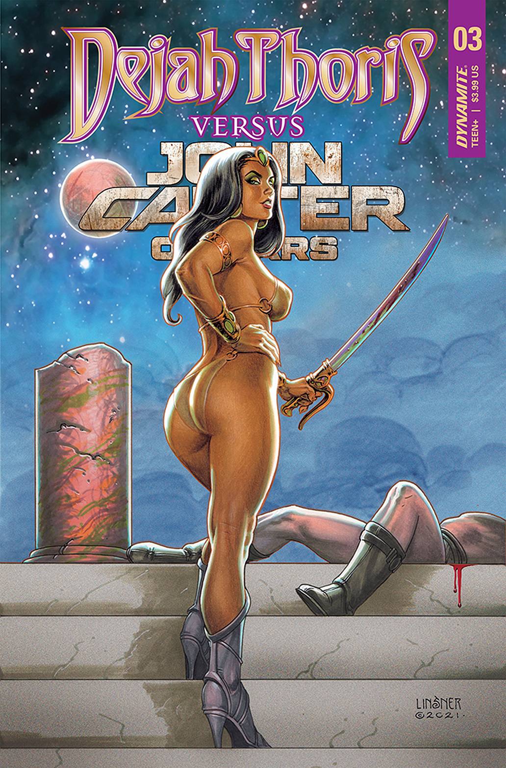
The art is provided by Alessandro Miracolo who delivers an, at times, odd angular style. this is great for the action panels as the angles go some way to showing movement. It does therefore kind of work against the majority of the dialogue heavy panels. Still, it is refreshing to see an artist trying a different style, rather than rely on the tried and trusted “curvy” T &A method. Speaking of which, it is almost comedic how Dejah’s nakedness is, well, covered throughout the panels. Dearbhla Kelly adds a bold color scheme, with some lovely backgrounds. Kelly takes another step forward with the window to the longborn. Letters are provided byDynamite stalwart Simon Bowland, who uses an easy font to counteract the sheer verbiage on display. Finally, as is seemingly the norm for todays comic books, there are a variety of covers to choose from. For me, you cannot ever go wrong with Joseph Michael Linsner (see above).
A chewy issue at times, this book is an important piece of the puzzle for readers of this series. Patience is requires, maybe more than John Carter himself displays, but patience nonetheless. the next few issues may be make or break for this run in order to make the time spent here worthwhile.
Writing -3.5 Stars
Art – 3 Stars
Colors – 4 Stars
Overall – 3.5 Stars
Written by; Dan Abnett
Art by; Alessandro Miracolo
Colors by; Dearbhla Kelly
Letters by; Simon Bowland
Published by; Dynamite Entertainment
Author Profile
- I am a long time comic book fan, being first introduced to Batman in the mid to late 70's. This led to a appreciation of classic artists like Neal Adams and Jim Aparo. Moving through the decades that followed, I have a working knowledge of a huge raft of characters with a fondness for old school characters like JSA and The Shadow
Currently reading a slew of Bat Books, enjoying a mini Marvel revival, and the host of The Definative Crusade and Outside the Panels whilst also appearing on No-Prize Podcast on the Undercover Capes Podcast Network
Latest entries

 Comic BooksApril 19, 2024Review: Jill and the Killers #4
 Comic BooksApril 11, 2024Review: Deadweights #1 (of 6)
 Comic BooksApril 10, 2024Review: Jim Henson’s Labyrinth Archive Edition #1 (of 3)
 Comic BooksApril 3, 2024Review: Red Sonja Empire of the Damned #1


