REVIEW: Fallen #6
 Fallen is an interesting read. It’s a story about a war between gods from different pantheons. Greek gods, Nordic Gods, and Egyptian Gods. Gods of all shapes and sizes battle it out in the towering skyline of New York. This issue starts rather abruptly with two very minimal panels that are set on white. Whilst I do not personally like this choice I can’t help but think it is a bold choice despite it being so simple. Usually, panels with no background will clash with the white border of the page, and yet on this first page, we can see how this was done to bring complete and total attention to the items inside those two panels. Which makes it that much more of an interesting choice.
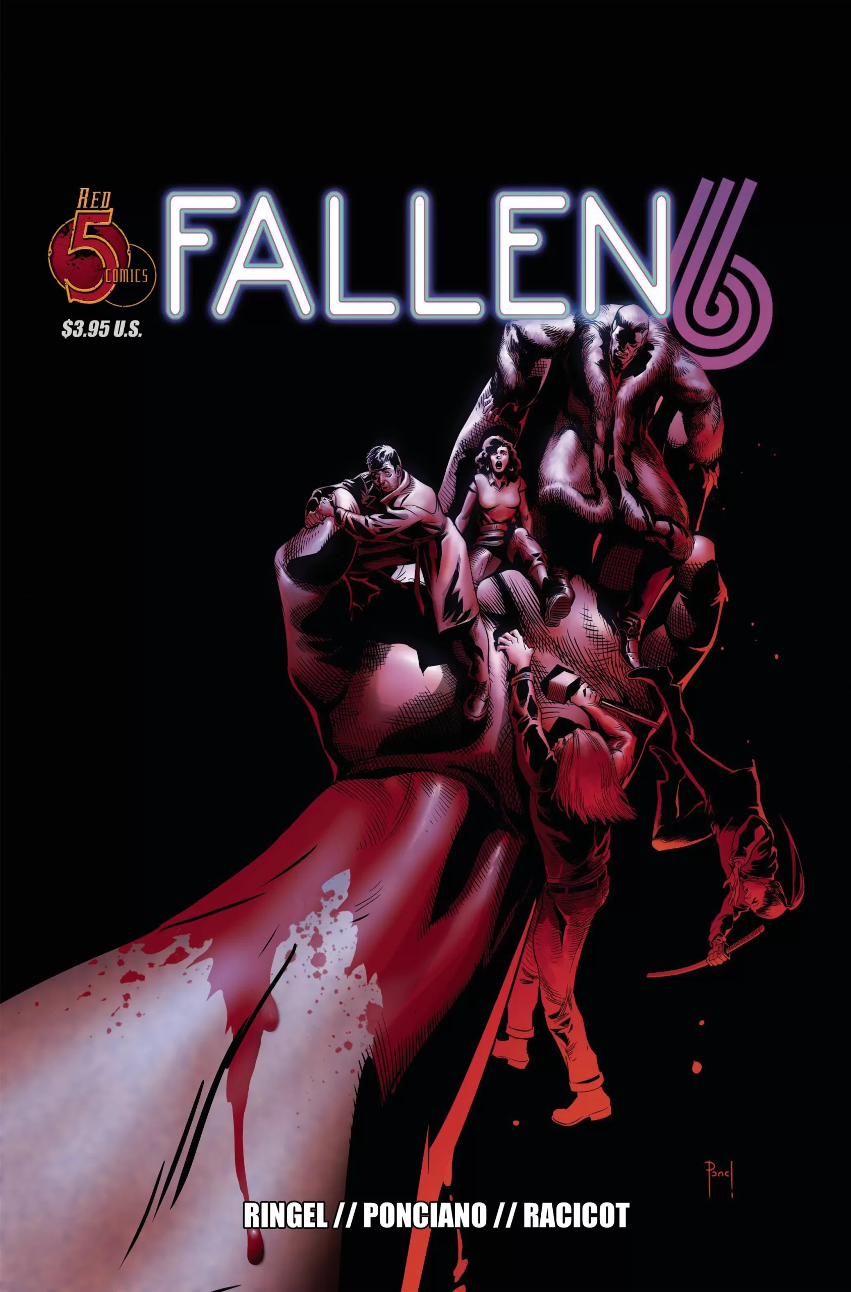
The art is really good. The colors are rather standard and it’s mostly done in cell shading with a light blending of the edges of the shadows, but it works. The character designs however are a little boring, at least for the gods that aren’t Egyptian. Thor looks pretty much like he does in Marvel books, which I think is a shame because this is not a Marvel book, and I would’ve loved to see a different Thor altogether, yes he is a blond nordic God that is built like a mountain, but I feel like we could take him in some other different direction other than what we’ve been accustomed to. However when we talk about Hephaestus that guy has a rocking design and he looks a lot more original, which I appreciate. The Egyptian Gods look really awesome though and the artist took advantage of their ceremonial headdresses to really create some cool costumes.
I like seeing this kind of stuff, where you take certain aspects of history; like mythology, and turn them on their head to create a new story. I think it’s both grounded in reality as well as pretty inventive. So extra points for going that route. I also really like that they didn’t stick to only one pantheon but instead decided to use gods from all sorts of places, including Japanese and Mayan culture. It’s pretty cool to see a story that isn’t limited to only one tradition. In the end, we are all humans, and playing with each other’s heritage in art is something that should be encouraged, not frowned upon.
The lettering is pretty good too, there are some nice custom sound fx’s, the word balloons are very well organized and the crossbar I rule is kept in mind throughout the whole thing. I do which that we had a couple of different word balloons for different characters, but that’s just my own personal preference.
The coloring is probably the one thing that sticks out to me the most. It’s pretty boring overall. Most of the scenes only have one light source, it kinda makes things feel like playdough instead of human skin. There are a couple of panels that look really good colorwise, like in the “in between life and death” scenes but other than that and the action scenes, everything is set on a black background or a flat color background. Despite this, however, it is a fun story and if you like mythology this is worth a read. I think the page with the different styles of art from each different culture looks fantastic and it’s probably one of my favorite pages in the whole book. Would be cool to see them explore this a bit more in future issues.
The writing itself is alright, it’s a little sparse in terms of people basically only saying what they have to say, and whilst that works for many action stories. In this case, I felt like we could have gotten a bit more information into the characters and their motivations. This being issue #6, I’m sure that they have explained it before, but at issue #6 we are still early enough that repeating a bit of information from the previous chapters wouldn’t be a bad thing, and could definitely help new readers that are getting in late, understand what’s going on better.
I also saw one typo in the “Previously on” section which could’ve been avoided, and in all honesty should’ve been avoided since this is literally the first thing people are seeing, and for new readers, it’s the first taste of the comic they are about to read. For all the good things this book has, that was a tiny mistake that makes the comic feel a bit amateurish. It’s a fun, easy, very well-drawn book, but it’s still not really capturing me completely. I do hope it gets better in future issues, and we see more creativity come from the pages overall.
It’s not bad but it’s not great. It feels a little safe at the moment. Let’s see where issue #7 takes us.
Writing: 4 Stars
Art: 5 Stars
Colors: 4 Stars
Overall: 4 Stars
Written by: Matt Ringel
Art by: Henry Ponciano
Lettering by: Toben Racicot
Cover art by: Henry Ponciano
Published by Red 5 Comics
Author Profile
Latest entries
 Comic BooksApril 30, 2024REVIEW: Rick and Morty: Kingdom Balls #1
 ReviewsApril 30, 2024PRCC2024 Recap: Fans from all over the world join together in Puerto Rico to celebrate all things comics, anime and videogame
 Comic BooksMarch 30, 2024REVIEW: Monstress #50
 Comic BooksMarch 28, 2024REVIEW: Cemetery Kids Don’t Die #2