
REVIEW: Fence #3
 Fencing, it should be cool right? I mean you’re using swords and wearing some cool-ass face masks to protect yourself from your opponent, and yet there is this air of pretty boy, boarding schools to the whole thing. Personally, the only time I’ve ever enjoyed seeing fencing in media was during the Wednesday show, that black outfit against all the white ones was awesome. That being said this was a pretty good comic.
The art is nice, it’s a little bit manga-esque but I think it works well for this kind of story as the proportions are close to being realistic and this seems to be a story about high schoolers trying to win a fencing competition. The nationals to be exact. Whilst there are action scenes, it is fencing after all so don’t expect huge battle scenes. Instead, we’re seeing quick moves with lots of action lines, and honestly, that’s refreshing to see. During these matches, it actually feels like you are seeing the actual fencing play out, and I think they captured it very well. In between these more realistic scenes, we also get some chibi drawings when there is some kind of emotion happening, like when the winner of a match shakes the hand of his opponent or when the top fencer is asking questions to the reserve fencer and he’s for some reason scared about this guy. It’s cute, not particularly in line with the rest of the story, but it’s cute. It works to break up the more realistic panels. However, I think the full-page illustrations they’ve drawn do a way better job of breaking up the talking heads’ dynamics than the chibis. Speaking of full-page illustrations, there aren’t that many in this comic, and many of them don’t really show much action going on, but where the action really shines is in half-page and quarter-page panels, these are splendid. There are way more of those in this issue and many of them show a ton of action and that’s awesome because they definitely show the right panels to portray the important action.
 The colors are very good too, they are simple and there’s not a lot of complex shading anywhere, and many of the backgrounds are either manga action line panels or gradients with some textures but sometimes that’s all you need to set the tone of what’s going on. The writing is pretty good too and every character seems to have a defined characteristic. I’ll be honest though, there are a TON of characters and they are all playing their own part in the story in very different ways, but sometimes I get lost because I just don’t know why we saw something at that specific time from that character POV while we were watching a whole ‘nother conversation before that. I guess it’s hard to show all the different conversations that would be going on during a fencing tournament, yet I think if they had maybe focused on two or three plot points at most instead of so many crammed into one issue it would have been a little easier to follow the story and we would’ve seen more of the action and not so much about the different characters talking to each other.
I personally really enjoyed the conversation two of the boys are having about saying yes or no, to things you want to do. I found that very realistic and quite reflective. Sometimes we go along with what people want of us, just so we don’t have to look bad or so we don’t make other people feel bad, but in the end, we end up messing ourselves up. So sometimes it’s good to say no. This whole thing was very fun to read and it was nice to see this topic be explored in a comic. Also, my favorite panel has to be the one with the pentathlon activities, it was very well composed and shows a bunch of really cool activities that honestly just look really good together. Also, the way they did the water and used it both as the ground and as the fence the horse was jumping was just brilliant. Really awesome stuff there.
The one thing I did notice is that whilst the lettering works pretty well for the story, there were a couple of instances where the word balloons were a little too close to other inked parts of the characters and created weird tangents that weren’t that pretty to look at. I’m also not a huge fan of putting word balloons on corners and not cutting the negative space that forms between the word balloon and the panel, I think that in those instances you should just cut the panel and let the word ballon merge with the white border. Other than that though, the lettering is very good and I think they did some wonderful work with all the extra information we see like the match details and the narration boxes.
Overall this is a pretty good story, it’s fun to read, the art is pretty good, the coloring is great and there are some really fantastic panels in it. The writing is pretty good too, even if the pacing can be a little hard to keep up with, but regardless I think this is a great addition to the series and I look forward to reading more of it.
I wonder if you could kill someone with a fencing sword, is that even possible?
Writing: 4 Stars
Art: 4 Stars
Colors: 5 Stars
Overall: 4 Stars
Written by: CS. Pacat
Art by: Johanna the Mad
Colors by: Joana Lafuente
Lettering by: Jim Campbell
Cover art by: Johanna the Mad
Varian Covers by: Magdalena Pągowska & Yukishiro
Published by Boom! Box
Author Profile
Latest entries

 Comic BooksMarch 30, 2024REVIEW: Monstress #50
 Comic BooksMarch 28, 2024REVIEW: Cemetery Kids Don’t Die #2
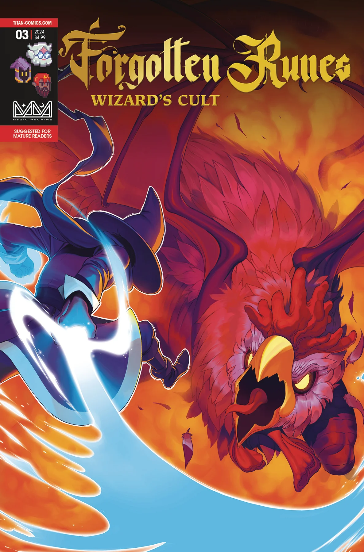
 Comic BooksMarch 27, 2024REVIEW: Forgotten Runes #3 (of 10)
 Comic BooksMarch 6, 2024REVIEW: Sam and Twich- Case Files #1


