
Review: I Hate This Place #8
 “I Hate This Place” or the more aptly titled explicit version “Fuck This Place” is a story of time travel, ghosts, monsters, and romance. This story written by Kyle Starks with art by and coloring by Lee Loughridge, is a visually enticing pick for anyone looking for some magical horror in their comic archives. Issue 8 is nonetheless as thrilling as perhaps the first issue. But even with 8 issues in, reading through this feels refreshing and exhilarating.
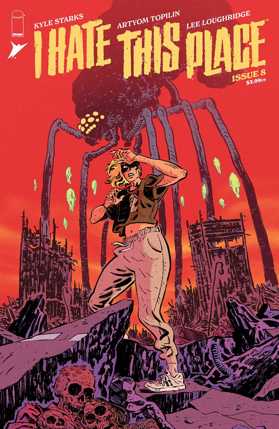
The art is quite impressive, it gives indie vibes very similar to books like Head Looper by Andrew MacLean, but perhaps with a darker twist. The use of shading feels very similar to books by Mike Mignola, which I greatly enjoy. One thing that makes the art in this book stand out from the aforementioned is the color. Muted pastel colors are used masterfully throughout each page, and the sketchy brushwork works so well to contrast with the big blocks of colors. Issue 8 features a wonderful use of greens for dialogue-heavy scenes and a red-yellow-orange palette for action-heavy sequences. Whilst I don’t think the (“present timeline”) humanoid character designs are anything to rave about, the monsters are simply frightening. The horned man-creature and the big spider-like monsters are absolutely stellar.
I put “present timeline” in quotes because this, being a time travel story on top of a sci-fi thriller means that we’ll be jumping between times and different versions of the characters, and let me tell you that the designs on the alternate timeline characters are crazy good. They look so good next to the original characters, they do an outstanding job at showing a future filled with hardships by using details like gruesome burn marks, scratches, and literally ripping an arm out of one of the main characters. This serves not only to add drama and further deepen the lore of the story, but it serves to catch in new readers, as seeing all this detail-heavy character design makes you want to go back and get all 7 previous issues just to find out how the characters got so messed up in this alternate timeline.
I personally enjoy that this book throws you right into the horrors it holds. Right from the first page, you are shown a scene filled with destruction, chaos, and monsters. Truly a post-apocalyptic wonderland. Then we pan out and we see that this first page is actually a frame inside a video being shown on a tv inside an interrogation room, and it literally feels like we’re watching a movie and we just panned from an establishing shot into the meat and potatoes of the story. This technique definitely uses the wonderful medium of comics for what it was meant. To tell visually compelling stories that use the imagination of the reader to fill in the action between panels. I will always applaud this clever use of art because it feels like we’re reading a fully elaborated storyboard for a future movie. Some people might disagree with me, but in my opinion, if I sit down to read a comic and in my head, I am seeing a whole movie of what’s going on, then that right there is a good comic.
This book has so many good things going for it, the colors, the art, the inking, the panel flow and layout, and the often overlooked albeit incredibly important part of a comic, the text. This book handles text in a wonderful manner. From the sound fx’s to the actual word balloons, this reads easily and the text is done in such a way as to keep up with the tempo of the story. An action scene is read quickly and has sparring text so as to not distract us from the action unfolding in the panels. The use of sound fx’s is used so wonderfully that in some panels we need not a single word more to understand what just happened. Truly a masterclass in “show, don’t tell”. There is basically no recap in this issue filling the pages, and yet new readers can easily pick it up and know that many things have happened before that will be just as thrilling as this current issue.
Oh and the faces! The faces of these characters are simply amazing, emotions are so clearly displayed on them that we have no choice but to feel their pain and their fears, their love and their confusion. If I had to pick out one thing I didn’t like, I think it would be literally one single panel out of the whole issue. There is one panel where a character is about to brake because there is something in the road and the way the background of the panel is textured almost makes it look like the character was just shot in the head when in reality they are alive and well. Perhaps this could have been avoided by making the panel blue and red instead, red and dark red, however, a book filled with tons of awesome moments, if only one panel causes a tiny bit of confusion and quickly resolves it in the next, then this can be easily overlooked.
I give this book a well-deserved 4.9 out of 5 stars for its amazing art, and wonderful narrative and it’s amazing job at creating a world that, whilst I do not want to live in, I definitely want to read more about.
Writing – 5 Stars
Art – 4.8 Stars
Colors – 5 Stars
Overall – 4.9 Stars
Written by; Kyle Starks
Art by; Artyom Topilin
Colors by; Lee Loughridge
Lettering by; Pat Brosseau
Published by; Image Comics
Reviewed by Antonio “Mabs”
Author Profile
Latest entries

 Comic BooksMarch 30, 2024REVIEW: Monstress #50
 Comic BooksMarch 28, 2024REVIEW: Cemetery Kids Don’t Die #2
 Comic BooksMarch 27, 2024REVIEW: Forgotten Runes #3 (of 10)
 Comic BooksMarch 6, 2024REVIEW: Sam and Twich- Case Files #1


