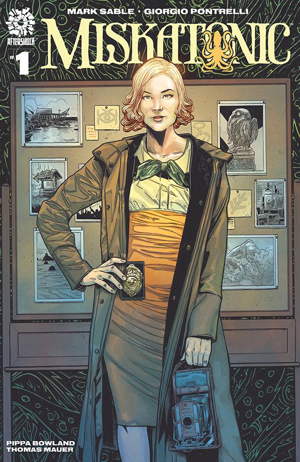
Review: Miskatonic #1
 With AfterShock Comics you are never quite sure what you are going to get. Could be horror, sci-fi, Victorian lesbian bug love or even a mix of all the above and more. In Miskatonic we have period drama elements, mixed with a kind of Peggy Carter vibe with some X-Files thrown in for good measure.
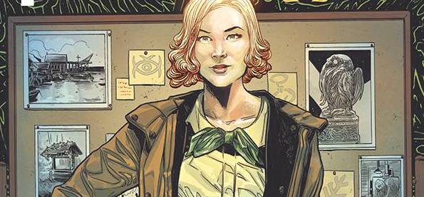
Miranda Keller is an agent in the new J. Edgar Hoover led bureau of investigation. Now, Hoover is in the middle of cleaning shop making his bureau a more masculine team. Keller it seems has some sort of hold that allows her to keep working for Hoover, though this does mean being sent to Miskatonic to help solve a firebombing case. Still, the resident retired local law enforcement agent believes that there are bigger and scarier things going bump in the night than bombers.
Creator Mark Sable writes a story that borders on several tropes, without fully succumbing to any of them. Miranda is clearly something of a loose end for Hoover; the town Miskatonic has its fair share of demons and the retied cop serves as some sort of know-it-all, even if he doesn’t want to be. The steps along the way are interesting enough, though Sable may need to soften the hard nosed elements of Miranda to get reader buy-in. I quite like stubborn characters, though I also like to know the reason why they are that way inclined. I have every faith that Sable will provide the details down the line. For now, Sable is happy to go with shocks and scares; it will be interesting to see how the horror and the detective elements intertwine. It is a word heavy book for sure, which may be down to being a first issue with the usual amount of scene setting, or Sable’s preferred style.
The art is provided by Giorgio Pontrelli who goes for realism over drama, at least for two thirds of the book. Pontrelli has a faint Paul Gulacy influence in the early part of the book. That coupled with the wordiness does kind of drag out the pace of story. Art wise, the characters have a sturdiness to them that I found appealing for this type of story. True, some of the action scenes lose something in a less is less lack of impact, but this sort of art redresses the expectation level before the horror elements seeps into the book. Pippa Bowland’s color scheme is a well worked worn affair that hints at darker undertones. Finally, letterer Thomas Mauer font is fine even if there are a couple of colored text boxes that hinder the reading of the font.
I quite enjoyed this book. I am a little concerned that I have read a previous book from Dark Horse where an unspeakable horror stalks a port town. Whilst that was set at the turn of the century as opposed to a more recent, but still historical times, I am sure that further similarities will dissolve as Miranda and her retired detective move further into the caee.
Writing – 3.5 Stars
Art – 3.5 Stars
Colors 4 Stars
Overall – 3.5 Stars
Written by; Mark Sable
Art by; Giorgio Pontrelli
Colors by; Pippa Bowland
Letters by; Thomas Mauer
Published by; AfterShock Comics
Author Profile
- I am a long time comic book fan, being first introduced to Batman in the mid to late 70's. This led to a appreciation of classic artists like Neal Adams and Jim Aparo. Moving through the decades that followed, I have a working knowledge of a huge raft of characters with a fondness for old school characters like JSA and The Shadow
Currently reading a slew of Bat Books, enjoying a mini Marvel revival, and the host of The Definative Crusade and Outside the Panels whilst also appearing on No-Prize Podcast on the Undercover Capes Podcast Network
Latest entries

 Comic BooksApril 19, 2024Review: Jill and the Killers #4
 Comic BooksApril 11, 2024Review: Deadweights #1 (of 6)
 Comic BooksApril 10, 2024Review: Jim Henson’s Labyrinth Archive Edition #1 (of 3)
 Comic BooksApril 3, 2024Review: Red Sonja Empire of the Damned #1


