REVIEW: Monstress #45
 To summarize this comic into one sentence it would be “Hayao Miyazaki’s Princess Mononoke but make it even darker.” Trust me when I say that in the highest regard possible, the art in this comic is so freaking good! The designs are outstanding and the level of detail that each panel has is beyond admiration, it is simply wonderful. Each full-page illustration is crafted with such attention to detail, every panel is brimming with interest, and every character design is unique and fantastical in the weirdest of ways. The art in this comic is next-level stuff! Sana Takeda’s style screams Mobious meets Miyazaki meets, Junji Ito, I am here for all of it. The coloring is fantastic, the textures are astonishing and the compositions are spectacular. Art and color here receive a full 5/5 without a doubt. Just based on that you should read this comic, simply to marvel at how beautiful it is.
The writing however is something you need to buckle down for, and I don’t mean that in a bad way. Let me explain, because this is issue 45 of who knows how many more issues, this is a comic filled with a ton of lore and there will be issues that simply serve as an exposition on the characters, and not a lot will be happening. This is one of those issues, other than the action at the beginning and the end, there’s just not that much going on and it’s a dense read, filled with all sorts of background information that a fan of the comic will find interesting and is no doubt setting up a ton of cool stuff to happen in future issues. You have to keep that in mind because if you’re planning to pick this issue up for its action, I would suggest you maybe pick something else, however, if you’re ready to read exposition text for 30mins and look at beautiful art then definitely pick this one up. The script itself is not boring, it’s actually very interesting, but again it’s a dense read so each page will take you about a minute or two to process, and sitting at 30 pages, that is a lot of time to be reading a comic. It kinda feels like the script itself is as detailed as the art that accompanies it.
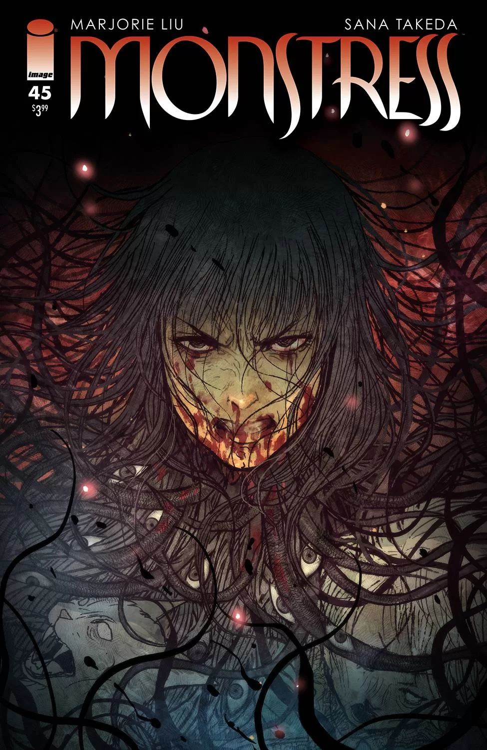
One cool thing I did see in this comic is that the word balloons are devoid of outlines. At first, it caught me by surprise and I was debating whether this was a good or a bad choice but reading the whole thing through, I consider it to be a genius idea because it gives the eye a place to rest and focus on the text. The art is so detailed that these spaces of just text and no black outline feel refreshing and makes the reading experience that much more pleasant. Another thing I have to applaud is the cover art by Takeda, it is brilliant and it’s so eye-catching. It also goes in line with the inside art style and I love it when the cover art matches the inside pages it sets up the expectations of the reader to a realistic level, which I think is fantastic. All that being said there are a couple of minor things that I didn’t enjoy too much, I have never been a fan of “story so far…” pages or “these are the characters…” pages, I personally find them tacky and a waste of a page. Unless they are done in the style of the rest of the comic, or being spoken by one of the characters I would much rather not even read them at all. I know there is merit to having those pages explain what’s going on, especially on books of this length but at the same time, I think that if the inside pages aren’t interesting enough to get me to want to read what happened before and after, then this extra page won’t do it either. The second thing that irked me about this comic is that the panels aren’t cleaned up, they are not perfect boxes in the sense that where two panels are cut, you still have extra lines that will often either just hang in the white space or literally connect to another panel and that just looks lazy. With such beautiful art inside each panel, this tiny detail could have been avoided. Other than that I think this is a great read and I enjoyed it a lot. I also really liked the sound fx text, whilst it is not in the style of the rest of the art, the letterer did that extra step of stretching and resizing it to make it look different and make you feel something and I can appreciate that.
It’s not a perfect comic by any means but it is a fun read. However, this is one of those comics that I would wait to get the TPB instead of reading individual issues, and that way I can get a mouthful of this story instead of nibbling away at a very interesting albeit complex story.
Writing: 4 Stars
Art: 5 Stars
Colors: 5 Stars
Overall: 4.5 Stars
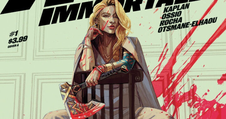
Written by; Marjorie Liu
Illustrated by; Sana Takeda
Lettering by; Rus Wooton
Cover art by; Sana Takeda
Published by Image Comics
Author Profile
Latest entries
 Comic BooksApril 30, 2024REVIEW: Rick and Morty: Kingdom Balls #1
 ReviewsApril 30, 2024PRCC2024 Recap: Fans from all over the world join together in Puerto Rico to celebrate all things comics, anime and videogame
 Comic BooksMarch 30, 2024REVIEW: Monstress #50
 Comic BooksMarch 28, 2024REVIEW: Cemetery Kids Don’t Die #2