Review: Neon Future #6 (of 6)
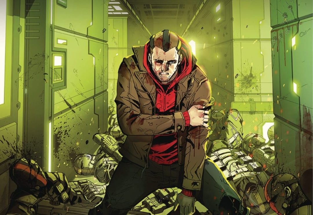
 The final issue of this sci-fi series sees Clay facing impossible odds, seemingly alone. But is the hero of the piece really all alone when he has friends in all sorts of places eager to help him.
Clay finally takes the battle to the CTG in a bid to rescue his friends. If you have been reading the series, you will know that this isn’t the first time Clay has caused trouble from behind the wheel of a car. Armed with his control of electronics, Clay is pretty much a formidable enemy of the state to say the least. Still, with every battle there is the risk of loss, could this loss be the most devastating of all?
The book is written by a clutch of people, in this case Jim Krueger, Tom Bilyeu, Steve Aoki, Matt Colon, Dana Brawer and Samantha Levenshus. Truth be told, I am not sure why there was a need for so many writers, a total that gives a DC event book a run for it’s moeny! This number of authors does give the writing a disjointed feel at times, where good ideas are thrown together rather built towards or on. A case in point Clay has his nemesis by the short and curly’s only to not go through with his threat till later in the issue after re-issuing the threat. This is just one example of dialogue that feels clunky. Other moments tend to fall into place as expected; I guess that’s going to be a problem when the major influences are as popular and as evident as Star Wars and Tron.
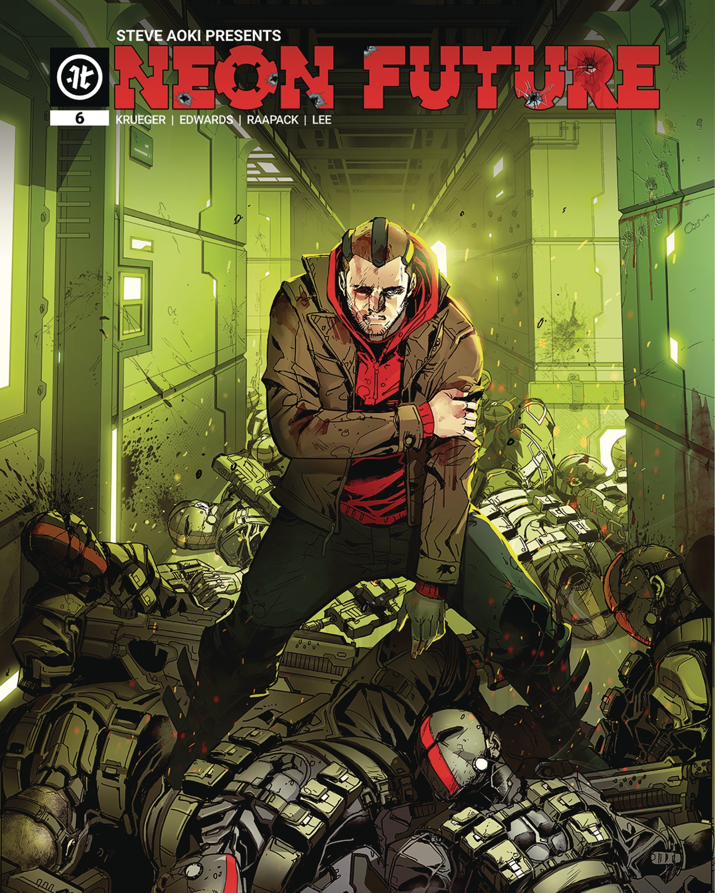
The art is supplied by the pairing of Neil Edwards and Jheremy Raapack, who are joined by Keith Champagne, of Frank N. Stein Private Eye fame. The trio provide some stunning visuals that help sell the future elements of the book. The panel design works where dynamism is a premium. Throw in the “other worldly” element of the Neon Garden and you get to see the ambition of the artists. Part of the visual attraction is also the excellent colors of David Kim, Nuo Xu, Gabe Eltaeb and Anthony Washington under the art direction of Abraham Lee. Why four colorists? The tone of this book is ever changing, with the various environments in play, which may be the reason why distinct differences from distinct coloring styles and skills were required. Finally, to round of the gauntlet of creators we have three letterers with A Larger World Studios, Farhad Heydarain and Samantha Levenshus all delivering different fonts to aid the reader in recognising the different environments and at times, characters.
This book has been garnering a lot of praise, and visually I can see why. Thing is, comics are not a visual medium alone. As it stands, for me at least, the writing fails to meet the required high standard of the art and the overall potential grandeur of the story-line.
Writing – 3 Stars
Art – 3.5 Stars
Colors – 4 Stars
[yasr_overall_rating size=”large”]
Written by; Jim Krueger, Tom Bilyeu, Steve Aoki, Matt Colon, Dana Brawer and Samantha Levenshus
Art by; Neil Edwards, Jheremy Raapack and Keith Champagne
Colors by; David Kim, Nuo Xu, Gabe Eltaeb and Anthony Washington and Abraham Lee
Letters by; A Larger World Studios, Farhad Heydarain and Samantha Levenshus
Published by; Impact Theory
Author Profile
- I am a long time comic book fan, being first introduced to Batman in the mid to late 70's. This led to a appreciation of classic artists like Neal Adams and Jim Aparo. Moving through the decades that followed, I have a working knowledge of a huge raft of characters with a fondness for old school characters like JSA and The Shadow
Currently reading a slew of Bat Books, enjoying a mini Marvel revival, and the host of The Definative Crusade and Outside the Panels whilst also appearing on No-Prize Podcast on the Undercover Capes Podcast Network
Latest entries

 Comic BooksApril 19, 2024Review: Jill and the Killers #4
 Comic BooksApril 11, 2024Review: Deadweights #1 (of 6)
 Comic BooksApril 10, 2024Review: Jim Henson’s Labyrinth Archive Edition #1 (of 3)
 Comic BooksApril 3, 2024Review: Red Sonja Empire of the Damned #1