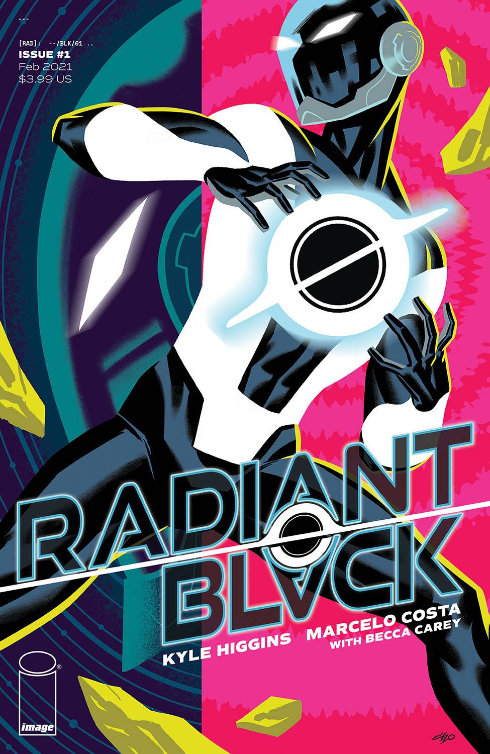
Review: Radiant Black #1
 Of all the comic books that Image produce, it is surprising that they don’t have more superhero books especially considering how the original Image creators broke out of their Marvel entrenchment with a batch of superheroes no less. Touted as a book for fans of Invincible and Power Rangers, this new ongoing series offers more than a glance to Image’s after years.
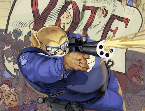
Turning thirty has had a huge impact on Nathan Burnett. Up to his ears in debt, sucking at two jobs there is only one way for him to go; thats right back to his parents. With an uncertain future colliding with a miss-managed past, Nathan is feeling pretty low at the moment, a feeling that is made worse by his best friends best efforts. That’s when he comes across the Radiant. An encasement, power giving, black hole that has the potential to change his world, one way or another.
Kyle Higgins has written a number of different books, possibly most noteworthy being a more than decent Nightwing book, which we can now say in hindsight. Here, Higgins takes time to set up the players of the book, the situations that work well. Every hero it seems has to have some sort of trouble. Gone are the “my parents / uncle / planets are dead” motives; in there place are neurosis and feelings of failure. The world has defo changed, yet somehow, the down on their luck will always remain down on their luck. Higgins throws in his version of the radioactive spider, before hinting at a larger universe. The dialogue works well; I liked the affection of Nathan starting to say something before sopping and saying something completely different.
The art is provided by Marcelo Costa who delivers a kind of angular approach that I would assume is more suited to a younger audience. A bit if research shows that Costa has worked on a range of books including Power Rangers, which suits the vibe of this book well. I am not totally sold on the art to be honest; there are some great background elements that help create the atmosphere, the opening panel is well observed. Faces are also expressive, which I like. I can’t deny that the younger audience feeling i get when I look at this book doesn’t appeal; the colors, though realistic in their usage does have an almost too digital look that can occur in books from time to time. Finally, letterer Becca Carey does a nice job with the speech affectation of Nathan and with a svelte font throughout.
Overall, whilst this is a fun romp with an interesting cliff hanger, it is probably a little lightweight for me to wholly enjoy. That said, Higgins has a great track record and this could end up being something of a sleeper hit for him and for Image.
Writing – 3.5 Stars
Art – 3.5
Colors – 3.5
Overall – 3.5 Stars
Written by; Kyle Higgins
Art & Colors by; Marcelo Costa
Letters by; Becca Carey
Published by; Image Comics
Author Profile
- I am a long time comic book fan, being first introduced to Batman in the mid to late 70's. This led to a appreciation of classic artists like Neal Adams and Jim Aparo. Moving through the decades that followed, I have a working knowledge of a huge raft of characters with a fondness for old school characters like JSA and The Shadow
Currently reading a slew of Bat Books, enjoying a mini Marvel revival, and the host of The Definative Crusade and Outside the Panels whilst also appearing on No-Prize Podcast on the Undercover Capes Podcast Network
Latest entries

 Comic BooksApril 19, 2024Review: Jill and the Killers #4
 Comic BooksApril 11, 2024Review: Deadweights #1 (of 6)
 Comic BooksApril 10, 2024Review: Jim Henson’s Labyrinth Archive Edition #1 (of 3)
 Comic BooksApril 3, 2024Review: Red Sonja Empire of the Damned #1