Review: Second Chances #1
 When things get tough, won’t it be nice to disappear, to kind of step off the world and re0invent yourself. Sure, there would be some collateral damage but when the rides gets too wild, get off! Par of this idea makes up the thrust of Second Chances, a new series from Image Comics.
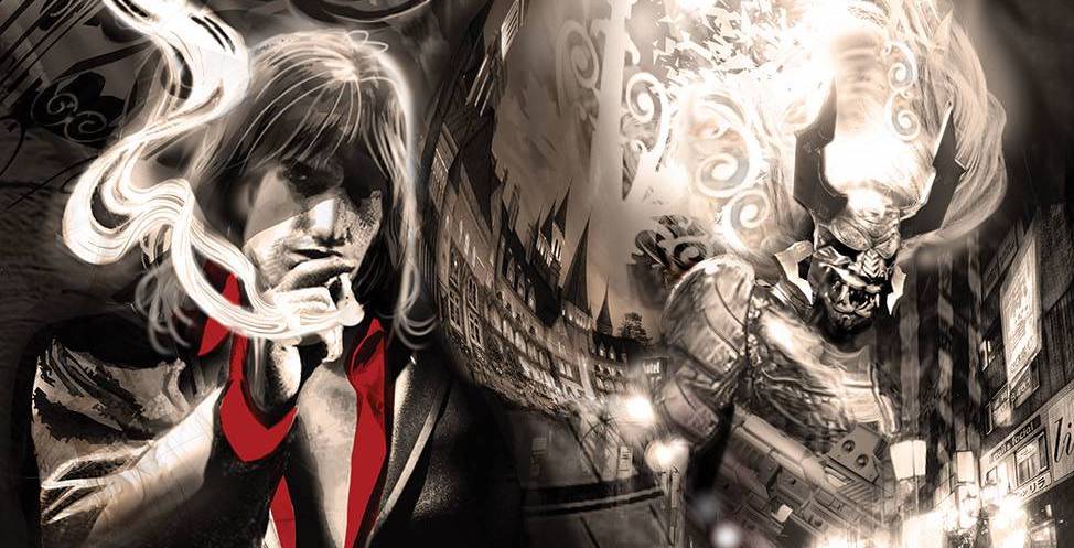
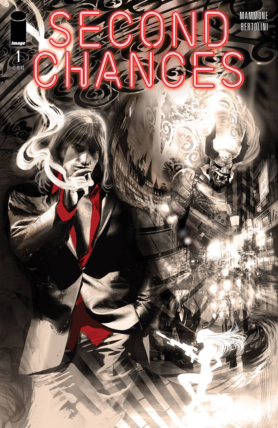
If you are in trouble and need to disappear then Leblanc is the man who can help you. Call him and you will start a process that removes you from your life, leaving money for your “bereaved” loved ones, giving you a new identity and a required amount of downtime. When a figure from his past call, Leblanc is drawn into a cat and mouse game, where everything and everyone is not quite what they seem.
At first glance, I thought that Ricky Mammone was channeling Ray Donovan, Throw in some John Wick style action and a bunch of crazy ninja assassins and tickle porn and you will realise that we are nowhere near Kansas! Mammone starts the book with a noir style monologue; all you need is the hot woman scorned to enter the office and the trope would be complete. The action is hectic in places, forcing you to be patient to see how the story progresses. Snippets of the past are interjected in order to give some relevance to the crazy, though be warned, questions are answered with more questions! By utilising the monologue of LeBlanc, Mammone manages to educate the reader, albeit in a one sided way. It also means that the table is set ready for the characters and the reader to be be challenged. It is a good effort for sure, though there has to be some likeable element to Leblanc for it to work out.
The art is provided by Max Bertolini who delivers a black and white style that has become a bit of a trend amongst publishers. At least no one had to pay for a colorist! Seriously though, the choice to go monochrome ramps up the noir elements in a visual way, matching the monologue. the impressive tone doesn’t stop there. The lack of color makes the shadows all that more imposing and surprisingly the backgrounds are full of well observed details. The figure work is also well structured and facial elements are well covered, given the amount of high emotions that are show. The action is well paced, which is where the John Wick comparisons will no doubt be made. DC Hopkins delivers a font that is breezy which adds to the pace of the book.
This book took, ironically, a couple of look for me to fully realise how enjoyable this book is. The black and white didn’t help in the first instance. But after spending time with Leblanc, I don’t think that this book would look or read as well as it does. Another hit for Image Comics.
Writing – 5 Stars
Art – 5 Stars
Overall – 5 Stars
Written by; Ricky Mammone
Art by; Max Bertolini
Letters by; DC Hopkins
Published by; Image Comics
Author Profile
- I am a long time comic book fan, being first introduced to Batman in the mid to late 70's. This led to a appreciation of classic artists like Neal Adams and Jim Aparo. Moving through the decades that followed, I have a working knowledge of a huge raft of characters with a fondness for old school characters like JSA and The Shadow
Currently reading a slew of Bat Books, enjoying a mini Marvel revival, and the host of The Definative Crusade and Outside the Panels whilst also appearing on No-Prize Podcast on the Undercover Capes Podcast Network
Latest entries

 Comic BooksApril 19, 2024Review: Jill and the Killers #4
 Comic BooksApril 11, 2024Review: Deadweights #1 (of 6)
 Comic BooksApril 10, 2024Review: Jim Henson’s Labyrinth Archive Edition #1 (of 3)
 Comic BooksApril 3, 2024Review: Red Sonja Empire of the Damned #1


