Review: Shelter Division #1 (of 3)
 Source Press have an eclectic stable of books under their publishing umbrella. Shelter Division, their newest mini-series, combine the ideas of two massively popular properties; its X-Files meets Men in Black!
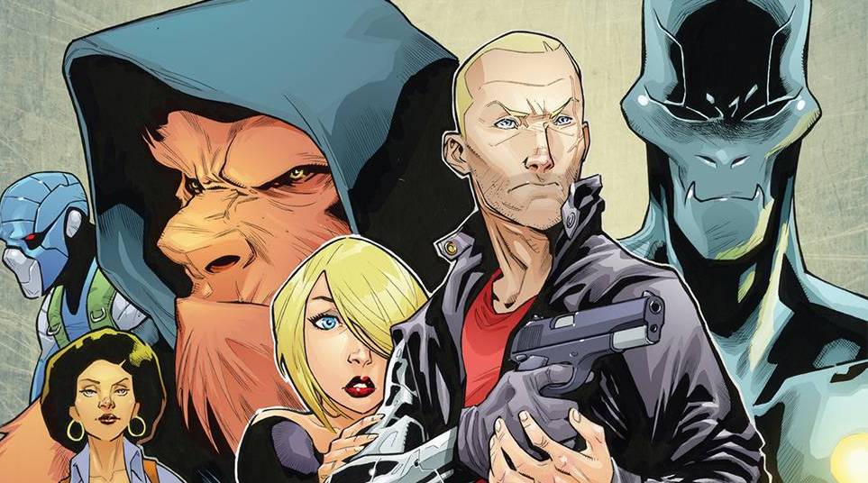
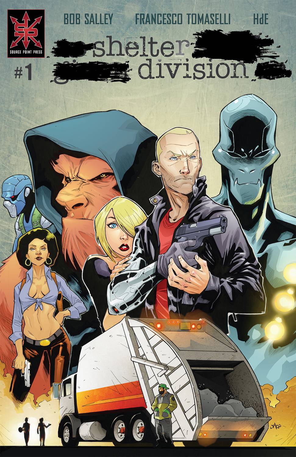
Protecting the Earth from “the worst scum in the universe”, are a group of abnormal individuals who were once the investigated and have now become the investigators. Chaplin, Biggs (no, not that one!) and the fantastically named alien Roswell. Together they are on point to try and deal with a new emerging threat that could have larger repercussions.
Writer Bob Salley seems to have taken a look at several influences and looked to accommodate them into something new. only partially successful. Along with the aforementioned X-Files and MiB obviousness, there is a touch of James Bond and even Winter Soldier in there. This mix does make for an action packed, albeit confusing first issue. This is a risk given that Salley only has three issues to play with. Clearer motivation of the bad guys, hell, even clear explanation of who are the bad guys would help massively. The dialogue is full of banter and expects the reader to go with the flow, with nary any exposition, in part due to the action on top of action model.
With so many movie / TV touches on show it is no surprise that Salley is looking for cinematic panel and page designs. Hitting this idea spot on is artist Francesco Tomaselli. Tomaselli looks to use establishing shots to give the reader a grander than it could type of feel. Camera angles are used well, staying focussed on parts of the character rather than their full body, at least early on. When Tomaselli goes full body in the frame, as if compressing the characters has created an issue with perspectives as they take a bit of a dip, which distract the eye. Facial elements work well enough, even if they are a tad cartoony. Tomaselli also provides the colors with some misty looking establishing shots. Letters are supplied by HdE who uses a simple font with a mix of different text boxes for effect.
Getting a whole story down in three issues in today’s story compressed times is difficult, especially given the breakneck speed that this issue moves along at. Salley may be hoping that there is enough of the characters on show to make the reader want to return to not just this series, but future runs which may give up the teams origins. If this is the aim, then the book kind of achieves it, with a couple of nice ideas and workable art.
Writing – 3 Stars
Art – 3 Stars
Colors – 3 Stars
Overall – 3 Stars
Written by; Bob Salley
Art & Colors by; Francesco Tomaselli
Letters by; HdE
Published by; Source Point Press
Author Profile
- I am a long time comic book fan, being first introduced to Batman in the mid to late 70's. This led to a appreciation of classic artists like Neal Adams and Jim Aparo. Moving through the decades that followed, I have a working knowledge of a huge raft of characters with a fondness for old school characters like JSA and The Shadow
Currently reading a slew of Bat Books, enjoying a mini Marvel revival, and the host of The Definative Crusade and Outside the Panels whilst also appearing on No-Prize Podcast on the Undercover Capes Podcast Network
Latest entries

 Comic BooksApril 19, 2024Review: Jill and the Killers #4
 Comic BooksApril 11, 2024Review: Deadweights #1 (of 6)
 Comic BooksApril 10, 2024Review: Jim Henson’s Labyrinth Archive Edition #1 (of 3)
 Comic BooksApril 3, 2024Review: Red Sonja Empire of the Damned #1


