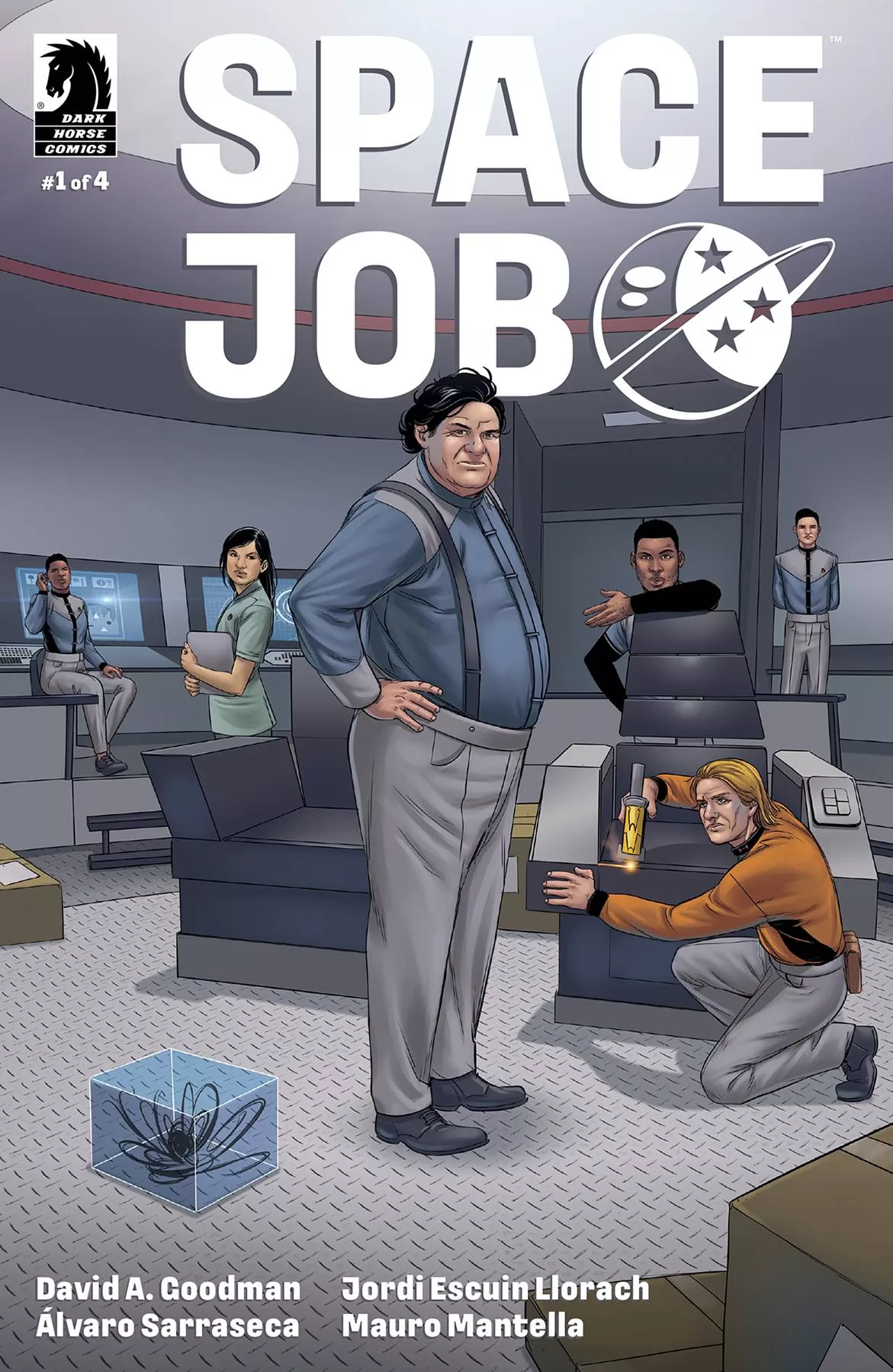
Review: Space Job #1 (of 4)
 “Space, the final frontier”, is one of the genres where, normally, I can enjoy a serious dose of fiction, with nary a whimsy or joke abound. After all, in a vacuum “no-one can hear you laugh!”. With the possible exception os Space Balls, humour in sci-fi can be a hard to do thing; kind of like horror in comics. Both need context, though the latter maybe need music also. With this in mind I wasn’t quite ready to step aboard the SS George H.W. Bush.
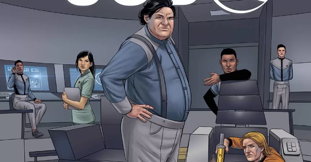
Chef’s assistant Danny Sheridan is getting a promotion; not up to chef as you would expect, but to First Officer. Thing is, reality barely exists in the same realm as expectation for Danny who goes from cooking a goose to having his own goose cooked. In doing so, we get to meet and greet the crew and get the first insights to who is who and the sort of nonsense that will follow.
Writer David A. Goodman has generated a book full of characters that will seem kind of familiar to anyone who has watched Star Trek, The Orville and of course Lower Decks. All three show have huge fanbases so I am assuming that these are the audiences that Dark Horse are looking to capture. Goodman peppers the book with one liners an sarcastic situations, some of which occur in every workplace. Some of these land, others I hope, are setups for punchlines down the line. The doctor being a marriage counsellor using security to spy on her husband is probably the funniest (and flagrant mis-uses of rank) parts of the book.
The art is supplied by Álvaro Sarraseca who does a great job of keeping Trek in the readers mind’s eye, although with a focus on the comedic elements, some of which work and others don’t quite hit the mark. The how for’s of Danny’s situation is a great example of a gag not quite working. Maybe its the pacing or the plotting of the page. The talking heads portion of the book, of which this quite a bit, is done well with facial aspects working well with the dialogue. The colors from Jordi Escuin Llorach are a bright affair, which this time seems a little of kilter with the idea of a cluttered, not quite up to spec starship. Mauro Mantella, who gets a cover credit, supplies a lettering font that keeps things easy to read, with different boxes for different people adding texture to the various characters different voices.
Whilst not wholly my cup of tea, there is enough familiarity from the inherent influences to create a general interest in the book. How and if this translates into enjoyment and genuine belly laughs will depend on what’s to come. “Ahead full impulse”, seems to be the course of action here.
Writing – 3.5 Stars
Art – 3 Stars
Colors – 3 Stars
Overall – 3 Stars
Written by; David A. Goodman
Art by; Álvaro Sarraseca
Colors by; Jordi Escuin Llorach
Letters by; Mauro Mantella
Published by; Dark Horse Comics
Author Profile
- I am a long time comic book fan, being first introduced to Batman in the mid to late 70's. This led to a appreciation of classic artists like Neal Adams and Jim Aparo. Moving through the decades that followed, I have a working knowledge of a huge raft of characters with a fondness for old school characters like JSA and The Shadow
Currently reading a slew of Bat Books, enjoying a mini Marvel revival, and the host of The Definative Crusade and Outside the Panels whilst also appearing on No-Prize Podcast on the Undercover Capes Podcast Network
Latest entries

 Comic BooksApril 19, 2024Review: Jill and the Killers #4
 Comic BooksApril 11, 2024Review: Deadweights #1 (of 6)
 Comic BooksApril 10, 2024Review: Jim Henson’s Labyrinth Archive Edition #1 (of 3)
 Comic BooksApril 3, 2024Review: Red Sonja Empire of the Damned #1


