Review: Specs #1 (of 4)
 As a glasses wearer myself, from an earlier age, I think I would have wished not to have to wear them. In the tone of this new book from Boom! Studios, Specs, my wish may have translated into my eyes falling out! That is the sort of intent over vocalised wishes horror that co-creators David M. Booher and Chris Shehan look to mine.
For all those people of a certain age will remember those comic adverts promising Sea Monkeys, cowboy boots and x-ray glasses will recognise the the modus operandi that drives this book forward. Kenny and Ted are the kind of outcasts from small town America from the mid to late 80’s. Kenny is secretly gay, in love with his African American best friend Ted; the pair are dealing with their own perceptions, both imaginary and real respectively. When a pair of magic glasses from an old comic book that promise to make their wishes comes true suddenly appear, they have the chance to live their best lives….. at a cost!
David M. Booher sets the tone, with the type of school environment we have seen from any number of media. Booher also mines the issues of bullying for whatever differences exist. The dialogue works really well, with Booher using Kenny’s monologue setting the pace and the tone, which is intermixed with hope, suffering and the bittersweet feeling of unrequited love. Booher’s environs are well detailed and especially defined to mirror the moods of the characters, in this first issue thats Kenny, Ted and Bernard the bully.
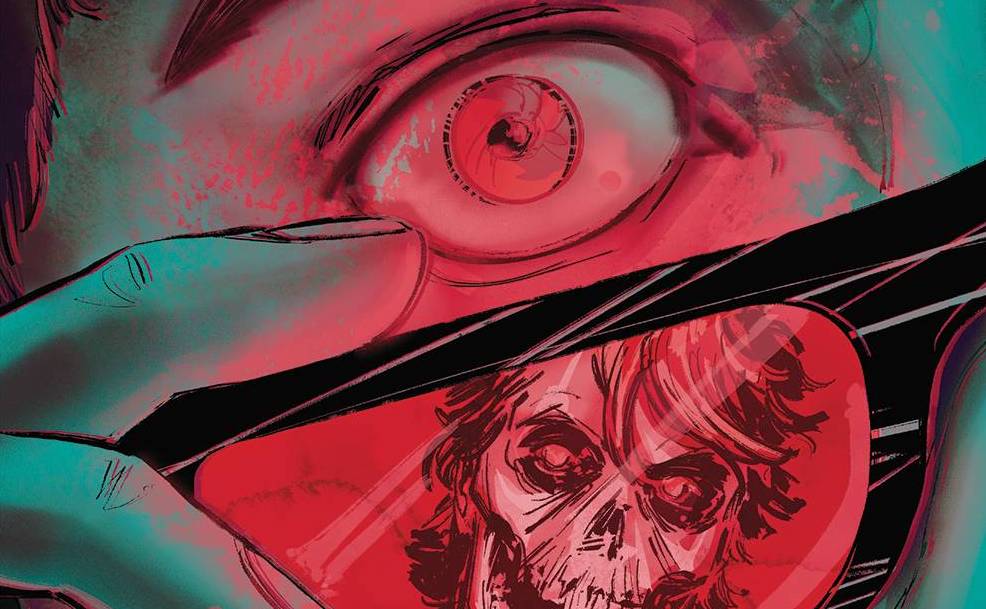
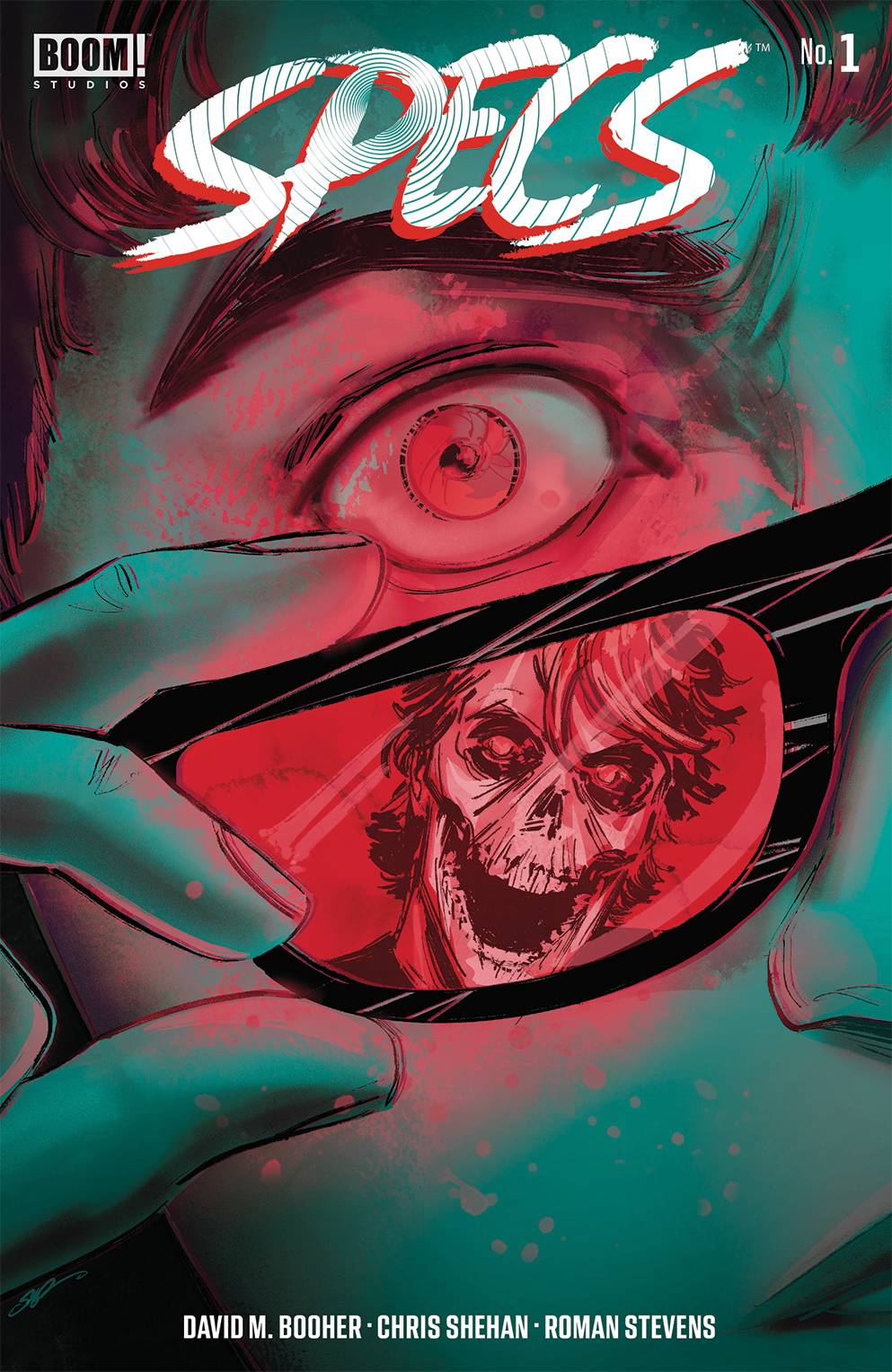
Providing the aforementioned environs is artist and co-creator Chris Shehan who sets the various tables very well indeed. Shehan’s strength, apart from the locales are the facial elements. Giving that this is an emotionally driven book, this aspect is massively important. Throw in some strong camera angles to add impact to the action elements and you have very impressive storytelling techniques on show. If you want tone, then the colors from Roman Stevens absolutely ooze a darkness at the edge of this particular town, with hues of green and pastel styled colors. Letters are supplied by Jim Campbell who delivers an easy font in places, though always draws the reader in to the dialogue, helping to create an immersive experience. Pity that level of work doesn’t come with a cover credit!
After reading a spate of horror book due to Halloween, I wasn’t really looking to take yet another walk on the scary side. Booher, Shehan and company have delivered a first issue that intrigues, mystifies and carries the strength of the lead characters through that which they think they want.
Writing -5 Stars
Art – 5 Stars
Colors – 5 Stars
Overall – 5 Stars
Written & co-created by; David M.Booher
Art & co-created by; Chris Shehan
Colors by; Roman Stevens
Letters by; Jim Campbell
Published by; BOOM! Studios
Author Profile
- I am a long time comic book fan, being first introduced to Batman in the mid to late 70's. This led to a appreciation of classic artists like Neal Adams and Jim Aparo. Moving through the decades that followed, I have a working knowledge of a huge raft of characters with a fondness for old school characters like JSA and The Shadow
Currently reading a slew of Bat Books, enjoying a mini Marvel revival, and the host of The Definative Crusade and Outside the Panels whilst also appearing on No-Prize Podcast on the Undercover Capes Podcast Network
Latest entries

 Comic BooksApril 19, 2024Review: Jill and the Killers #4
 Comic BooksApril 11, 2024Review: Deadweights #1 (of 6)
 Comic BooksApril 10, 2024Review: Jim Henson’s Labyrinth Archive Edition #1 (of 3)
 Comic BooksApril 3, 2024Review: Red Sonja Empire of the Damned #1