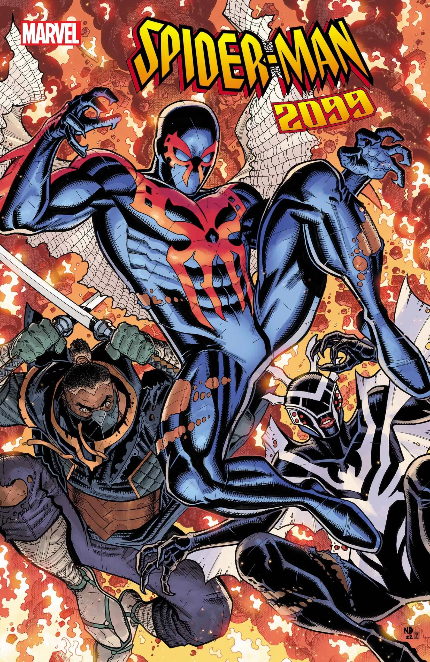
Review: Spider-Man 2099 #2
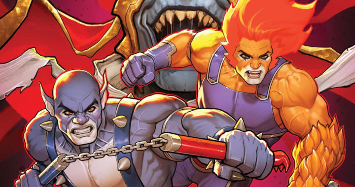
 Spider-Man has gone through all sorts of different renditions. From the black Spider-Man to Spider Pig. From Spider Rex to Spider Killer, none other comes close to the coolness of Spider-Man 2099. Well, Spider-Man 2099 is alright himself, but what really makes this story stand out is the myriad of supporting characters that join our Spider friend in his action-packed ventures. In this issue, we are introduced to a future version of Blade the Vampire Hunter, and we get to see Ghost Rider in all of its demonic fiery glory and I love every second of it. We also see a pretty cool yet creepy rendition of Spider-Woman and we even have some special appearances by Moon Knight and Venom and of course the hardest villain in the Spider Universe, Carnage.
This book is really nice! The art is outstanding and the character designs are through the roof. They managed to take our standard heroes and give them a stylistic upgrade like no other. There is a panel in this story that shows Ghost Rider in a super fire demon version and dang does he look awesome! Even Blade looks cool in his neo-Samurai attire. The writing is fun and even manages to sneak a couple of jokes here and there with the interactions of Carnage and Halloween Jack. Halloween Jack is an agent of mischief and mayhem that gives off Green Goblin vibes mixed with a little Loki; he and Carnage make a great team in this series and no doubt are going to cause all sorts of problems for our customed superheroes.
I like pretty much everything in this book, from the action scenes to the backgrounds from the story to the dialog it all fits in like the perfect Marvel puzzle, and yet one thing stands out too much for my taste, and that has to be the lettering. Whilst it is actually really good lettering, and it is handled professionally by Cory Petit, I keep seeing this issue come up again and again in Triple AAA books, they forget how weird perfectly clean balloons look over uber-textured artwork. It feels like you if you printed the pages and then glued the word balloons on top, and I really don’t like that. It’s too clean for my taste. I would much rather see a little bit of texture in those balloons that dirty them up a little bit and blends them in better with the panel art. Even just decreasing the opacity a tiny bit might help some of the background texture come through instead of having them look like vector art on top of raster art. It’s no doubt a minor nuance on an otherwise wonderful piece of work but one that still makes me uncomfortable when I’m reading. I’m also reading the digital version of these stories and perhaps the final printed material will tie it all together, but at least for me I can always tell when the balloons were done at the end of the story in Illustrator or a vector-based program instead of the same program the art was painted on.
I haven’t seen a moment where this works well, but perhaps there is an instance where it could work well. Maybe if you have a character that is clean and proper, maybe you could have perfect vector balloons on there, but for the most part, a little dirt never hurt anyone and makes everything look so much better. Other than that, this is a wonderful book, the panel designs are outstanding and the black borders featuring a little of that grime I’m talking about that make the book feel like it’s hand-drawn instead of computer generated. Even though I’m sure it was all drawn digitally these little bits of ruggedness f the line art and the imperfections in the colors make it that much more charming and transmit the human factor that makes me love comics. All those little details transport me to the artists’ studio and make me feel like a real human sweated and poured their all into one of these books I love that aspect of comics, but it has to be consistent throughout every aspect of the book, including the word balloons and the text.
Enough about that though, the art is fantastic and the cover art is outstanding. Between Spider-Woman, Ghostrider, and Blade I don’t know whose design I like more but I think this is a wonderful series to study when it comes to great character design and I hope more artists take note of how to redesign renowned characters in the future. A great story with great art.
Writing- 5 Stars
Art – 4.7 Stars
Colors – 5 Stars
Overall – 4.9 Stars
Writing by; Steve Orlando
Art by; Justin Mason
Colors by; Jordan Boyd
Lettering by; Cory Petit
Edited by; Matt Paniccia
CoverArt by; Nick Bradshaw & Neeraj Menon
Variant Covers by; Ken Lashley & Juan Fernandez, Rod Reis, and Justin Mason
Published by; Marvel
Reviewed by Antonio “Mabs”
Author Profile
Latest entries
 Comic BooksApril 30, 2024REVIEW: Rick and Morty: Kingdom Balls #1
 ReviewsApril 30, 2024PRCC2024 Recap: Fans from all over the world join together in Puerto Rico to celebrate all things comics, anime and videogame
 Comic BooksMarch 30, 2024REVIEW: Monstress #50
 Comic BooksMarch 28, 2024REVIEW: Cemetery Kids Don’t Die #2