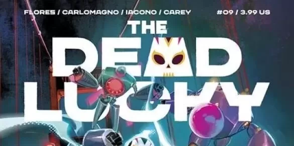
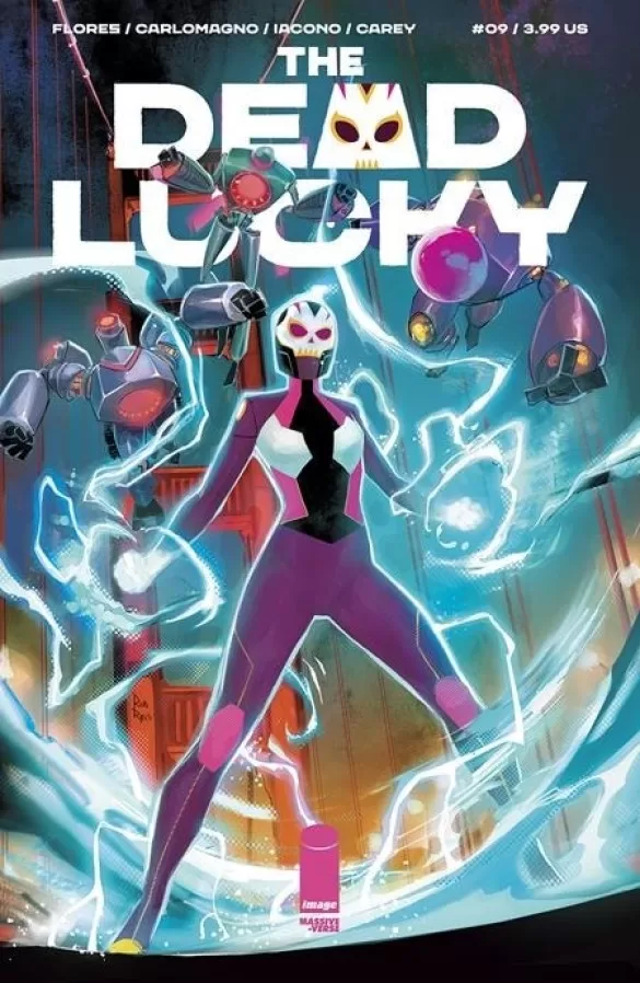
REVIEW: The Dead Lucky #9
 The Dead Lucky #9 continues the story as Bibi returns to base after being missing for 3 days after failing a contracted mission, and ghosts from the past begin to pop up again. This comic features a wonderful book design, wonderful characters, and a great story with equally fantastic lettering and coloring. Whilst being a little on the slow side, it still manages to pack a few funny jokes, some nice action, and a great story recall.
I hadn’t read The Dead Lucky before today, and to be 100% fair, I am still not fully sure I know what they are. I think they’re a group of mechanized government agents, sorta like the Power Rangers but more modern and owned by the government. That being said, I enjoyed reading this new issue. In part it was a little slow to read because it’s mostly just people talking to each other, about what happened, or what’s going to happen, or something that hasn’t happened but they wish happened; yet when it ramps up it really gets good. It starts off strong with a blazing (pun intended) scene of a guy named Ghost grilling (another pun that’s very much intended) some soldiers in the desert, and then we cut to what seems to be the manager of the “The Dead Lucky” group fielding calls from the media about the whereabouts of one of the members of the group. This whole issue goes on for a little too long and it’s not till page 10 that we see some action break loose. One of the coolest parts about this comic is the way that the characters transform into their “super-powered” personas. It is spontaneous but the way it is laid out in the panels makes for a really surprising moment when one second you see the characters in their civilian clothes and you turn the page and they’re looking like badass luchador power rangers.
Speaking of badass, these costumes are awesome! From Bibi’s customer with the purple color scheme and the skull helmet to Ghost’s orange and black fire-themed attire, even the AI robots look awesome. They have a really cool angular aesthetic that I am all down for, it is carried into the civilian character designs in some respects but they don’t look as cool when they’re not wearing their costumes. However, two characters did stand out for me that were not part of “The Dead Lucky” and that was the African-American woman with the afro and the pointy shoulder pads and the AI expert with the pink lines on her face and the mohawk ponytail. I think those two characters are really interesting to look at, and whilst it is clear that they are supporting characters, they don’t feel like afterthoughts or generic characters created to populate the world, which in all honesty some of the other characters do feel a little generic. This is completely understandable, sometimes you’re gonna need a few disposable soldiers here and there, not every soldier is part of GI Joe and has a cool backstory with a cool character design to go along with it.
Despite the drudgery of conversations about where Bibi was or wasn’t, this comic does a lot of really good things both in terms of the story and in terms of the overall design of the book. The story itself does a magnificent job at setting up the climax/cliffhanger right from the very beginning but it’s done so subtlety that you don’t even notice it right up till the end when it happens. I know I’m being a little hard at the fact that it was slow to get started, but it is bound to happen with long stories, there will come a time when you need to set up some plot elements for future issues and the only way to do that is by having characters talk to each other. With this in mind, it is easy to move past the slow build-up, and really enjoy reading this, especially when the book is so well designed. We don’t often credit the designer because we’re focused on the art of the book (including lettering, story, and coloring) but my hat goes off to Michael Busuttil for the fantastic design of this book.
I am a huge fan of the way they chose to display the credits page. It is both written as log information and debug text, and it is displayed in a minimalist style that is very reminiscent of computer screens and programming IDEs, which is genius for a story that is about robots and artificial intelligence. I also really like that they went for a fuchsia color scheme instead of the usual blues, blacks, and greens that are often linked to technological themes. One last point I would like to note about this book is that there are very empathic and conscientious people in this book team. You can see it by the fact that they decided to use their last pages to not only provide support to war veterans who might feel affected by themes or issues in the series, which in my personal opinion is fantastic and deeply moving, but also because the last page of the true content of this book is dedicated to teaching you how to prepare a Lychee Margarita; complete with the ingredients you will need, a little backstory of the recipe and step by step instructions to prepare the beverage. I think that’s awesome, if this sort of stuff is added to all the issues of the book you might as well collect all of them and then have an awesome story for your dinner guests to read through whilst they are trying out your new recipes at your fancy or not so fancy dinner party.
Last but definitely not least, we have to talk about the lettering by Becca Carey and the color choices of Mattia Iacono. First off, the lettering is very good. It reads very well, is creative in displaying robotic information, and does a great job with sound fx. I would’ve personally loved a couple more sound fx here and there, perhaps in the panels where the characters are changing into their costumes, but other than that it is pretty stellar work. I have to echo this statement for the colors; stellar work all around. Mattia Iacono does a phenomenal job at dividing each individual scene with its own color palette, which is something I find truly smart because it guides the reader along through the story and allows them to not get confused with what happened before and what’s happening now. This change in color almost serves like a jump-cut TV or movie, instead of having the screen fade to black, you get a color scheme that is completely new to you, and even though the characters remain the same because the colors are so different you understand that this is either a new location, or a different time, or both. It works very well in the later pages where you have two scenes playing out at the same time, the difference in color palettes makes it super clear that whilst they are happening at the same time, the story points being discussed aren’t 100% the same ones. It’s really great to see what color scripting can do to a story and to be honest, I had no idea of the importance it held in the comic’s making process till reading this. So Mattia, props to you and keep up the amazing work.
Writing: 4 Stars
Art: 5 Stars
Colors: 5 Stars
Overall: 4.5 Stars
Written by: Melissa Flores
Art by: French Carlomagno
Coloring by: Mattia Iacono
Lettering by: Becca Carey
Cover art by: Rod Reis
Published by Image Comics
Author Profile
Latest entries
 Comic BooksApril 30, 2024REVIEW: Rick and Morty: Kingdom Balls #1
 ReviewsApril 30, 2024PRCC2024 Recap: Fans from all over the world join together in Puerto Rico to celebrate all things comics, anime and videogame
 Comic BooksMarch 30, 2024REVIEW: Monstress #50
 Comic BooksMarch 28, 2024REVIEW: Cemetery Kids Don’t Die #2