Review: The Phalanx One-Shot
 The comic book world is full of fans who love their personal favourites, be it Batman, Spider-Man, DC, Marvel or any of the Indie publishers that are putting out books. For a lot of people the creation of Image Comics was the watershed moment that brought a lot of of new fans into the industry along with the huge fanbases of those leaving Marvel Comics. It is this love for Image Comics that is the germination for this new book.
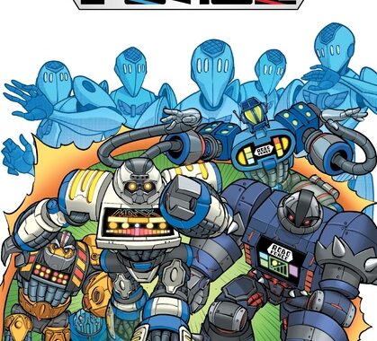
Spur, a mercenary in present day LA, has been tasked to find a certain red gem of mysterious powers. On the hunt, as the villain of the piece uses the gem to escape; following him leads spur to 1992 and the Phalanx!
This book is created by Jonathan Luna who produces the script, the art, letters and the design is, ironically, a homage to Image circa 1992. Therefore you could argue it is a book that is more art than story, more style than substance. Taking the writing first, Luna starts with an adult theme; you can tell its adult because of the swearing! Whilst I am being facetious, it is a nice change to have the expletive used rather than the usual symbols. It’s just a pity that there is no real impact or need for it. Story wise, it all hangs on the dubious decision of Spur. The introductions to the Phalanx seems a little twee and despite their various designs, at this stage I can’t really tell one from another personality wise. The other aspects of the book could have been taken from Power Rangers Time Force.
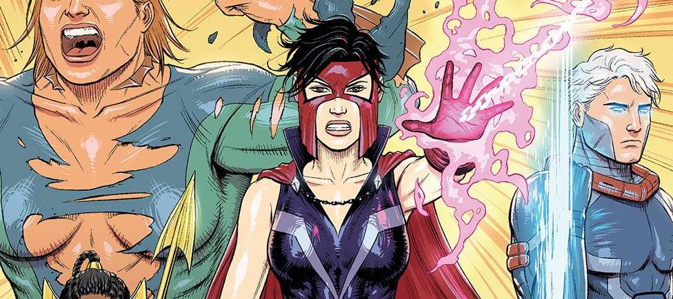
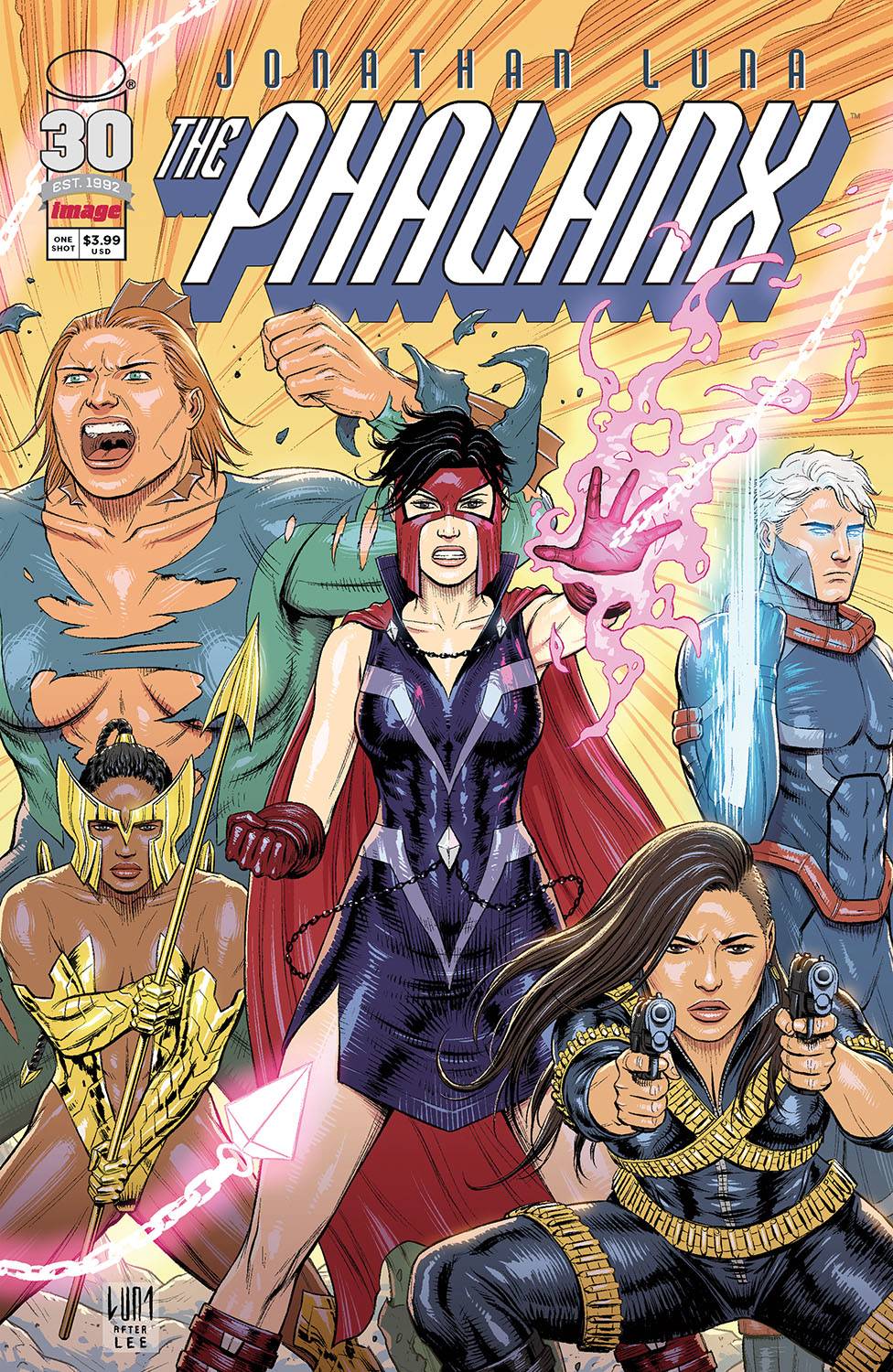
Regarding the art, I can see what Luna is trying to achieve, yet lacks dynamism. This gives the book a flat look in most of the panels. Perspectives can also be a tad off which distracts the eye. Facial elements look vacant, as if disjointed from the action or situations that the myriad of characters find themselves in. I am also at a loss as to why one of the female characters is bare chested. Is it a nod to the absurdity of the Hulk’s trousers? For a homage to artists like MacFarlane, Lee, Liefeld and Silvestri there is a lack of background art. The colors, acting as the background in places, are muted with a scratchy element in places. The font is easy to read and Luna does well with some of the conversational panels where dialogue dominates.
I understand the need to pay homage to that which you love. It’s a laudable idea and thanks to a Youngblood type cover, Luna is clearly wearing his heart on his comic, rather than his sleeve. For me, I am not certain that Luna manages to achieve his lofty goal, though I applaud his effort.
Writing – 2.5 Stars
Art – 2.5 Stars
Colors – 3 Stars
Overall – 2.5 Stars
Written, Art, Letter & Design by; Jonathan Luna
Published by; Image Comics
Author Profile
- I am a long time comic book fan, being first introduced to Batman in the mid to late 70's. This led to a appreciation of classic artists like Neal Adams and Jim Aparo. Moving through the decades that followed, I have a working knowledge of a huge raft of characters with a fondness for old school characters like JSA and The Shadow
Currently reading a slew of Bat Books, enjoying a mini Marvel revival, and the host of The Definative Crusade and Outside the Panels whilst also appearing on No-Prize Podcast on the Undercover Capes Podcast Network
Latest entries

 Comic BooksApril 19, 2024Review: Jill and the Killers #4
 Comic BooksApril 11, 2024Review: Deadweights #1 (of 6)
 Comic BooksApril 10, 2024Review: Jim Henson’s Labyrinth Archive Edition #1 (of 3)
 Comic BooksApril 3, 2024Review: Red Sonja Empire of the Damned #1