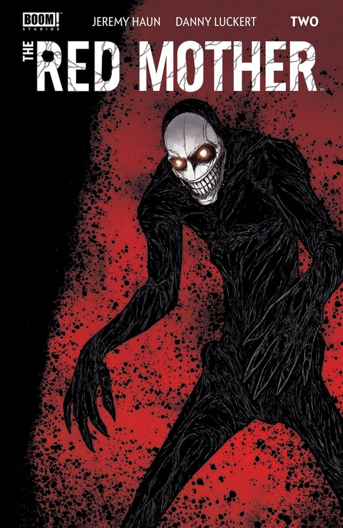
Review: The Red Mother #2
 The quiet horror book,The Red Mother from Boom! continues as Daisy looks to both find Luke and avoid the image haunting her vision.
Daisy has a lot to deal with. She is still reeling from the loss of Luke, coupled with her best friend being out of town, leaves Daisy quite vulnerable. Still, she has her shrink for company in addition to the monster living in her prosthetic eye. But what does it all mean and what does the vision want from her?
This book is a slow burner for sure. The first issue was pacy in the fact that time was spent getting to know the cast, coupled with Luke going missing and the first horrific visitation. With this second issue, things slow down a little. Now is the time for us to get to know a little more about Daisy, her life up to this point and so on. Sure enough it is not long till a certain someone or something pops up, along with a warning of sorts.
Writer Jeremy Haun is certainly ramping up the tension. With not a lot of clues to go on, we are still in reactive mode. Haun knows when to keep things tense before moving onto the next part of the story. Haun is counting on keeping the reader intrigued and invested. It is a balancing act; stay too long in one aspect of the story or move too quickly and you lose the reader. I have every confidence in Haun as he weaves his way through this issue. The dialogue is almost whimsy in contrast to the horror element that is on show, though I am sure that there are nods hidden in there as to what is going on or at least, what may yet be going on.
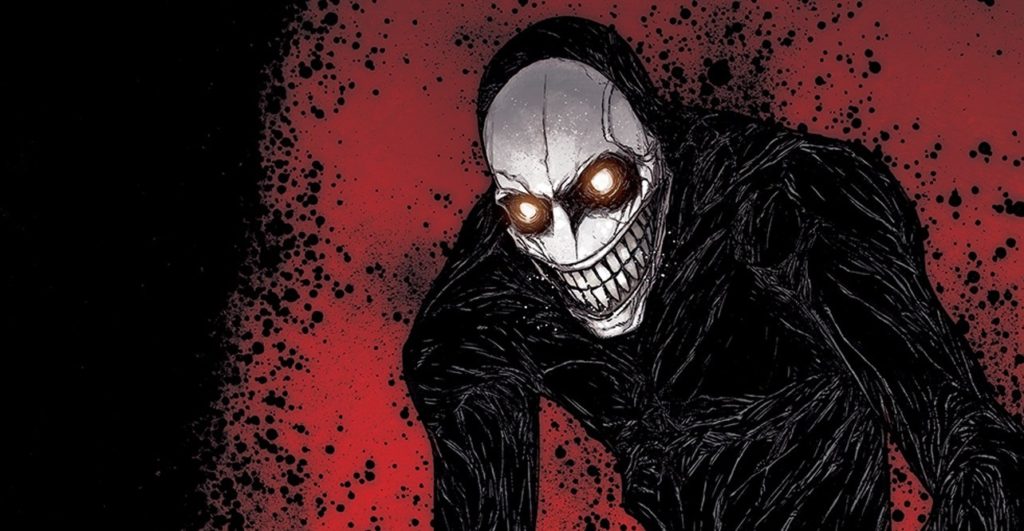
The art is supplied by Danny Luckert who has a styles that at times reminds me of a less developed Frazer Irving in places, especially in the first few pages of this issue. Eventually, Luckert moves into clean lines with minimal detaisl, though backgrounds and camera angles all are used to help create an nuanced approach to the mystery. Panel design is also hugely important especially given the fact that this issue is quite talky. The panels help keep the the reader’s interest at a low heat until the red panels, and figure that they are associated with show up. Luckert also provides the colors utilising different features for the opening act, serving as a third contrast within the book. Letterer Ed Dukeshire provides a solid job, playing with fonts to insinuate ghostly goings on.
I am not a horror book fan. Still there is something about this book that catches my attention, that despite my usual lack of disinterest, I am genuinely curious and want to see what is going on.
Writing – 4 Stars
Art – 4 Stars
Colors – 3.5 Stars
Overall – 4 Stars
Written by; Jeremy Haun
Art & Colors by; Danny Luckert
Letters by; Ed Dukeshire
Published by; BOOM! Studios
Author Profile
- I am a long time comic book fan, being first introduced to Batman in the mid to late 70's. This led to a appreciation of classic artists like Neal Adams and Jim Aparo. Moving through the decades that followed, I have a working knowledge of a huge raft of characters with a fondness for old school characters like JSA and The Shadow
Currently reading a slew of Bat Books, enjoying a mini Marvel revival, and the host of The Definative Crusade and Outside the Panels whilst also appearing on No-Prize Podcast on the Undercover Capes Podcast Network
Latest entries

 Comic BooksApril 19, 2024Review: Jill and the Killers #4
 Comic BooksApril 11, 2024Review: Deadweights #1 (of 6)
 Comic BooksApril 10, 2024Review: Jim Henson’s Labyrinth Archive Edition #1 (of 3)
 Comic BooksApril 3, 2024Review: Red Sonja Empire of the Damned #1