
Review: The Warning #1
 It is funny how trends come and go in all things, be it movies, TV, music and of course comic books. Not content with the plethora of augmented soldiers that seem to be running around various universes, Image Comics step up with some of their own, courtesy of writer / artist / creator Edward Laroche.
The Earth is acting like a tractor beam with the materialisation of a machine in a major West Coast city, drawing the machine’s creators across the stars, to our fair planet and invasion. All that stands in their way, the Gladiator Two-Six, a multinational combat brigade fitted with the latest in next-gen military science and tech.
Edward Laroche starts the book with a meandering type of monologue, which brings to mind a certain nanite infected killing machine. Yet rather than go straight for the proverbial jugular, Laroche takes his time, setting the field with the various players that will coalesce into, possibly, intergalactic war. By taking this approach, Laroche is giving the reader time to get to know the characters, from the gung-ho soldier to the out but pulled back in flawed doctor. This then gives the book depth away from what could be seen as yet another alien invasion book. Laroche also plays with the timeline, jumping back and forth which alludes to the length of time it took to move the team from zero to active. I hope that Laroche has put the effort in with his series bible as jumping through a books own timeline can cause continuity issues.
Laroche also delivers the art for the book. Looking through the book, I think I can see a couple of influences in play, one more obvious than the other. When it comes to the figure work and some of the faces, the art reminds me of Amancay Nahuelpan’s work for Black Mask Studios. Of course, the rain-soaked pages scream Fran Miller at his Sin City best, albeit with a tad more color. There are times in the issue where I would like to see more details to the soldiers, with some of them seemingly quite stagnant at times. Laroche tries to offset this with the use of camera angles, but this only makes the pose or art forced somehow. Maybe things will improve when the action heats up. Colors are provided by Brad Simpson who, after a couple of gorgeous introduction pages, delves into the murky world of ochre, brown and green, not forgetting black and red. Each color is used effectively to paint a world that, in part, is teetering on the edge. Jaymes Reed’s letters help propel the reader through the book, but I do feel that the bubbles or maybe the font is just a tad to big in places. This is of course a minor quibble.
For a story type that has probably been done a fair few times, it is admirable how well Laroche has done with this well-worn trope. The challenge will be to try to keep the book fresh as it goes through the paces. It is almost as if the alien invasion, at least in this first issue, is actually just window dressing, and like all good window dressing, Laroche’s talent should entice you into the store.
Writing – 4 Stars
Art – 3.5 Stars
Colors – 4 Stars
[yasr_overall_rating size=”large”]
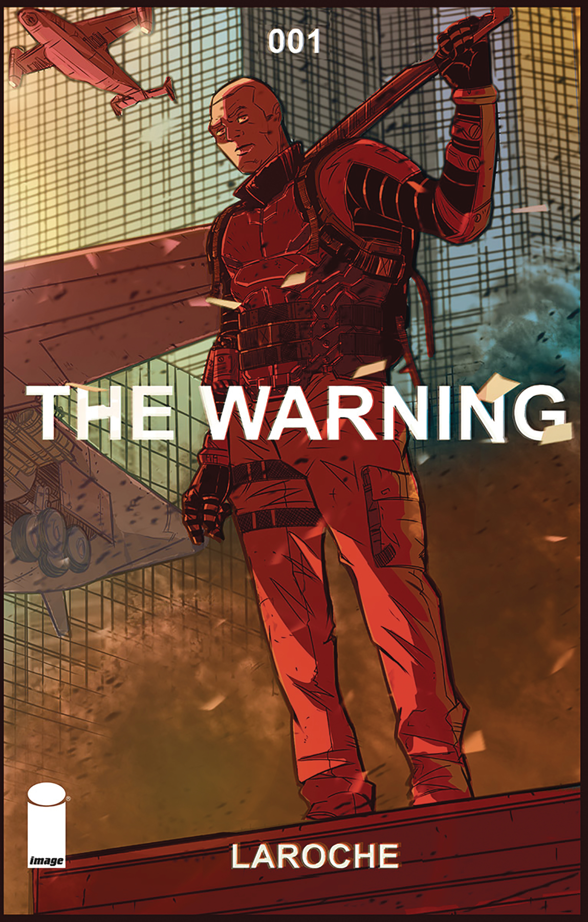
Written & Art by; Edward Laroche
Colors by; Brad Simpson
Leters by; Jaymes Reed
Published by; Image Comics
Author Profile
- I am a long time comic book fan, being first introduced to Batman in the mid to late 70's. This led to a appreciation of classic artists like Neal Adams and Jim Aparo. Moving through the decades that followed, I have a working knowledge of a huge raft of characters with a fondness for old school characters like JSA and The Shadow
Currently reading a slew of Bat Books, enjoying a mini Marvel revival, and the host of The Definative Crusade and Outside the Panels whilst also appearing on No-Prize Podcast on the Undercover Capes Podcast Network
Latest entries

 Comic BooksApril 19, 2024Review: Jill and the Killers #4
 Comic BooksApril 11, 2024Review: Deadweights #1 (of 6)
 Comic BooksApril 10, 2024Review: Jim Henson’s Labyrinth Archive Edition #1 (of 3)
 Comic BooksApril 3, 2024Review: Red Sonja Empire of the Damned #1


