Review: Vampirella / Red Sonja #12 FINAL ISSUE
 What a strange week. On one hand, one of my favourite books of the last year is back with Black Cat #1 and on the other, one of my favourite books of the least year is coming to an end with Vampirella Red Sonja seeing the last issue on the racks. Truth be told, my wallet is probably quite happy!
This series has mutated from a fish out of water story, through a mutual respect and love of two strong female characters tale, to something that has a depth that is quite surprising. As the final curtain falls, it’s the life lived and lost for Sonja that takes centre stage. In many ways, this aspect is apt as it has been Sonja that has gone through more than a small amount of changes during this series.
The book is written by Jordie Bellaire, who you will recognise as an excellent colourist. Bellaire has been something of a revelation as a writer. Whilst this issue is definitely closure for this particular tale, the modus operandi is well hidden and may come as a bit of a surprise; it did me. Bellaire’s plotting has ensured that readers were treated to new adventures every month, enabling little tells to be hidden in plain sight. Bellaire’s scripting has shown she has her finger on the pulse of both of this characters. True a couple of the issues have been fast read; though the kinetic energy between the pair fo leads is part of the charm of this book.
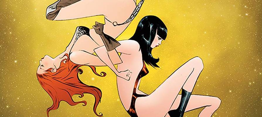
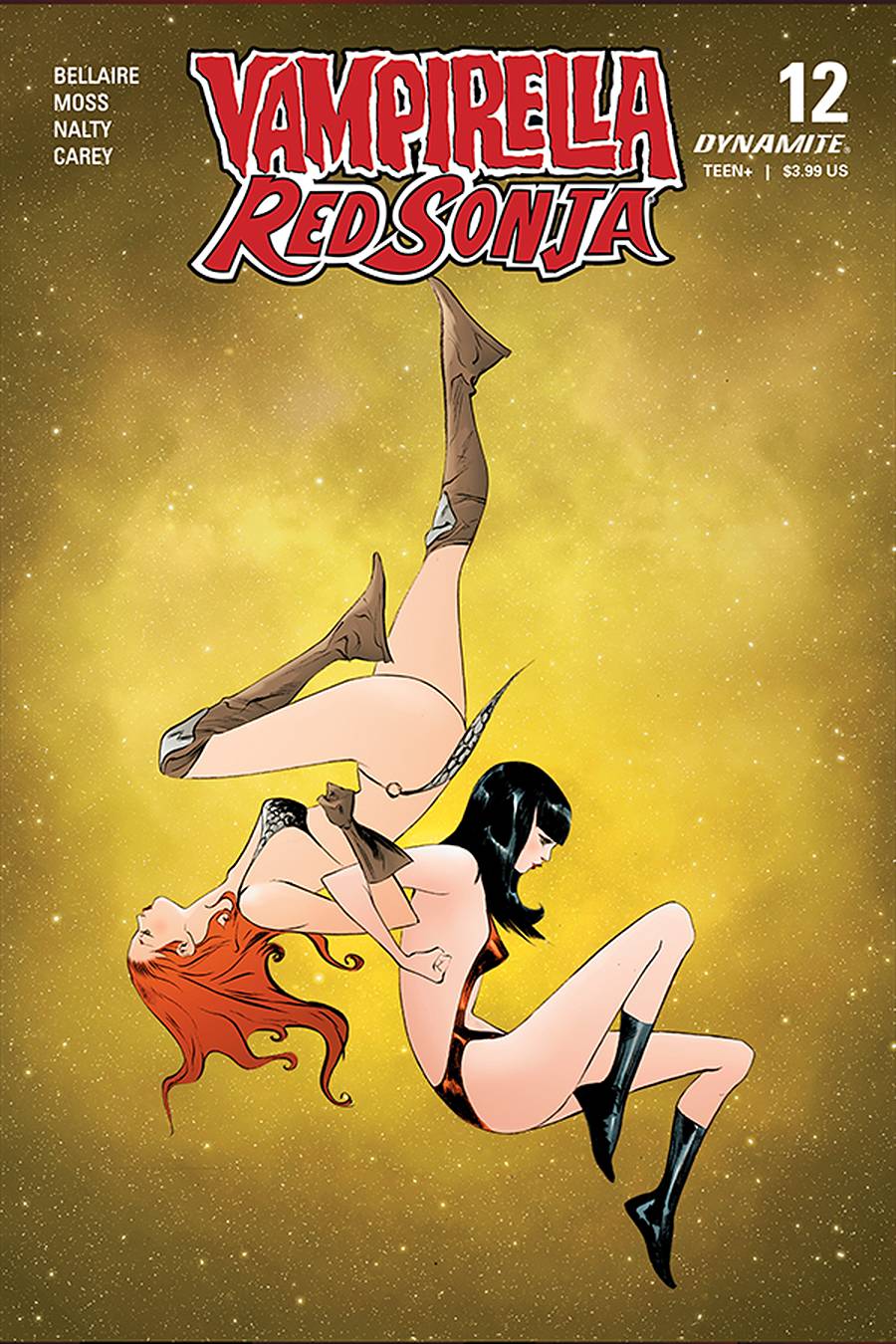
Artist Drew Moss has produced a style that at times really works in its simplicity, though is contrasted well with the facile elements with the focus on emotions, all of which are in play in this final issue. Moss uses some interesting panel designs to move Sonja’s life forward in a way that feels genuine rather than played to force a closure. Moss avoids the usual “sexy-ploitation” which you could expect and in its place are still attractive characters that demonstrate the core values of themselves. The tone fo the book is well served by colorist Rebecca Nalty who goes for hues of colors to add texture to environs. Letters are provided by Becca Carey whose font is svelte to the point where some could say doesn’t fit the word balloons. I, however, enjoyed the easier, lighter font that Carey has chosen. As it is a Dynamite book, and it seems the norm for a number of publishers, there are a range of covers to choose from; the Jae Lee “A” cover is gorgeous!
I started this book, in part, because I loved the idea of these two ladies working together in what I assumed would be a standard fare kind of book. I was surprised at the quality from the outset and completely bought into the premise from the second issue. It has been a fun ride and whilst I am genuinely saddened to see this book end; I am looking forward what Jordie Bellaire attempts next.
Writing – 5 Stars
Art – 4 Stars
Colors – 5 Stars
Overall – 4.5 Stars
Written by; Jordie Bellaire
Art by; Drew Moss
Colors by; Rebecca Nalty
Letters by Becca Carey
Published by; Dynamite Entertainment
Author Profile
- I am a long time comic book fan, being first introduced to Batman in the mid to late 70's. This led to a appreciation of classic artists like Neal Adams and Jim Aparo. Moving through the decades that followed, I have a working knowledge of a huge raft of characters with a fondness for old school characters like JSA and The Shadow
Currently reading a slew of Bat Books, enjoying a mini Marvel revival, and the host of The Definative Crusade and Outside the Panels whilst also appearing on No-Prize Podcast on the Undercover Capes Podcast Network
Latest entries

 Comic BooksApril 19, 2024Review: Jill and the Killers #4
 Comic BooksApril 11, 2024Review: Deadweights #1 (of 6)
 Comic BooksApril 10, 2024Review: Jim Henson’s Labyrinth Archive Edition #1 (of 3)
 Comic BooksApril 3, 2024Review: Red Sonja Empire of the Damned #1