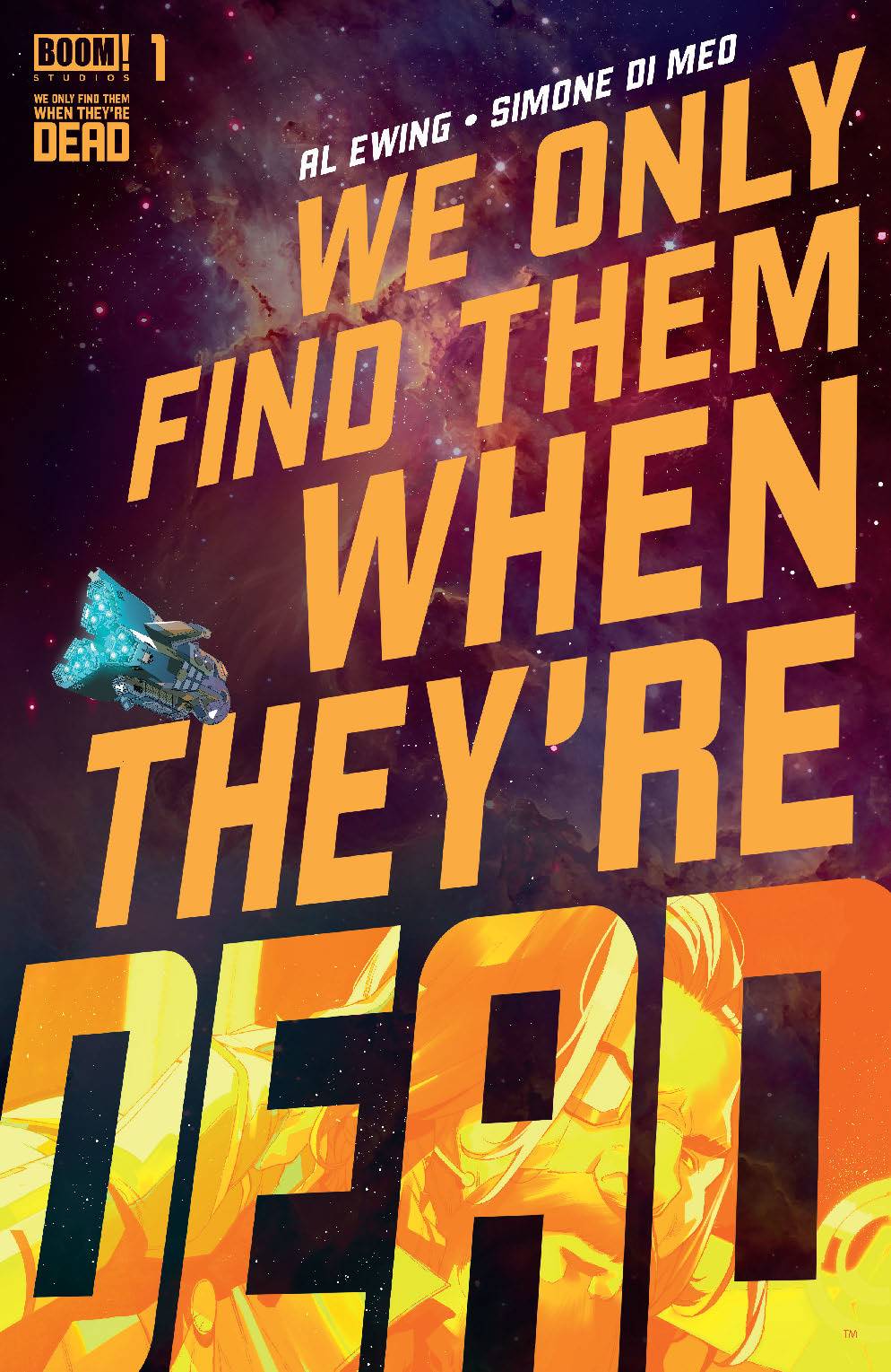
Review: We Only Find Them When They’re Dead #1
 There is an episode of Babylon 5 where Sinclair’s girlfriend runs afoul of a giant spaceship which is presumed to be one of the “old ones”. This ship is vast and shorts outs her ship. Looking through this book, it is that episode that springs to mind.
Captain Malik and the crew of the Vihaan II harvest resources from the giant corpses of alien gods found on the edge of human space. While other autopsy ships race to salvage the meat, minerals, and metals that sustain the human race, Malik sees an opportunity to finally break free from this system by being the first to find a living god. But to do that he and his crew face the depths of unknown space and a rogue agent that has it in for Malik or is it vice versa.
Al Ewing is the co-creator of the book. Ewing’s star has been on a bit of a rise of late. His Hulk series is loved by nearly everyone who has read it. He is also an architect of the current “epic” Empyre and will soon be the scribe on the Avengers book. With all that going on, it’s a wonder he has time to create something like this comic. To say that it is a grand adventure is an understatement, but it is grounded with a bunch of characters that have flaws and desires. There is a wordiness to it; the dialogue is undermined at times by exposition which slows the pace of the reading. With a new universe to play in, Ewing has to somehow let the reader what is going on, even if it is just to break the rules down the line. The actual dialogue feels a tad clichéd at times which came as a bit of a surprise.
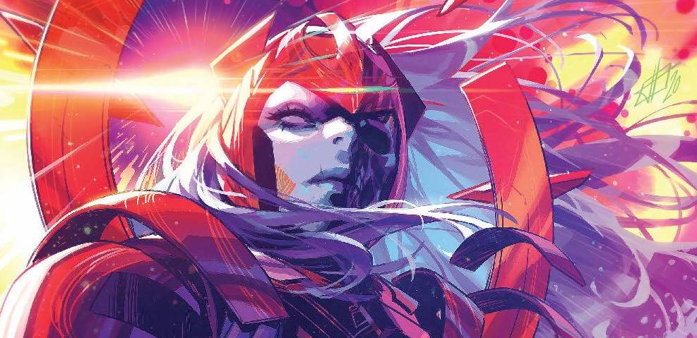
The art is supplied by co-creator Simone Di Meo who delivers a style that reminds of video games. There are clean lines on show, but it seems that Di Meo is more focussed on the environments that the crew find themselves in. This then matches the expositional elements of the writing. The colors by Mariasara Miotti make the book to be honest Miotti excels at the grandiose as well as using colors to affect the aesthetic, changing throughout the panels in a kaleidoscope style cacophony of sight. Finally, AndWorld design provides a font that is east on the eye for the most part, perhaps recognising that a simple approach would contrast the colors and make the reading of the book a little less hard work.
All in all, this is a mixed bag for me. Ewing has a plan in place for sure and I am sure that there will be meta-textual metaphors to enjoy and discuss. For right now though, fans of Ewing will have to be a little patient.
Writing – 3.5 Stars
Art – 3 Stars
Colors – 4 Stars
Overall – 3.5 Stars
Written by; Al Ewing
Art by; Simone Di Meo
Colors by; Mariasara Miotti
Letters by; AndWorld Design
Published by; Boom! Studios
Author Profile
- I am a long time comic book fan, being first introduced to Batman in the mid to late 70's. This led to a appreciation of classic artists like Neal Adams and Jim Aparo. Moving through the decades that followed, I have a working knowledge of a huge raft of characters with a fondness for old school characters like JSA and The Shadow
Currently reading a slew of Bat Books, enjoying a mini Marvel revival, and the host of The Definative Crusade and Outside the Panels whilst also appearing on No-Prize Podcast on the Undercover Capes Podcast Network
Latest entries

 Comic BooksApril 19, 2024Review: Jill and the Killers #4
 Comic BooksApril 11, 2024Review: Deadweights #1 (of 6)
 Comic BooksApril 10, 2024Review: Jim Henson’s Labyrinth Archive Edition #1 (of 3)
 Comic BooksApril 3, 2024Review: Red Sonja Empire of the Damned #1


