Review: X-O Manowar #2
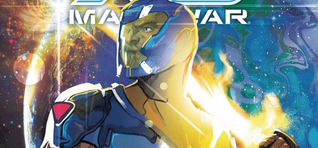
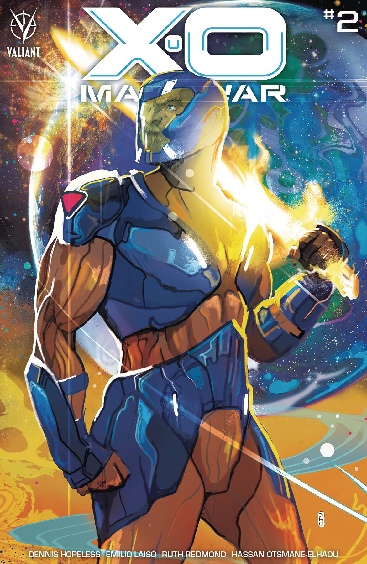 If there is a character that has gone through a number of cosmetic changes in the past it’s good old Aric the Visigoth. One of the original characters from the very first of Valiants foray into comic books. The first impressions back then were that X-O was an Iron Man clone; now though, I think there are other influences in play, specifically green in nature.
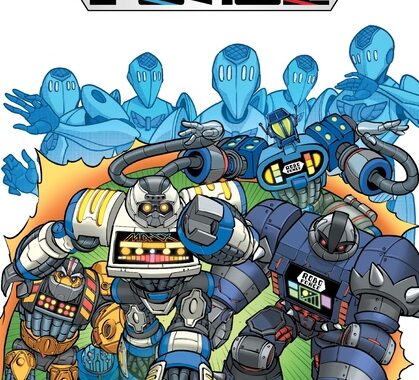
Aric and Shanhara are in a battle against a big robot, that leads them further into the sort of fight that the pair won’t be able to win by themselves, a PR one!
Dennis “Hopeless” Hallum is the writer on this latest X-O series. Now, being a fan of his Spider-Woman run and having read his Jean Grey book, I kind of had an idea of what to expect; sure enough there was the type of humour that seems to be ingrained at Marvel at the moment. What I didn’t expect was Shanhara sounding like a Green Lantern ring! I am not saying that either of those things are necessarily bad, it’s just if I wanted a Marvel book, I’d read a Marvel book; if I wanted to read Green Lantern I’d go and dig out the Sam Humphries run on Green Lanterns. The dialogue is snappy and down pat, which for me gives the book a feeling of over production. Maybe I just miss the roughness of Aric’s barbarism. Story wise, giving the main character an enemy that they can’t punch is always fun.
The art is provided by Emilo Laiso, who is also a dab hand at the Marvel vibe after his work on Spider-Man and a slew of Star Wars books. Laiso does a great job across all aspect of the storytelling process. There are fantastic action pieces with strong, vibrant, powerful characters. The faces express all the right emotional beats, which is great considering the main parts of the story are meeting based, Backgrounds are well observed, especially the kitchen scene and have texture, which is helped by the colors from Ruth Redmond who delivers a scheme that enriches the art. The blue and gold of X-O really pops against some of the more muted colors. Finally, letterer Hassan Otsmane-Elhaou , whose works has graced many a Dynamite comic, produces a fantastic font and word bubble combo that feel a little reminiscent of how the lanterns talk to their rings.
For fans of X-O, this is a fun little read with enough of Hallum’s usual writing tricks to keep those who normally stick to Marvel interested. I am no sure how this series will play into the overall narrative of Aric’s journey, meaning that for some, this may feel like a step too far.
Writing – 3.5 Stars
Art – 4 Stars
Colors – 5 Stars
[yasr_overall_rating]
Written by; Dennis “Hopeless” Hallum
Art by; Emilo Laiso
Colors by; Ruth Redmond
Letters by; Hassan Otsmane-Elhaou
Published by; Valiant Entertainment LLC
Author Profile
- I am a long time comic book fan, being first introduced to Batman in the mid to late 70's. This led to a appreciation of classic artists like Neal Adams and Jim Aparo. Moving through the decades that followed, I have a working knowledge of a huge raft of characters with a fondness for old school characters like JSA and The Shadow
Currently reading a slew of Bat Books, enjoying a mini Marvel revival, and the host of The Definative Crusade and Outside the Panels whilst also appearing on No-Prize Podcast on the Undercover Capes Podcast Network
Latest entries

 Comic BooksApril 19, 2024Review: Jill and the Killers #4
 Comic BooksApril 11, 2024Review: Deadweights #1 (of 6)
 Comic BooksApril 10, 2024Review: Jim Henson’s Labyrinth Archive Edition #1 (of 3)
 Comic BooksApril 3, 2024Review: Red Sonja Empire of the Damned #1