Review: Zodiac #1 (of 3)
 It seems that every comic book universe requires an assassin. Whether it’s Bullseye, Deadpool, Deathstroke or Deadshot, it seems we all like a bad guy, pardon the paraphrase.
Zodiac was on a bit of a mission; ridding his Irish streets of drugs in his own style; his life changed when he threw his lot in with Merlin. Now, taking on Merlin’s mission has given Logan Patrick O’Connell a chance to walk the path of vengeance, albeit a path of his master’s making.
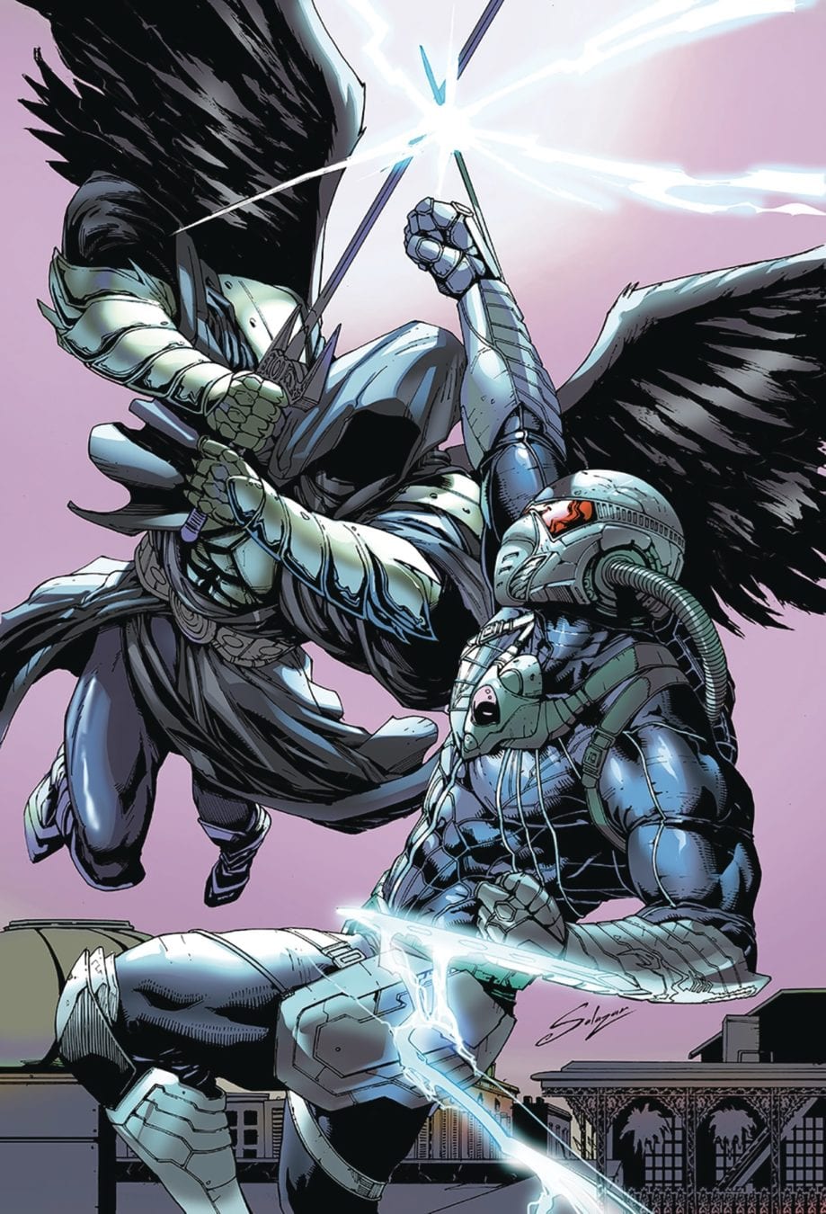
This first issue of this mini series acts in part as a showcase of the lead character. It also goes to set up the framing of the character’s motivation whilst also giving the reader a rundown on his suits abilities. With the confrontation in the first act we get to see the pacing of Joe Brusha’s script, which does have a certain energy to it. The monologue feels a tad familiar, maybe due to the number of “better than the people they face” scenario’s that permeates this sort of story, at least at first. It’s kind of like watching Smackdown and a WWE superstar goes up against Joe Unknown; you know how the fight is going to go down. Brusha uses this technique to maybe set up the second act as Zodiac finally faces a challenge that will eventually help him on his quest.
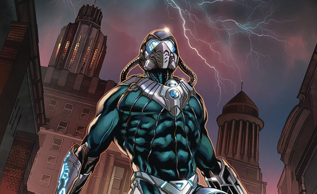
The art is provided by Daniel Maine who works hard to give the titular assassin a powerful look. The problem here is that the character himself seems like too much of an amalgam of other characters; his headgear look like to came from the MASK cartoon, arm blades from the disastrous Wolverine Origins movie and Azbats gloves claws along with Boba Fett’s jet pack all make an appearance. Maine’s art suits the big panels, with the focus on those key, almost splash pieces, though he can lose some of the energy in smaller panels. Maine also manages to draw the female form well, which is probably a prerequisite for anybody wanting to work on a Zenescope book. Colors are provided by Jorge Coates who continues to deliver the type of high-end colouring we have come to expect from Zenescope. Letterer extraordinaire Tyler Esposito is on hand to deliver a tour-de-force with a number of fonts used expertly to differentiate the different characters throughout the book.
This book in of itself, isn’t a bad book. I get that Brusha wants to elevate this character, especially as the War of the Grail will no doubt have impacts on other books in the range. It seems that Brusha has researched various assassins and picked the bits he thinks are the coolest to use. I shouldn’t have a problem with this, after all the whole Grim Universe is based on fairy tales with a twist. Here though, there is something lacking in production. Take for example the panels where Zodiac isn’t wearing his helmet, then in the next he is. Little inconsistencies like this can have an impact on the overall feeling of quality, that those involved have tried to deliver.
Writing – 3 Stars
Art – 3 Stars
Colors – 4 Stars
[yasr_overall_rating size=”large”]
Written by; Joe Brusha
Art by; Daniel Maine
Colors by; Jorge Cortes
Letters by; Taylor Esposito
Published by; Zenescope Entertainment
Author Profile
- I am a long time comic book fan, being first introduced to Batman in the mid to late 70's. This led to a appreciation of classic artists like Neal Adams and Jim Aparo. Moving through the decades that followed, I have a working knowledge of a huge raft of characters with a fondness for old school characters like JSA and The Shadow
Currently reading a slew of Bat Books, enjoying a mini Marvel revival, and the host of The Definative Crusade and Outside the Panels whilst also appearing on No-Prize Podcast on the Undercover Capes Podcast Network
Latest entries

 Comic BooksApril 19, 2024Review: Jill and the Killers #4
 Comic BooksApril 11, 2024Review: Deadweights #1 (of 6)
 Comic BooksApril 10, 2024Review: Jim Henson’s Labyrinth Archive Edition #1 (of 3)
 Comic BooksApril 3, 2024Review: Red Sonja Empire of the Damned #1